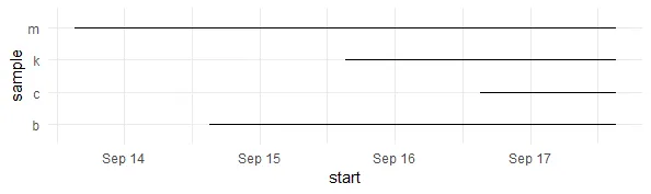
我有样本和持续时间。
library(lubridate)
daf <- data.frame(sample=c("m","k","c","b"),duration=ddays(c(4,2,1,3)))
daf$start <- Sys.time()-daf$duration

> head(daf)
  sample          duration               start
1      m 345600s (~4 days) 2018-09-13 15:08:17
2      k 172800s (~2 days) 2018-09-15 15:08:17
3      c  86400s (~1 days) 2018-09-16 15:08:17
4      b 259200s (~3 days) 2018-09-14 15:08:17
我已经能够使用ggplot绘制出下面的图表。
library(ggplot2)
ggplot(daf)+
geom_segment(aes(x=start,y=sample,xend=Sys.time(),yend=sample))+
 theme_minimal()
我希望将其转化为可交互的图形,使用dygraphs或highcharter。尤其是要使用交互式缩放滑块和附加变量作为工具提示。但是,我不确定如何将此数据与dygraphs或highcharter配合使用。
library(xts)
library(dygraphs)
dygraph(xts(as.integer(factor(daf$sample)),order.by=daf$start))
library(highcharter)
hchart(xts(as.integer(factor(daf$sample)),order.by=daf$start))
library(plotly),然后将你的ggplot()包装在ggplotly()中,这是一个免费且无痛的尝试。另一方面,让我们等待一些高级图表或动态图表专家,我真的很想看到使用这些包的答案。 - s__ggplotly()是我的备选方案 :-) 与此同时,我会等待高手的到来。 - mindlessgreenhighcharter来制作一个范围条形图。请参考此页面。 - patL