CSS3如何制作带渐变边框的圆形?

4
我正在尝试在纯CSS3中复制一个绿色方形的图像。您可以在这里看到该图像:enter image description here
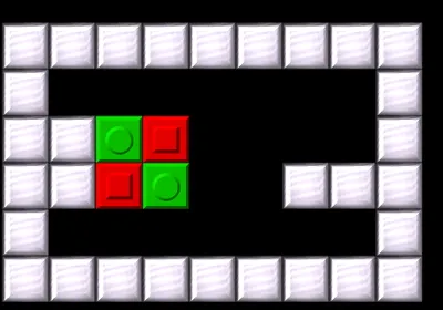
到目前为止,我已经成功生成了方形,并且看起来与图像中的方形完全相同。问题是方形中圆圈的边框。正如您所看到的那样,图像中圆圈的边框是梯度的,而我的不是(请参见fiddle),我不知道如何在CSS中进行复制...
这是我正在使用的CSS代码: 这里是我的方形的fiddle
.greenBlock, .greenCore {
    background-color: #00c200;
    border: 3px solid;
    border-top-color: #00de00;
    border-right-color: #006900;
    border-bottom-color: #006900;
    border-left-color: #00de00;
    z-index: 10;
    width: 42px;
    height: 42px;
}

.greenCore {
    width: 22px;
    height: 22px;
    border-radius: 50%;
    -webkit-transform: translate(25%, 25%);
    transform: translate(25%, 25%); 
}

我该如何在CSS3中实现这个渐变圆形边框?
非常感谢。
3个回答

6

我会使用伪元素(:before),并使用渐变背景进行样式设置。
这是因为无法将border-imageborder-radius组合使用

.greenBlock {
 background-color: #00c200;
 border: 3px solid;
 border-top-color: #00de00;
 border-right-color: #006900;
 border-bottom-color: #006900;
 border-left-color: #00de00;
 width: 42px;
 height: 42px;
 position:relative;
 z-index:10;
}

.greenCore {
 background-color: #00c200;
 width: 22px;
 height: 22px;
 border-radius: 50%;
 top:50%;
 left:50%;
 margin-left:-11px; /*half width*/
 margin-top:-11px;
 position:relative;
}
.greenCore:before{
 content:'';
 position:absolute;
 z-index:-1;
 border-radius:50%;
 width:28px; /*22 of greenCore + 3 + 3 for the borders*/
 height:28px;
 left:-3px;
 top:-3px;
    
 background: -moz-linear-gradient(-45deg, #00ff00 0%, #004900 100%);
 background: -webkit-gradient(linear, left top, right bottom, color-stop(0%,#00ff00), color-stop(100%,#004900));
 background: -webkit-linear-gradient(-45deg, #00ff00 0%,#004900 100%);
 background: -o-linear-gradient(-45deg, #00ff00 0%,#004900 100%);
 background: -ms-linear-gradient(-45deg, #00ff00 0%,#004900 100%);
 background: linear-gradient(135deg, #00ff00 0%,#004900 100%);
}
<div class="palette greenBlock" data-code="2">
   <div class="greenCore"></div>
</div>


1
一种可能的方法是制作一个带有对角渐变背景的稍大圆形,并将其放置在“核心”圆形后面。这样,较大的圆形将显示为第二个圆形的边框。通过修改您的 fiddle,我得到了类似 this 的东西。
为了制作渐变效果,我使用了 linear-gradient 函数,并将其分配为背景。
background: linear-gradient(135deg, #00de00, #006900);

第一个值是梯度的方向(以度为单位)。后面的两个值分别表示梯度的起始颜色和结束颜色。


0

或许你可以尝试添加这个:

box-shadow:1px 1px 3px 1px #000, -1px -1px 1px #fff; -moz-box-shadow:1px 1px 3px 1px #000, -1px -1px 1px #fff; -webkit-box-shadow:1px 1px 3px 1px #000, -1px -1px 1px #fff;

到你的.greenCore类中。这可能会接近你想要的效果。你可以调整数值来使其更符合你的喜好。


网页内容由stack overflow 提供, 点击上面的
可以查看英文原文,
原文链接