ChartJs:X轴标签在底部被截断

4
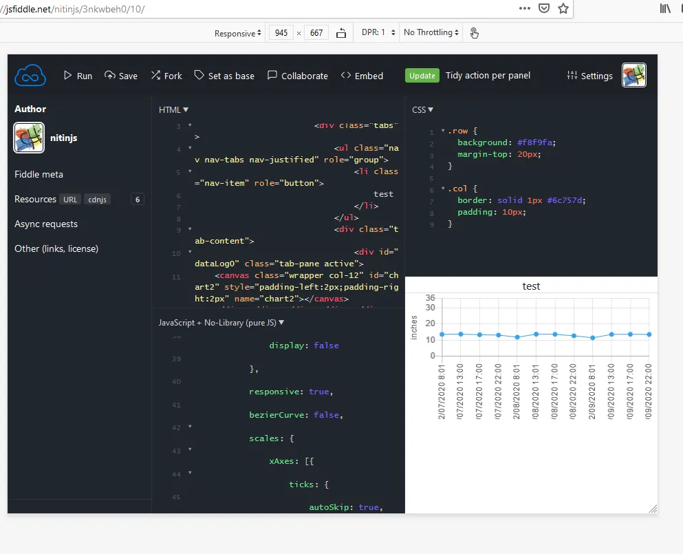
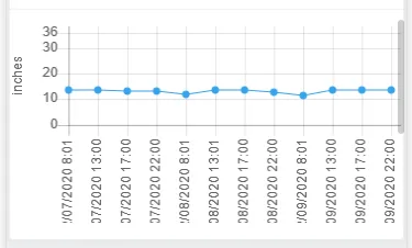
我正在创建竖直X轴标签,但在移动设备上标签会被切断:

enter image description here 我的代码如下:
window.chartColors = {
    red: 'rgb(255, 99, 132)',
    orange: 'rgb(255, 159, 64)',
    yellow: 'rgb(255, 205, 86)',
    green: 'rgb(51, 204, 51)',
    blue: 'rgb(54, 162, 235)',
    purple: 'rgb(153, 102, 255)',
    grey: 'rgb(201, 203, 207)'
};


var options2 = {
type: 'line',
data: {
    labels: ["02/07/2020 8:01", "02/07/2020 13:00", "02/07/2020 17:00", "02/07/2020 22:00", "02/08/2020 8:01", "02/08/2020 13:01", "02/08/2020 17:00", "02/08/2020 22:00", "02/09/2020 8:01", "02/09/2020 13:00", "02/09/2020 17:00", "02/09/2020 22:00"],
    datasets: [
        {
            label: 'Water Level',
            data: [13.534,13.652,13.298,13.062,11.763,13.613,13.534,12.629,11.369,13.495,13.574,13.456],
            borderWidth: 1,
            lineTension: 0,
            fill: false,
            backgroundColor: window.chartColors.blue,
            borderColor: window.chartColors.blue,
        }
    ],
    scales: {
      xAxes: [{
        ticks: {
          beginAtZero: false
        }
      }]
    }
},
options: {
    legend: {
        position: 'bottom',
        display: false
    },
    responsive: true,
    bezierCurve: false,
    scales: {
        xAxes: [{
            ticks: {
                autoSkip: true,
                maxRotation: 90,
                minRotation: 90
            }
        }],
        yAxes: [{
            ticks: {
              min: 0,
              max: 36,
              stepSize: 10
            },
            scaleLabel: {
              display: true,
              labelString: 'inches'
            }
        }]
    },
    backgroundRules: [{
        backgroundColor: window.chartColors.green,
        yAxisSegement: 6
    }, {
        backgroundColor: window.chartColors.grey,
        yAxisSegement: 12
    }, {
        backgroundColor: window.chartColors.red,
        yAxisSegement: 999999
    }]
},
plugins: [{
    beforeDraw: function (chart) {
        var rules = chart.chart.options.backgroundRules;
        var ctx = chart.chart.ctx;
        var yAxis = chart.chart.scales["y-axis-0"];
        var xaxis = chart.chart.scales["x-axis-0"];
        for (var i = 0; i < rules.length; ++i) {
            var yAxisSegement = (rules[i].yAxisSegement > yAxis.ticksAsNumbers[0] ? yAxis.ticksAsNumbers[0] : rules[i].yAxisSegement);
            var yAxisPosStart = yAxis.height - ((yAxisSegement * yAxis.height) / yAxis.ticksAsNumbers[0]) + chart.chart.controller.chartArea.top;
            var yAxisPosEnd = (i === 0 ? yAxis.height : yAxis.height - ((rules[i - 1].yAxisSegement * yAxis.height) / yAxis.ticksAsNumbers[0]));
            ctx.fillStyle = rules[i].backgroundColor;
            ctx.fillRect(xaxis.left, yAxisPosStart, xaxis.width, yAxisPosEnd - yAxisPosStart + chart.chart.controller.chartArea.top);
        }
    }
}]
};

var ctx2 = document.getElementById('chart2').getContext('2d');
var chart2 = new Chart(ctx2, options2);

Fiddle: https://jsfiddle.net/nitinjs/3nkwbeh0/10/

帮助

更新
若要在 Firefox 中复制,请按下 CTRL + shift + m

输入图像描述


你的fiddle正在使用Chart.js 2.3.0版本。最新发布的版本是2.9.3。尝试使用最新版本,因为轴渲染代码已经有了很多改进。 - timclutton
更新版本后,仍然遇到相同的问题。 - Nitin Sawant
1个回答

4
如果您将此选项添加到您的图表选项中,它将解决问题:
maintainAspectRatio: false,

完整 JavaScript 代码(在第40行添加代码):

window.chartColors = {
  red: 'rgb(255, 99, 132)',
  orange: 'rgb(255, 159, 64)',
  yellow: 'rgb(255, 205, 86)',
  green: 'rgb(51, 204, 51)',
  blue: 'rgb(54, 162, 235)',
  purple: 'rgb(153, 102, 255)',
  grey: 'rgb(201, 203, 207)'
};


var options2 = {
  type: 'line',
  data: {
    labels: ["02/07/2020 8:01", "02/07/2020 13:00", "02/07/2020 17:00", "02/07/2020 22:00", "02/08/2020 8:01", "02/08/2020 13:01", "02/08/2020 17:00", "02/08/2020 22:00", "02/09/2020 8:01", "02/09/2020 13:00", "02/09/2020 17:00", "02/09/2020 22:00"],
    datasets: [
      {
        label: 'Water Level',
        data: [13.534,13.652,13.298,13.062,11.763,13.613,13.534,12.629,11.369,13.495,13.574,13.456],
        borderWidth: 1,
        lineTension: 0,
        fill: false,
        backgroundColor: window.chartColors.blue,
        borderColor: window.chartColors.blue,
      }
    ],
    scales: {
      xAxes: [{
        ticks: {
          beginAtZero: false
        }
      }]
    }
  },
  options: {
    legend: {
      position: 'bottom',
      display: false
    },
    maintainAspectRatio: false,  // <--- THIS LINE WAS ADDED
    responsive: true,
    bezierCurve: false,
    scales: {
      xAxes: [{
        ticks: {
          autoSkip: true,
          maxRotation: 90,
          minRotation: 90
        }
      }],
      yAxes: [{
        ticks: {
          min: 0,
          max: 36,
          stepSize: 10
        },
        scaleLabel: {
          display: true,
          labelString: 'inches'
        }
      }]
    }
  },
  plugins: []
};
var ctx2 = document.getElementById('chart2').getContext('2d');
var chart2 = new Chart(ctx2, options2);

function RefreshGraph2() {
  console.log(chart2);
  var dt2 = {
    serial: "310021000e51353532343635",
    from: $("#txtFrom2").val(),
    to: $("#txtTo2").val()
  };

  $.post("/Mobile/GetGraphData", dt2, function(data) {
    var labels2 = _.pluck(data.result, 'createdAtLabel');
    var values2 = _.pluck(data.result, 'waterLevel');
    chart2.data.labels = labels2;
    chart2.data.datasets[0].data = values2;
    console.log(labels2);
    console.log(values2);
    //chart2.data.datasets[0].data = data.result;
    chart2.update();
    return false;
  });
}

$(document).ready(function () {
  $("#btnRefresh2").on("click", function () {
    RefreshGraph2();
    return false;
  });
});

网页内容由stack overflow 提供, 点击上面的
可以查看英文原文,
原文链接