我想将蓝色正方形 div 的角落放在橙色 div 下面。我尝试了我所知道的一切:
z-index 不起作用,因为我的 div 被包装在另一个 div 中,如果我取消包装,我会在定位八个元素时遇到麻烦。
有人能告诉我如何做到这一点吗?或如何为所有元素使用 z-index?
我现在的 HTML 代码:
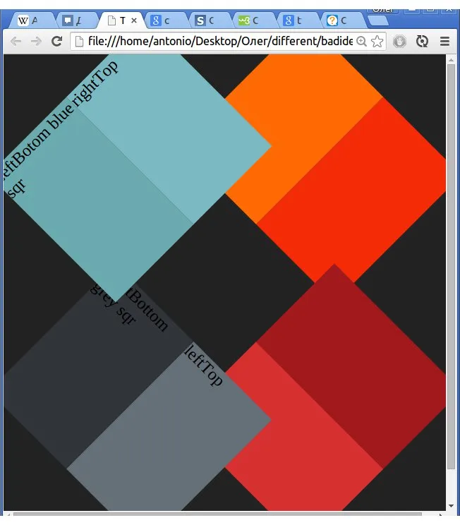
我需要的效果:

 body {
   background-color: #222;
   background-repeat: no-repeat;
 }
 #blueSquare {
   position: absolute;
   left: 15px;
   top: 15px;
   width: 50%;
   height: 170px;
   -webkit-transform: rotate(-45deg);
 }
 #rightTopblueSquare {
   height: 100%;
   width: 50%;
   position: relative;
   left: 50%;
   background-color: #7ab9c2;
   opacity: .99;
 }
 #leftBottomblueSquare {
   position: relative;
   top: -100%;
   height: 100%;
   width: 50%;
   background-color: #6baaae;
 }
 /*----------------------------------*/
 #greySquare {
   width: 50%;
   height: 170px;
   position: absolute;
   bottom: 15px;
   left: 15px;
   -webkit-transform: rotate(45deg);
 }
 #lefTopgreySquare {
   height: 100%;
   width: 50%;
   position: relative;
   left: 50%;
   background-color: #656f78;
 }
 #rightButtomgreySquare {
   position: relative;
   top: -100%;
   height: 100%;
   width: 50%;
   background-color: #313439;
 }
 /*----------------------------------*/
 #redSquare {
   width: 50%;
   height: 170px;
   position: absolute;
   right: 15px;
   bottom: 15px;
   -webkit-transform: rotate(-45deg);
 }
 #leftBottomredSquare {
   height: 100%;
   width: 50%;
   position: relative;
   left: 50%;
   background-color: #a2191d;
 }
 #rightTopredSquare {
   position: relative;
   top: -100%;
   height: 100%;
   width: 50%;
   background-color: #d63030;
 }
 /*----------------------------------*/
 #orangeSquare {
   width: 50%;
   height: 170px;
   position: absolute;
   right: 15px;
   top: 15px;
   -webkit-transform: rotate(45deg);
   z-index: -1;
 }
 #rightBottomorangeSquare {
   height: 100%;
   width: 50%;
   position: relative;
   left: 50%;
   background-color: #f42b06;
 }
 #lefttToporangeSquare {
   position: relative;
   top: -100%;
   height: 100%;
   width: 50%;
   background-color: #ff6a05;
   opacity: 1;
}<div id="orangeSquare">
<div id="rightBottomorangeSquare"></div>
<div id="lefttToporangeSquare"></div>
</div>
<div id="redSquare">
<div id="leftBottomredSquare"></div>
<div id="rightTopredSquare"></div>
</div>
<div id="greySquare">
<div id="lefTopgreySquare">leftTop</div>
<div id="rightButtomgreySquare">rightBottom grey sqr</div>
</div>
<div id="blueSquare">
<div id="rightTopblueSquare">rightTop</div>
<div id="leftBottomblueSquare">LeftBotom blue sqr</div>
</div>