以下截图显示我的x轴。
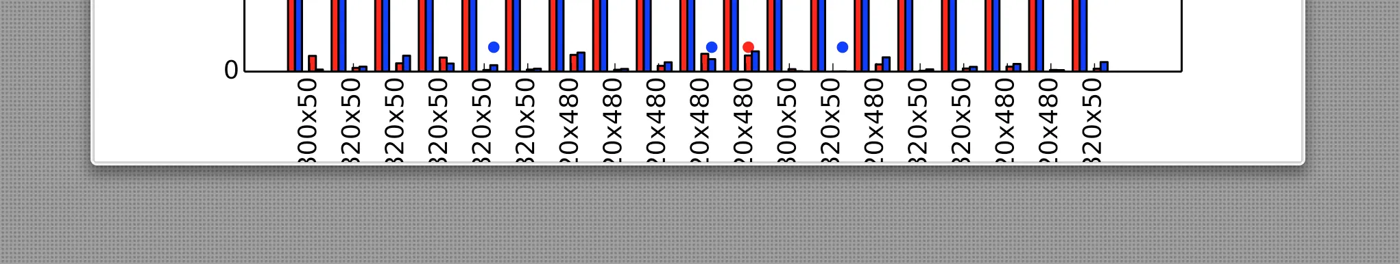 我添加了一些标签并将它们旋转90度以更好地阅读它们。 但是,pyplot截断了底部,使我无法完全读取标签。
如何扩展底边距以便查看完整标签?
我添加了一些标签并将它们旋转90度以更好地阅读它们。 但是,pyplot截断了底部,使我无法完全读取标签。
如何扩展底边距以便查看完整标签?
我添加了一些标签并将它们旋转90度以更好地阅读它们。 但是,pyplot截断了底部,使我无法完全读取标签。
如何扩展底边距以便查看完整标签?
我添加了一些标签并将它们旋转90度以更好地阅读它们。 但是,pyplot截断了底部,使我无法完全读取标签。
如何扩展底边距以便查看完整标签?两种追溯方式:
fig, ax = plt.subplots()
# ...
fig.tight_layout()
或者
fig.subplots_adjust(bottom=0.2) # or whatever
这是一个 subplots_adjust 的示例:http://matplotlib.org/examples/pylab_examples/subplots_adjust.html
(但我更喜欢 tight_layout)
我使用过的一个快速解决方案是直接使用pyplot的自动tight_layout方法,该方法可在Matplotlib v1.1及以上版本中使用:
plt.tight_layout()
plt.show()),但在对轴进行操作(如刻度标签旋转等)之后,可以立即调用此方法。import matplotlib.pyplot as plt。fig.savefig('name.png', bbox_inches='tight')
fig.tight_layout()
Subplot-adjust对我没有用,因为整个图形会随着标签仍然超出边界而重新调整大小。
我发现的一种解决方法是始终将y轴保持在最高或最低y值的某个余量上:
x1,x2,y1,y2 = plt.axis()
plt.axis((x1,x2,y1 - 100 ,y2 + 100))
axis()函数指定了坐标轴的视口,因此不清楚为什么使用plt.axis()会有助于位于坐标轴之外的标签...似乎更合理的期望是从plt.figure()中找到解决方法。 - PatrickTfig, ax = plt.subplots(tight_layout=True)
这有点复杂,但它提供了一个通用而整洁的解决方案。
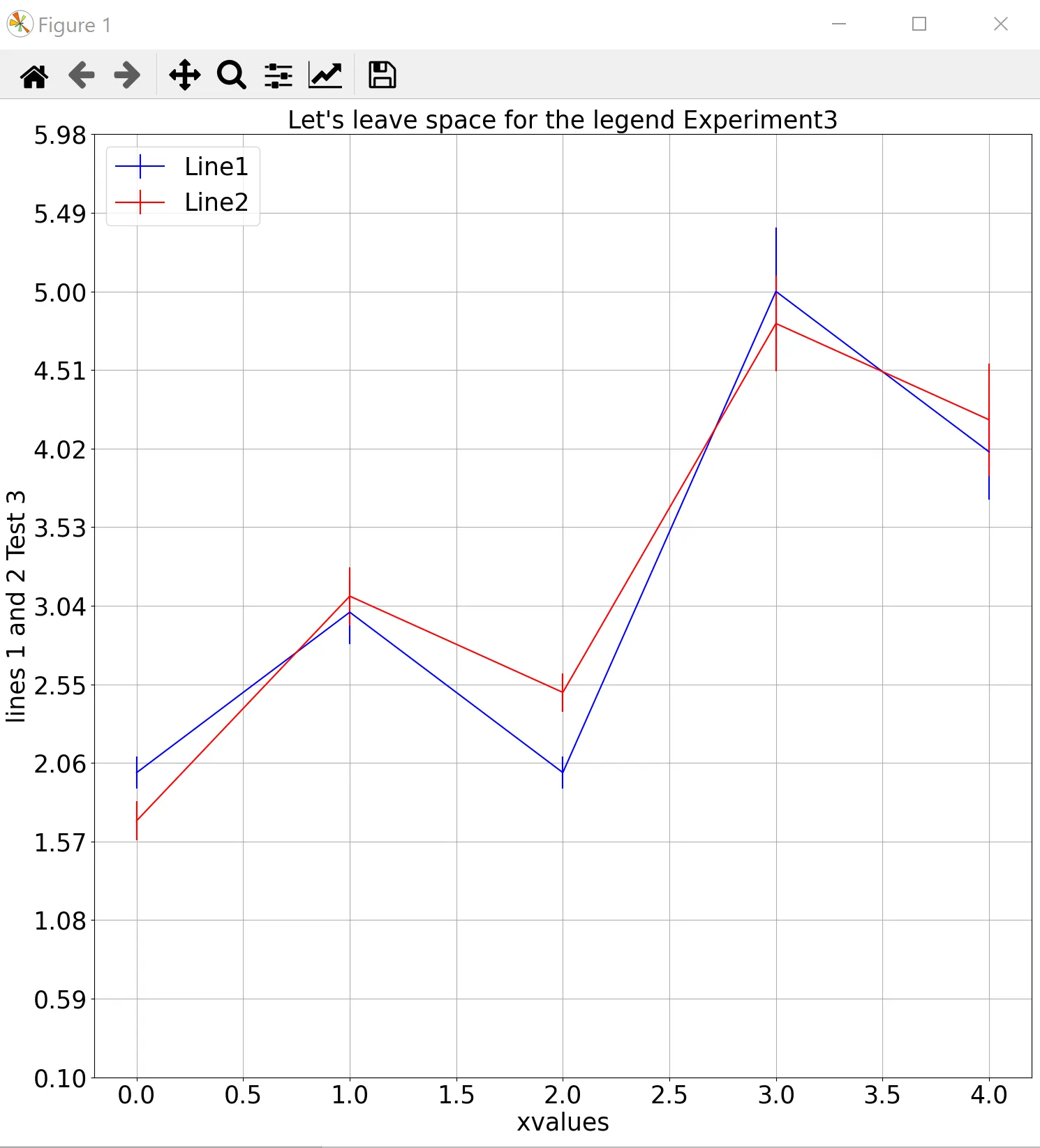
import numpy as np
value1 = 3

xvalues = [0, 1, 2, 3, 4]
line1 = [2.0, 3.0, 2.0, 5.0, 4.0]
stdev1 = [0.1, 0.2, 0.1, 0.4, 0.3]

line2 = [1.7, 3.1, 2.5, 4.8, 4.2]
stdev2 = [0.12, 0.18, 0.12, 0.3, 0.35]

max_times = [max(line1+stdev1),max(line2+stdev2)]
min_times = [min(line1+stdev1),min(line2+stdev2)]

font_size = 25

max_total = max(max_times)
min_total = min(min_times)

max_minus_min = max_total - min_total

step_size = max_minus_min/10
head_space = (step_size*3)


plt.figure(figsize=(15, 15))
plt.errorbar(xvalues, line1, yerr=stdev1, fmt='', color='b')

plt.errorbar(xvalues, line2, yerr=stdev2, fmt='', color='r')
plt.xlabel("xvalues", fontsize=font_size)
plt.ylabel("lines 1 and 2 Test "+str(value1), fontsize=font_size)
plt.title("Let's leave space for the legend Experiment"+ str(value1), fontsize=font_size)
plt.legend(("Line1", "Line2"), loc="upper left", fontsize=font_size)
plt.tick_params(labelsize=font_size)
plt.yticks(np.arange(min_total, max_total+head_space, step=step_size) )
plt.grid()
plt.tight_layout()
结果:
subplots中传递tight_layout=True,它会产生相同的效果。 - tacaswellfig = plt.figure(); fig.add_axes(...);https://matplotlib.org/api/_as-gen/matplotlib.figure.Figure.html#matplotlib.figure.Figure.add_axes - Paul Hsubplots_adjust部分地为我解决了问题,在图例被切断的情况下,它增加了一些空间在图形的顶部:top=0.75的效果不够理想,而top=1.5奇怪地似乎没有任何效果。在这种特殊情况下,tight_layout似乎没有任何效果。 - bli