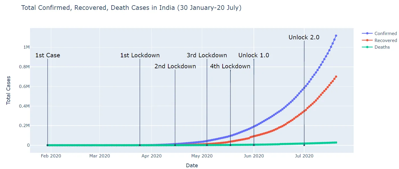
如何在 Matplotlib 中添加示例的注释文本,如 Plotly 中的“1st Lockdown、2nd Lockdown”?
ax.annotate 的示例,正如另一个答案所建议的那样:import matplotlib.pyplot as plt
import pandas as pd
dr = pd.date_range('02-01-2020', '07-01-2020', freq='1D')
y = pd.Series(range(len(dr))) ** 2
fig, ax = plt.subplots()
ax.plot(dr, y)
ax.annotate('1st Lockdown',
xy=(dr[50], y[50]), #annotate the 50th data point; you could select this in a better way
xycoords='data', #the xy we passed refers to the data
xytext=(0, 100), #where we put the text relative to the xy
textcoords='offset points', #what the xytext coordinates mean
arrowprops=dict(arrowstyle="->"), #style of the arrow
ha='center') #center the text horizontally
ax.annotate('2nd Lockdown',
xy=(dr[100], y[100]), xycoords='data',
xytext=(0, 100), textcoords='offset points',
arrowprops=dict(arrowstyle="->"), ha='center')
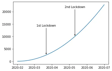
使用annotate有很多选项,因此我建议查找符合您需求的示例并尝试跟随它。
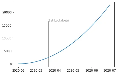
在matplotlib中,注释似乎是完成此操作的“聪明”方式;您也可以使用axvline和text,但可能需要添加额外的格式以使事物看起来更好:
import matplotlib.pyplot as plt
import pandas as pd

dr = pd.date_range('02-01-2020', '07-01-2020', freq='1D')

y = pd.Series(range(len(dr))) ** 2

fig, ax = plt.subplots()
ax.plot(dr, y)

ax.axvline(dr[50], ymin=0, ymax=.7, color='gray')
ax.text(dr[50], .7, '1st Lockdown', transform=ax.get_xaxis_transform(), color='gray')
ax.annotate('1st Lockdown', ...)