Material UI 进度指示器水平居中对齐

23

技术栈:Meteor + React + Material UI

这是我“主要”的渲染组件的完整代码:

// Sorry for not giving material-UI CSS,
// cause it cannot be served as a stand-alone CSS

render() {
    return ( 
      <div className = "container">
        <AppBar title = "test" />
        <Tabs /> // Tab contents goes here
        <RefreshIndicator
          left={70} // Required properties
          top={0}  // Required properties
          status="loading"
          style={{ 
              display: 'inline-block',
              position: 'relative',
              margin: '0 auto' }} />
      </div>
   );
},

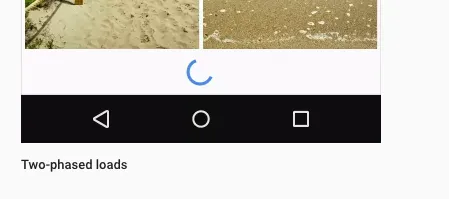
我想让刷新指示器水平居中于我的标签页下方,就像这张图片中的旋转圆圈一样:

enter image description here

在Material UI的文档这里中,该指示器带有以下样式:
display: 'inline-block',
position: 'relative',

使用这些样式我无法水平居中对齐,而没有这些样式,我甚至无法将其定位到我想要的位置。

我尝试过:

  1. margin: 0 auto --> 失败
  2. text-align: center --> 失败
  3. display: flex --> 失败
  4. 1和2的组合 --> 失败
  5. left={$(window).width/2-20} --> 这个方法可以,但我想仅使用CSS

你能否创建一个jsfiddle或jsbin来展示问题?你可以尝试移除position: 'relative'并检查一下吗? - Aditya Singh
我建议将“Refresh Indicator”组件包装在一个带有flex类的div中。然后使用justify-content:center将其居中。 - lux
@Adiya Singh 抱歉,似乎没有办法在jsfiddle/jsbin上创建独立的Material-UI示例...这个时候只有通过NPM安装Material-UI。 - Junho Kim
@lux 我喜欢以下代码:<div sytle={{ display: 'flex', justifyContent: 'center' }}><RefreshIndicator left={70} top={0} status="loading" style={{ display: 'inline-block', position: 'relative', margin: '0 auto' }}/> </div> 但是失败了。 - Junho Kim
很让人烦恼的是,Flex无法直接与此指示器配合使用。 - Oliver Dixon
5个回答

34
下面的解决方案可以使进度指示器居中,而不需要任何会导致元素偏移的计算技巧:
<div style={{display: 'flex', justifyContent: 'center'}}>
   <RefreshIndicator status="loading" />
</div>

2
我认为这是优先于 position: absolute 的首选显示方法 - TMU 在页面上有大量的 position: absolute/relative 元素时,可能会出现更大的 "性能" 问题,但是这种方法将使其居中,而不管容器的大小,而接受的答案则需要您知道宽度。 - keif

13

以下是我用来确保水平居中的方法,对于我来说非常有效。

  1. 将父组件的样式设为position: 'relative'
  2. 将刷新指示器的样式设为marginLeft: '50%',并设置left={-20}(假设大小为40)。

这是代码(我将其放在一个CardText组件中):

    ...
    <CardText style={{position: 'relative'}}>
      <RefreshIndicator
        size={40}
        left={-20}
        top={10}
        status={'loading'}
        style={{marginLeft: '50%'}}
      />
    </CardText>
    ...

这并没有完全居中进度指示器,使用此解决方案会使进度指示器偏离中心。 - Kevin Crain
不要依赖于 left: -20 并知道 "因为它有40像素宽",您可以利用 transform: translateX(-50%) 并使其响应。 - keif

11
Material UI v5 中,有一个 Stack 组件,它作为一个 flexbox 容器。默认情况下,方向是 column,要使其水平居中,可以将 alignItems 设置为 center
<Stack alignItems="center">
  <CircularProgress />
</Stack>

实时演示

Codesandbox Demo


我喜欢这个答案。我添加了边距:<Stack alignItems="center" spacing={5}> <CircularProgress /> </Stack> - Watanabe.N

2

背景组件可以将进度指示器放置在中心位置,并且还可以在应用程序上添加一个被遮罩的图层。该组件可在 MUI V5 中使用。

<Backdrop open={enabled} sx={{ color: '#fff', zIndex: (theme) => theme.zIndex.drawer + 1 }}><CircularProgress color="secondary" /></Backdrop>

2
在Material UI中实现圆形进程并将文本置于页面中央stackoverflow
 <div style={{ alignItems: "center", display: "flex", justifyContent: "center", height: "100vh", width: "100vw" }}>
                                <CircularProgress />
                                <span style={{ justifyContent: "center", position: "fixed", top: "55%" }}>Loading...please wait</span>
                            </div>[![enter image description here][1]][1]

网页内容由stack overflow 提供, 点击上面的
可以查看英文原文,
原文链接