如何在Material UI中对齐水平图标和文本

102

我是Material UI的新手,现在我的图标和文字无法对齐:
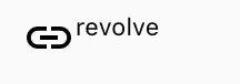
not align

我想要的结果:

我的代码是:

<div style={{
    display: 'inline-flex',
    VerticalAlign: 'text-bottom',
    BoxSizing: 'inherit',
    textAlign: 'center',
    AlignItems: 'center'
}}>
    <LinkIcon className={classes.linkIcon}  />
    revolve
</div>  

我尝试了grid和row,但是不起作用。有人可以帮帮我吗?

15个回答

110

这个完美地运作了!

<div style={{
    display: 'flex',
    alignItems: 'center',
    flexWrap: 'wrap',
}}>
    <LinkIcon />
    <span>revolve</span>
</div>  

2
我使用了这种样式,但将它们应用于单个“Typography”,因此我不需要“p”元素。在v4.0.2中运行良好。 - hsimah

50

你需要使用网格(Grid)。像这样应该就可以了:

<Grid container direction="row" alignItems="center">
  <Grid item>
    <LinkIcon className={classes.linkIcon} />
  </Grid>
  <Grid item>
    revolve
  </Grid>
</Grid>

9
如果文本超出了默认行的长度,网格会开始换行,这意味着文本会出现在图标下方。为了防止这种情况,您可以添加 wrap="nowrap" - Shikyo
2
感觉更像是“MUI”的方式,使用他们的组件。顺便说一句,direction="row"应该不需要。我很确定这是默认值。 - CodeFinity
FYI,alignItems应该放在子Grid项目中,并搭配display="flex"使用。 - undefined

50

MUI v5 中,可以通过使用 Stack 组件,并将 alignItems 属性设置为 center,轻松实现此目标:

import Stack from '@mui/material/Stack';
import Typography from '@mui/material/Typography';
import AddCircleIcon from '@mui/icons-material/AddCircle';
<Stack direction="row" alignItems="center" gap={1}>
  <AddCircleIcon />
  <Typography variant="body1">text</Typography>
</Stack>

Codesandbox Demo


2
这非常有帮助。谢谢。 - kisetu
最佳答案 - Jitendra Singh

33

请尝试以下代码。您可以根据需要使用variant

const useStyles = makeStyles(theme => ({
  wrapIcon: {
    verticalAlign: 'middle',
    display: 'inline-flex'
   }
}));

<Typography variant="subtitle1" className={classes.wrapIcon}>
    <LinkIcon className={classes.linkIcon}  /> revolve
</Typography>

你好 @chetan-gawai,我不是很确定你最初定义的 useStyles 变量在哪里被使用了... - maxxyme
2
通常示例代码如下:在函数内部定义常量 const classes = useStyles(); , 然后你可以看到 classes 在渲染/返回过程中被使用。 - svict4
你好,我该如何在图标和文本之间添加水平间距? - Muzu
1
嗨,终于你解决了我的问题。 - janadari ekanayaka
1
"'inline-flex'帮助保持了所有内容的居中。感谢!仅使用'flex'的顶部评论对我无效。" - dem

22

替代的简单解决方案

<Grid container direction="row" alignItems="center">
     <SearchIcon /> example
</Grid>

我很困惑为什么这个代码能够工作,因为Material UI的例子总是在<Grid container下面紧跟着一个<Grid item,但是在这里你只使用了<Grid container。我的情况是如果我添加<Grid container><Grid item>alignItems="center"就不起作用,图标仍然没有垂直对齐,但是通过这个解决方案,它终于可以工作了。我还发现<Grid container item也可以工作。由于Material UI提到容器的子元素是项目,我认为同时拥有containeritem是规范的。 - Shawn
我认为这就是为什么他们在 V5 中引入了栈的原因。 - ThomasP1988

7

样式

const styles = theme => ({
    icon: {
        position: "relative",
        top: theme.spacing.unit,
        width: theme.typography.display1.fontSize,
        height: theme.typography.display1.fontSize
    }
});

JSX

<Typography variant="display1">
    <Icon className={this.props.classes.icon}/>Your&nbsp;Text
</Typography>

您可以将所有3个位置的display1替换为display3或其他排版变体来选择您的文本大小。 &nbsp;确保您的文本在换行时不会在单词之间断开。

对于我而言,这可以呈现为以下内容:

enter image description here

添加了display3和一些其他颜色样式。


你好 @nxtman123,我不太确定你最初定义的 styles 变量在哪里使用。 - maxxyme
@maxxyme 那个变量进入了 withStyles HOC,请参见 https://material-ui.com/styles/basics/#higher-order-component-api - nxtman123
2
有趣的答案,现在你会这样写:icon: { position: "relative", top: theme.spacing(0.5), width: theme.typography.body1.fontSize, height: theme.typography.body1.fontSize } - Eric Burel
@EricBurel,我已经有一段时间没有与Material UI密切合作了,所以请随意编辑这个答案以反映Material UI近年来的变化。我了解他们有一个新的排版系统?我的“排版变体”链接似乎已经过时了。 - nxtman123

5
ListItemIconListItemText 包装在 ListItem 中可以使其保持在一行内,并且防止换行:
import ListItem from '@material-ui/core/ListItem';
import ListItemIcon from '@material-ui/core/ListItemIcon';
import ListItemText from '@material-ui/core/ListItemText';
    
<ListItem >
  <ListItemIcon><AccessAlarmIcon color="secondary" /></ListItemIcon>
  <ListItemText>Updated 1 hour ago</ListItemText>
</ListItem>

演示图片:

演示图片


3
请问您能否在回答中再加入一些背景信息? - Rigin Oommen
2
请仅仅放置一个链接到您想要附加的图片,并解释为什么ListItem可以解决问题。 - CPHPython
@Sabareesh,我看到你是 Stack Overflow 的新成员,所以欢迎加入社区。在回答问题时,解释为什么你的答案有效是很有帮助的。我不确定 AccessAlarmIcon 是如何神奇地垂直对齐的,请解释一下为什么这个方法有效。 - PatS

4
你也可以使用 Material UI 的 Flexbox 组件
例如:
// ...
import { Box } from '@material-ui/core';
// ...

<Box alignItems="center" display="flex">
 <Box>
    <LinkIcon className={classes.linkIcon}  />
 </Box>
 <Box>
    revolve
 </Box>
</Box>
< p > alignItems:center属性会垂直对齐内部元素。

这将添加一些额外的标记。但是,如果您查看组件的API,会发现有很多其他的灵活性。例如,使用与您的Material UI实现相一致的方法来使用边距或填充。此外,如果需要不同对齐项的用例,则非常容易进行对齐。


3

如果您想在MUI的Typography中垂直对齐文本和图标,而不使用variant,您可以按照以下方式将显示设置添加到Typography中:

<Typography display="flex">
    Welcome!
    <Icon />
</Typography>

这是对我有用的方法。

3
你可以将它们放在顶部导入。
import { Grid, Typography } from "@material-ui/core";
import LinkIcon from "@material-ui/icons/Link";

您可以使用。
<Grid style={{ display: "flex" }}>
    <LinkIcon />
    <Typography>Revolve</Typography>
</Grid>

示例沙盒演示在这里


网页内容由stack overflow 提供, 点击上面的
可以查看英文原文,
原文链接