问题来了:如何以最佳方式绘制分类变量的三重组合值?
以下是我在R中实现的部分代码:
library(tidyverse)
library(ggtern)

df_person <- tibble( name = c( 'Alice', 'Bob', 'Carla', 'Dave', 'Eve' ) ) %>%
  rowid_to_column( 'id_person' )

# generate all trios of persons (5 choose 3)
df <- df_person %>% select( name ) %>%
  map_df( function(x) { combn(x, 3, paste, collapse = '_') } ) %>%
  separate( name, c('person1', 'person2', 'person3') ) %>%
  mutate_all(~ as.factor(.) )
# assign a value to each trio
df$val <- runif( nrow(df) )

# generate ticks and labels for axes
axis <- df_person %>% mutate( fct = as.factor(name) ) %>%
  mutate( tick = as.numeric(fct) / 5 )

ggtern( df, aes(x = as.numeric(person1),
                y = as.numeric(person2),
                z = as.numeric(person3),
                color = val) ) +
  geom_point() +
  scale_T_continuous( breaks = axis$tick, labels = axis$name ) +
  scale_L_continuous( breaks = axis$tick, labels = axis$name ) +
  scale_R_continuous( breaks = axis$tick, labels = axis$name ) +
  labs( x = 'person1', y = 'person2', z = 'person3' )
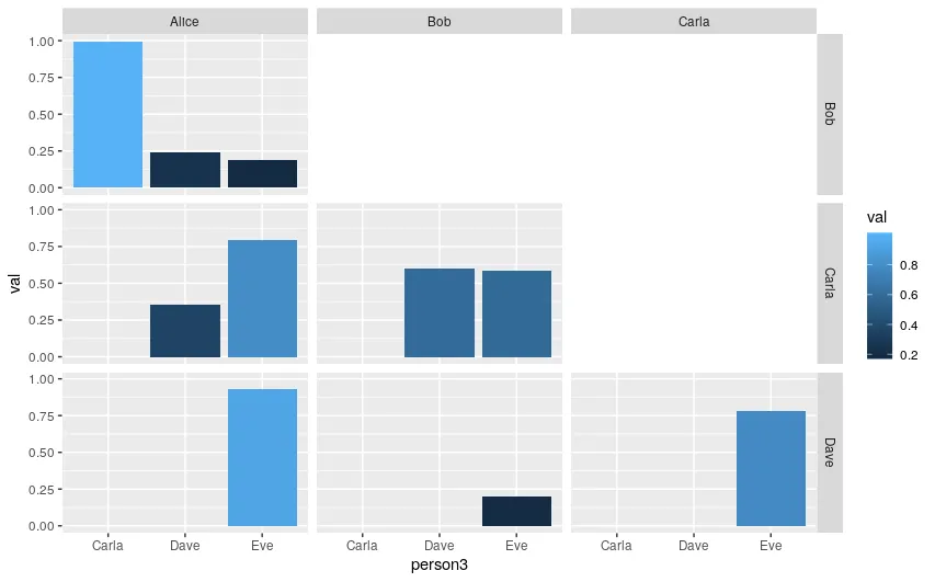
这会得到一个相当奇怪的结果:
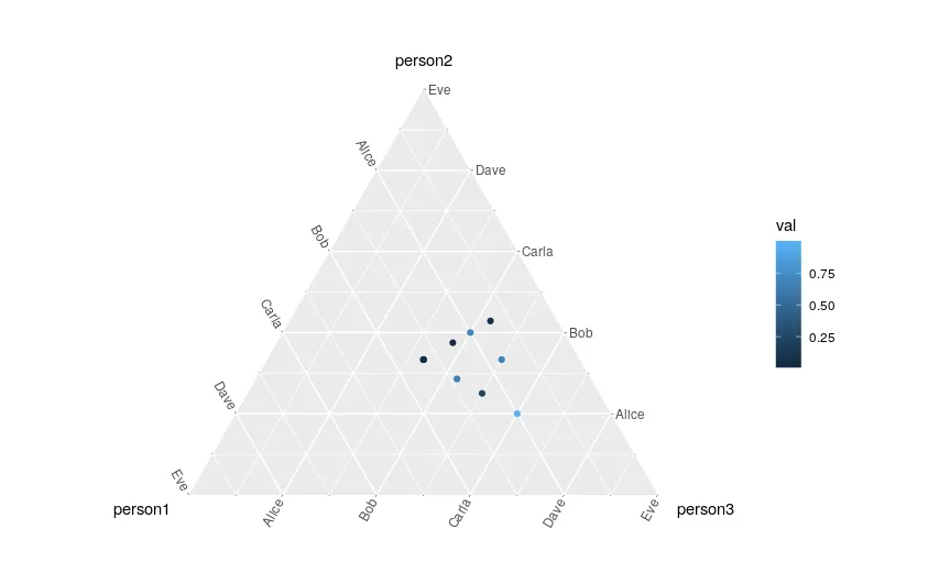 由于这些是分类变量,我希望有十个点位于网格线交汇处。
理想情况下,我希望生成一个类似于热力图的图形,即三角形瓷砖而不是点。
非常感谢您的任何帮助!