SGV渐变在停止处更加深色

5
我正在尝试制作一个球形行星的图像,其中夜间一面会投影阴影,并在浏览器中呈现,用于模拟网页。但我一直在与一个奇怪的视觉问题斗争,无法解决。

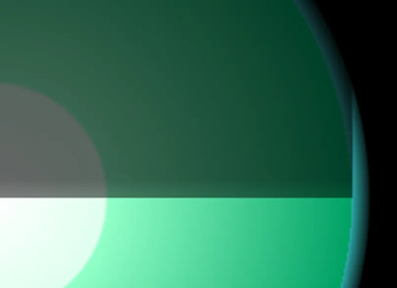
这是SVG的图像片段,在Chrome(在IE中也会发生)中显示,然后放大3倍:

SVG Planet Terminator

你会注意到在白昼和黑夜的分界线上方,有一条淡淡的水平暗带,宽度约为其距离分界线的1/3。那不应该出现在那里,我无法解释为什么会出现或如何去除它。
这是一个HTML片段中的SVG代码,以便于查看:

<div style="position:absolute; z-index:1; margin:15px; 
            width:640px; height:640px; 
            background-color:black">

  <svg id="svgEa" style="width:100%; height:100%;" viewBox="-5000 -5000 10000 10000" preserveAspectRatio="xMidYMid meet" clip-path="url(#svgEaClip)" transform="scale(1.0,1.0)" version="1.1" xmlns="http://www.w3.org/2000/svg" xmlns:xlink="http://www.w3.org/1999/xlink">
                <!-- NOTE: All internal units are in KM (or %)  -->
    
                <defs id="defsEa">
                    <clipPath id="svgEaClip">
                        <rect width="100%" height="100%" />
                    </clipPath>
                    <linearGradient id="lgdEaSphere">
                        <stop style="stop-color:#ffffff;stop-opacity:1.00;" offset="0.00" id="stopEarthCenter" />
                        <stop style="stop-color:#dfffef;stop-opacity:1.00" offset="0.30" id="stopEarthInner" />
                        <stop style="stop-color:#91ffc8;stop-opacity:1.00" offset="0.31" id="stopEarthMid" />
                        <stop style="stop-color:#00A064;stop-opacity:1.00" offset="0.95264" id="stopEarthOuter" />
                        <stop style="stop-color:#44ffff;stop-opacity:0.66" offset="0.95264" id="stopAirInner" />
                        <stop style="stop-color:#44ffff;stop-opacity:0.10" offset="1.00" id="stopAirOuter"  />
                    </linearGradient>
                    <radialGradient id="rgdEaSphere"  xlink:href="#lgdEaSphere"
                        gradientUnits="userSpaceOnUse"
                        cx="0" cy="0"
                        fx="0" fy="0"
                        r="3339.05" 
                        />
    
                    <linearGradient id="lgdEaNightSide" 
                        x1="0%" y1="0%" x2="0%" y2="100%"
                        spreadMethod="pad" >
                        <stop style="stop-color:#000000;stop-opacity:0.7;" offset="0.00" id="stopEaMidnight" />
                        <!-- this stop seems to cause the artifact -->
                        <stop style="stop-color:#000000;stop-opacity:0.6;" offset="0.99" id="stopEaDusk" /> 
                        <stop style="stop-color:#000000;stop-opacity:0.5;" offset="1.00" id="stopEaTerminator" />
                    </linearGradient>
                </defs>
    
                <g id="gEaAll" transform="scale(1.2,1.2)" >
                    <g id="gEaSunFacing" >
                        <!-- contains everything that stays oriented with the Sun -->
                        <circle
                            id="cEarthAir"
                            cx="0" cy="0" r="3339.05"
                            style="display:inline;fill-opacity:1;fill:url(#rgdEaSphere)" />
                        <!--  overlay to give Earth a night side.  -->
                        <path id="pNight" 
                            style="stroke:none; fill:url(#lgdEaNightSide)"
                            d="M -3189.05,0 
                                A 3189.05,15945.25 0 1,1 3189.05,0
                                Z" 
                            />
                    </g>
                </g>
    
            </svg>

</div>

如果您想要,可以将此保存为HTML( .html )文件(添加html和body标签),然后在浏览器中运行以查看它。或者将其保存为SVG文件( .svg ),并删除div和br标记,如果您想在其上使用任何SVG工具。
该伪影恰好出现在线性渐变的一个停止点上,具体是第33行的#stopEaDusk,它正在用作覆盖路径#pNight的填充的线性渐变#lgdEaNightSide 中。虽然这个伪影很微弱,但当缩放未达到300%时,它会更加明显。我的实际SVG还有一个补充的#pDay 叠加层,我已经删除了它以简化代码。但是当它被添加时,我会得到三个这样的黑暗带伪影,一个在上面,在另一侧的相应位置(那里我有另一个黎明/黄昏停止点),还有一个恰好位于两个叠加层相遇的中点处。当它们全部可见时,它看起来很糟糕,所以我不能忽视它。
其他要点:
  • 据我所知,这不仅仅是一个视觉错觉,如此处所示,即使放大后仍然存在。如果是,我仍需要修复它。
  • 我不认为这是旧版Chrome bug,如此答案中所建议的那样,因为它显示方式不同,但主要是因为我在IE中也看到它(虽然可能更微弱)。

简而言之:是什么导致了这个黑暗带,我该如何摆脱它?


有关问题的混淆似乎存在,因此请允许我澄清一下。线性渐变lgdEaNightSide是为了实现明确的效果而编写的,它似乎正在实现这个效果,但它也产生了一个不希望出现的副作用,这并不是预期的结果,根据我对SVG的理解,这种情况不应该发生。
期望的效果是pNight叠加: 1. 在其弧顶部(非常高且超出屏幕)添加70%的暗度,平滑地阴影到99%的60%暗度。 2. 然后从99%的60%暗度快速阴影到100%的50%暗度。这是为了提供类似黄昏的过渡区域。
然而,除此之外,它还会产生不希望的效果: - 在接近下降的98.8%处,它突然变暗。 - 然后在约99.2%的位置,它又突然变亮。
这不应该发生,据我所知,我编写的SVG不应该出现这种情况。
我需要的是如何保留最初编写代码时的视觉效果,同时消除不必要的第二个效果。我不需要被告知第二个停止位会导致问题,因为我已经在上面说明了,并在代码注释中指出了这一点。我需要的是:
1. 如何修复它,同时保留最初编写代码时的视觉效果;
2. 为什么会发生这种情况,因为据我所知,它不应该发生。
2个回答

3

代码没有问题。

条纹存在是因为显示器没有足够的颜色来表示微妙的变化。您正在尝试在大面积上改变10%的不透明度,这在大多数显示器上是不可能的。

您可以通过切换屏幕来确定这是一个显示器问题。根据显示器的质量和像素密度,您将看到略有不同的结果。一些浏览器使用抖动来减少颜色带状效果,但代价是像素化。

解决问题的唯一方法是引入更多的颜色变化,就像Prince所说的那样。

另一篇文章中的答案很好地解释了这个概念。值得一读,但我会引用解决方案以节省点击次数。https://dev59.com/AGXWa4cB1Zd3GeqPOJPJ#11274627

如果您想在当前的24位色彩显示器上使其不那么明显,您可以: - 更改设计,将微妙的颜色转移引入到您的渐变中(例如从深蓝色到灰绿色)。这会导致不同的RGB通道位可以在不同的时间进行过渡,将您的条带分解成更小的差异化颜色。 - 更改设计以增加动态范围(例如从纯白到纯黑),以便您有更多的色条可供使用。 - 更改设计以减少渐变发生的总距离,缩小带宽的宽度。 ...或者以上某些组合。
我实施了这种策略,但它并不完美。如果您真的想摆脱色带,您将不得不做出其他权衡。例如,您可能无法使用纯黑色。

<div style="position:absolute; z-index:1; margin:15px; 
            width:640px; height:640px; 
            background-color:#0c0c26">

  <svg id="svgEa" style="width:100%; height:100%;" viewBox="-5000 -5000 10000 10000" preserveAspectRatio="xMidYMid meet" clip-path="url(#svgEaClip)" transform="scale(1.0,1.0)" version="1.1" xmlns="http://www.w3.org/2000/svg" xmlns:xlink="http://www.w3.org/1999/xlink">
                <!-- NOTE: All internal units are in KM (or %)  -->
    
                <defs id="defsEa">
                    <clipPath id="svgEaClip">
                        <rect width="100%" height="100%" />
                    </clipPath>
                    <linearGradient id="lgdEaSphere">
                        <stop style="stop-color:#ffffff;stop-opacity:1.00;" offset="0.00" id="stopEarthCenter" />
                        <stop style="stop-color:#dfffef;stop-opacity:1.00" offset="0.30" id="stopEarthInner" />
                        <stop style="stop-color:#91ffc8;stop-opacity:1.00" offset="0.31" id="stopEarthMid" />
                        <stop style="stop-color:#00A064;stop-opacity:1.00" offset="0.95264" id="stopEarthOuter" />
                        <stop style="stop-color:#44ffff;stop-opacity:0.66" offset="0.95264" id="stopAirInner" />
                        <stop style="stop-color:#44ffff;stop-opacity:0.10" offset="1.00" id="stopAirOuter"  />
                    </linearGradient>
                    <radialGradient id="rgdEaSphere"  xlink:href="#lgdEaSphere"
                        gradientUnits="userSpaceOnUse"
                        cx="0" cy="0"
                        fx="0" fy="0"
                        r="3339.05" 
                        />
    
                    <linearGradient id="lgdEaNightSide" x1="0%" y1="0%" x2="0%" y2="100%" spreadMethod="pad">
                        <stop style="stop-color:#00033e;stop-opacity:0.7;" offset="0.00" id="stopEaMidnight"></stop>
                        <!-- this stop seems to cause the artifact -->
                        <stop style="stop-color:#090d24;stop-opacity:0.6;" offset="0.99" id="stopEaDusk"></stop> 
                        <stop style="stop-color:#000;stop-opacity:0.5;" offset="1.00" id="stopEaTerminator"></stop>
                    </linearGradient>
                </defs>
    
                <g id="gEaAll" transform="scale(1.2,1.2)" >
                    <g id="gEaSunFacing" >
                        <!-- contains everything that stays oriented with the Sun -->
                        <circle
                            id="cEarthAir"
                            cx="0" cy="0" r="3339.05"
                            style="display:inline;fill-opacity:1;fill:url(#rgdEaSphere)" />
                        <!--  overlay to give Earth a night side.  -->
                        <path id="pNight" 
                            style="stroke:none; fill:url(#lgdEaNightSide)"
                            d="M -3189.05,0 
                                A 3189.05,15945.25 0 1,1 3189.05,0
                                Z" 
                            />
                    </g>
                </g>
    
            </svg>

</div>


我已经在两个不同的显示器上尝试过这个。但我认为我理解了你的观点,我会尝试你的解决方案,看看是否有帮助。 - RBarryYoung
1
好的,我已经尝试了你的更改,它们似乎有效。感谢你的帮助! - RBarryYoung

0

这是因为您在渐变叠加的梯度中使用了额外的停止值。就像下面所示,在叠加中使用线性渐变(lgdEaNightSide)来给地球一个夜晚的一面。

您可以看到您正在使用两个偏移值,一个是at 0.99,另一个是at 1。这就是您得到微弱较暗的地平线带的原因。

<linearGradient id="lgdEaNightSide" x1="0%" y1="0%" x2="0%" y2="100%" spreadMethod="pad">
  <stop style="stop-color:#000000;stop-opacity:0.7;" offset="0.00" id="stopEaMidnight" />
  <!-- this stop seems to cause the artifact -->
  <stop style="stop-color:#000000;stop-opacity:0.6;" offset="0.99" id="stopEaDusk" />
  <stop style="stop-color:#000000;stop-opacity:0.5;" offset="1.00" id="stopEaTerminator" />
</linearGradient>

只需删除多余的停止值,代码就可以正常工作了,请参见下面的可用代码:

<div style="position:absolute; z-index:1; margin:15px; 
    width:640px; height:640px; 
    background-color:black">

  <svg id="svgEa" style="width:100%; height:100%;" viewBox="-5000 -5000 10000 10000" preserveAspectRatio="xMidYMid meet" clip-path="url(#svgEaClip)" transform="scale(1.0,1.0)" version="1.1" xmlns="http://www.w3.org/2000/svg" xmlns:xlink="http://www.w3.org/1999/xlink">
      <!-- NOTE: All internal units are in KM (or %)  -->

      <defs id="defsEa">
        <clipPath id="svgEaClip">
          <rect width="100%" height="100%" />
        </clipPath>
        <linearGradient id="lgdEaSphere">
          <stop style="stop-color:#ffffff;stop-opacity:1.00;" offset="0.00"
                id="stopEarthCenter" />
          <stop style="stop-color:#dfffef;stop-opacity:1.00" offset="0.30"
                id="stopEarthInner" />
          <stop style="stop-color:#91ffc8;stop-opacity:1.00" offset="0.31"
                id="stopEarthMid" />
          <stop style="stop-color:#00A064;stop-opacity:1.00" offset="0.95264"
                id="stopEarthOuter" />
          <stop style="stop-color:#44ffff;stop-opacity:0.66" offset="0.95264"
                id="stopAirInner" />
          <stop style="stop-color:#44ffff;stop-opacity:0.10" offset="1.00"
                id="stopAirOuter" />
        </linearGradient>
        <radialGradient id="rgdEaSphere" xlink:href="#lgdEaSphere"
                        gradientUnits="userSpaceOnUse" cx="0" cy="0" fx="0"
                        fy="0" r="3339.05" />

        <linearGradient id="lgdEaNightSide" x1="0%" y1="0%" x2="0%" y2="100%"
                        spreadMethod="pad">
          <stop style="stop-color:#000000;stop-opacity:0.7;" offset="0.00"
                id="stopEaMidnight" />
          <!-- this stop seems to cause the artifact -->
          <stop style="stop-color:#000000;stop-opacity:0.5;" offset="1.00"
                id="stopEaTerminator" />
        </linearGradient>
      </defs>

      <g id="gEaAll" transform="scale(1.2,1.2)">
        <g id="gEaSunFacing">
          <!-- contains everything that stays oriented with the Sun -->
          <circle id="cEarthAir" cx="0" cy="0" r="3339.05"
                  style="display:inline;fill-opacity:1;fill:url(#rgdEaSphere)" />
          <!--  overlay to give Earth a night side.  -->
          <path id="pNight" style="stroke:none; fill:url(#lgdEaNightSide)" d="M -3189.05,0 
                        A 3189.05,15945.25 0 1,1 3189.05,0
                        Z" />
        </g>
      </g>

    </svg>

</div>


那个停止点是必要的,因为它会从暗到亮逐渐变化为更快的梯度。它需要存在,并且据我所知,它不应该导致这种暗色条带。那个停止点应该标记着开始更快地变亮的位置。它不应该使任何东西变暗,但它确实会在短时间内变暗,然后恢复到较浅的阴影。 - RBarryYoung
1
正如我们所知,<stop>标签会创建一个渐变,颜色的变化。额外的<stop>标签会创建另一个渐变(颜色的变化,逐渐的改变)。这就是为什么额外的stop会产生额外的颜色变化的原因。它肯定解决了你的问题,让我考虑创建一个演示来展示给你。我不明白的是为什么这是有意的,它在做什么? - Jasdeep Singh
1
这种效果是由于偏移值非常接近(0.99到1),因此没有产生渐变效果。如果您将第二个<stop>的偏移值更改为其他值,例如9,则可以看到差异。我还在这里创建了一个jsfiddle,您可以通过操作偏移值进行检查-https://jsfiddle.net/szwnfxky/2/ - Jasdeep Singh
我的评论难道没有回答你的问题吗? - Jasdeep Singh
我会以最后的评论结束这个讨论。你正在添加一个额外的停止位,这将增加梯度和偏移值非常接近,你可以看到一条细线。似乎你不想理解这件事情。 - Jasdeep Singh
显示剩余3条评论

网页内容由stack overflow 提供, 点击上面的
可以查看英文原文,
原文链接