为什么在Bootstrap 5中,我的输入框和选择框中的文本不能对齐/填充相等?

4
我正在困扰一个问题,无法解决或理解。我有一个表单,其中包含一个文本输入和一个下拉选择框。我正在使用Bootstrap 5,并且希望减少所有表单控件中的默认左侧填充。因此,我已经在我的样式定义中添加了padding-left:0.3rem。这是我的示例代码:

.form-control,
.form-select {
  padding-left: 0.3rem;
}
<head>
  <title>Example</title>
  <meta charset="utf-8">
  <meta name="viewport" content="width=device-width, initial-scale=1">
  <link href="https://cdn.jsdelivr.net/npm/bootstrap@5.1.2/dist/css/bootstrap.min.css" rel="stylesheet">
  <script src="https://cdn.jsdelivr.net/npm/bootstrap@5.1.2/dist/js/bootstrap.bundle.min.js"></script>
</head>

<body>
  <div class="container">
    <form style="width:200px">
      <label for="name" class="form-label">Name:</label>
      <input type="text" class="form-control" id="name" name="name" value="John">

      <label for="country" class="form-label">Country:</label>
      <select class="form-select" id="country" name="country">
        <option>USA</option>
        <option>South Africa</option>
        <option>Sweden</option>
        <option>Netherlands</option>
      </select>
    </form>
  </div>
</body>

我希望您能够得到这样的结果,即“John”和“USA”在其表单控件中具有相同的填充量。但是请看下面的图片。 “USA”的填充比“John”更多。为什么会这样,我该如何解决?

enter image description here

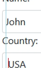
更新: 在测试不同浏览器后,我发现这个问题只出现在Firefox上。在Chrome和Edge上,填充/对齐似乎是正确的。所以,现在我想知道是否可以使用一些CSS技巧使其在Firefox上也能正常工作?


1
在我使用上述代码片段时,Firefox在Win10上没有出现这种情况。也许已经被修复了。投票关闭,因为无法重现。 - isherwood
4个回答

0
请使用以下 CSS 样式来设置标签。
.form-label {
      margin-left: 0.3rem;
}

可以使用“padding-left: 0.3rem”来实现。 - rizwan
这只是对齐标签。我关心的是输入/选择字段中文本的对齐/填充。问题只在Firefox中出现 - 在Edge / Chrome上没有。 - Gowire

0

这与选择或输入元素无关,而是与你所编写的字符有关。例如,“U”在某些字体中顶部有一条额外的线,使其周围有空白。也许使用另一种字体可以解决你的问题。


不,情况并非如此。如果我输入“日本”而不是“美国”,它将生成相同的缩进,即使它以“约翰”相同的字符开头。 - Gowire

0
也要为

0
你正在使用相对大小的 rem 进行填充,因此实际大小会有所不同。尝试去掉 padding-left

<html>
<head>
    <title>Example</title>
    <meta charset="utf-8">
    <meta name="viewport" content="width=device-width, initial-scale=1">
    <link href="https://cdn.jsdelivr.net/npm/bootstrap@5.1.2/dist/css/bootstrap.min.css" rel="stylesheet">
    <script src="https://cdn.jsdelivr.net/npm/bootstrap@5.1.2/dist/js/bootstrap.bundle.min.js"></script>
   
</head>
<body>
    <div class="container">
        <form style="width:200px">
            <label for="name" class="form-label">Name:</label>
            <input type="text" class="form-control" id="name" name="name" value="John">
    
            <label for="country" class="form-label">Country:</label>
            <select class="form-select" id="country" name="country">
                <option>USA</option>
                <option>South Africa</option>
                <option>Sweden</option>
                <option>Netherlands</option>
            </select> 
        </form>
    </div>
</body>
</html>

现在差距会小得多,尽管它仍然没有真正对齐。


这在Firefox上不起作用。即使只有2-3个像素,不同的边距仍然存在问题。 - Gowire
就像我说的,我只是让间隙变小了。我也在使用Firefox,这里是结果 https://imgur.com/a/fBGisEQ。 - miftahulrespati

网页内容由stack overflow 提供, 点击上面的
可以查看英文原文,
原文链接