当鼠标悬停时保持下拉菜单打开(CSS)

5
我已经创建了一个水平菜单,当您悬停在菜单项上时,会出现一个下拉菜单。这一切都很好。然而,当您离开菜单项(使用下拉菜单)时,下拉菜单消失了。我知道这是因为您不再悬停在它上面,但是如何解决?注意:我不希望下拉菜单直接出现在菜单项下方,我想要菜单项和下拉之间有一个合理的间隙(就像我目前所做的一样)。谢谢。
HTML
<header id="header">
    <div class="container">
        <a href="#top-anchor"><div id="logo"></div></a>
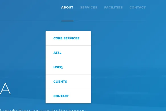
        <nav class="header-menu">
            <a href="index.html" class="header-menu-item">ABOUT</a>
                <div class="about-dropdown">
                    <a href="index.html#core-services-anchor">CORE SERVICES</a>
                    <a href="index.html#atandl-anchor">AT&amp;L</a>
                    <a href="index.html#hseq-anchor">HSEQ</a>
                    <a href="index.html#clients-anchor">CLIENTS</a>
                    <a href="index.html#contact-anchor">CONTACT</a>
                </div>
            <a href="services.html" class="header-menu-item">SERVICES</a>
            <a href="facilities.html" class="header-menu-item">FACILITIES</a>
            <a href="#map-anchor" class="header-menu-item">CONTACT</a>
        </nav>
        <div id="hamburger"></div>
        <!--<div id="box-shadow-menu"></div>-->
    </div>
</header>

CSS

#header {
  position: fixed;
  top: 0;
  left: 0;
  width: 100%;
  height: 100px;
  user-select: none;
  display: block;
  transition: all 0.8s;
  line-height: 100px;
  z-index: 1000;
  transform: translateX(0);
  backface-visibility: hidden;
  margin: 0;
}

header .container {
  width: 1440px;
  height: 100px;
  border-bottom: 0.75px solid rgba(255,255,255,0.1);
}

#logo {
  width: 55px;
  height: 55px;
  float: left;
  margin-top: 27px;
  background-image: url(../images/logo_white.png);
  background-size: cover;
}

nav.header-menu {
  float: right;
  height: 96px;
  vertical-align: middle;
  padding-top: 1px;
}

.header-menu-item {
  font-family: 'Montserrat', sans-serif;
  font-size: 11px;
  font-weight: 800;
  margin-left: 20px;
  text-decoration: none;
  color: #ffffff;
  line-height: 96px;
  letter-spacing: 0.5px;
  transition: 0.55s;
}

.toggle {
  opacity: 0.3;
}

.current {
  border-bottom: 2px solid #fff;
  padding-bottom: 40px;
}

.about-dropdown {
  position: absolute;
  background-color: #fff;
  min-width: 160px;
  box-shadow: 0 0 4px 3px rgba(0,0,0,0.1);
  z-index: 3000;
  margin-top: 35px;
  margin-left: -35px;
  border-radius: 3px;
  display: none;
  transition: 0.8s;
}

.about-dropdown a {
  display: block;
  text-decoration: none;
  padding: 0px 28px;
  font-family: 'Montserrat', sans-serif;
  font-size: 11px;
  font-weight: 800;
  margin: 0;
  line-height: 50px;
  border-bottom: 1px solid rgba(0,0,0,0.1);
}

.header-menu-item:hover + .about-dropdown {
  display: block;
}

Drop Down Menu


你想让它在你悬停在下拉列表子菜单上时保持打开状态,还是即使你不再悬停任何东西也要保持打开状态? - WasteD
1
我在fiddle中无法使其正常工作,但我猜测你的下拉菜单也需要悬停才能显示为块状。 - Gezzasa
你说间隙是个问题,你不能直接去掉这个间隙吗? - WasteD
@WasteD 需要加上间隔。我已经添加了一张截图来展示它的样子。 - Colin Stewart
1
很难在没有工作的fiddle的情况下进行测试。在“a”标签上,悬停时添加高度或padding-bottom。您的“a”标签可能需要绝对定位,以便其高度不会影响标题的高度。 - Gezzasa
显示剩余8条评论
2个回答

6
在“a”标签上,悬停时添加高度或填充底部。您的“a”标签可能需要绝对定位,以便其高度不会影响标题的高度。
类似以下内容:
.about-dropdown a:hover {
    padding-bottom: 30px; /*height dependent on the gap you want to fill*/
    position: absolute; 
}

1
谢谢!通过添加padding-bottom,我解决了这个问题。 - Akash Sethi

4

很遗憾,我无法让您的示例正常工作。我创建了一个小 演示 来解决您的问题。

它允许用户通过将鼠标悬停在菜单项上来触发子菜单。他们可以通过悬停在子菜单上使子菜单保持可见。当他们的光标离开子菜单时,在我的演示中选择了1秒的延迟后,子菜单将被隐藏。如果用户在此延迟内再次悬停在子菜单上,则不会隐藏子菜单。这不仅允许用户将光标从菜单项移动到子菜单,而且还使得当用户意外将光标移到子菜单的左侧或右侧时,子菜单不会立即隐藏。

.trigger {
  box-sizing: border-box;
  position: relative;
  width: 120px;
  margin: 0 0 50px;
  padding: 10px;
  background: #bada55;
  text-align: center;
}

.sub {
  box-sizing: border-box;
  position: absolute;
  top: 100px;
  left: 0;
  width: 120px;

  background: #4863a0;
  color: #fff;
  text-align: left;
  
  /* hide element for now */
  max-height: 0; overflow: hidden;
  opacity: 0;
  /* make submenu not hoverable when opacity transition finished,
   * do this instantaneously */
  transition: max-height 0s 1.5s,
              /* hide the submenu after 1 second, in 400ms */
              opacity .4s 1s;
  
  /* prevent users from showing submenu when hovering hidden element */
  pointer-events: none;
}

/* sub elements can be hovered */
.sub > * {
  pointer-events: auto;
}

/* show submenu when trigger or menu itself is hovered */
.sub:hover,
.trigger:hover .sub {
  max-height: 500px;
  opacity: 1;
  transition-delay: 0s;
}

/* give items some spacing */
.item:not(:last-child) {
  padding: 10px 10px 5px;
}
.item:last-child {
  padding: 10px;
}
<div class="trigger">HOVER ME
  <div class="sub">
    <div class="item">Item 1</div>
    <div class="item">Item 2</div>
    <div class="item">Item 3</div>
    <div class="item">Item 4</div>
  </div>
</div>

这个想法是滥用CSS 转换。我们完全隐藏子菜单并设置延迟的转换。然后,当悬停时,我们将延迟设置为零。这将立即显示子菜单,但仅在一些延迟后隐藏。这有点起作用,但现在当用户悬停在隐藏元素上时,子菜单可以被显示。为了防止这种情况发生,我们使子菜单没有高度(max-height: 0),并隐藏其子元素(overflow: hidden)。浏览器现在仍然可能决定触发悬停元素,因此我们通过设置pointer-events: none来确保它们不会触发。所有这些都应该被延迟,因此在max-height上进行转换。最后,我们通过为其中的元素设置pointer-events: auto,使得子菜单在显示时实际上可以悬停。不幸的是,不能过渡到max-height: none,因此我们在演示中使用了一些非常大的值,我使用了500px

谢谢回复。显然它有效,所以这很好 - 但对我来说另一个答案更简单。 - Colin Stewart
没问题。我想提一下我的解决方案的一个优点是,用户可以随意移动光标,只要他们快速回到子菜单,它就会保持可见。使用padding或添加其他元素意味着用户不能将光标移出菜单项和子菜单之间的空间。 - Just a student
它不起作用。 - abc
你能详细说明一下吗,@abc?在代码片段中它似乎仍然对我有效(Chrome + Firefox)。 - Just a student

网页内容由stack overflow 提供, 点击上面的
可以查看英文原文,
原文链接