D3 图表中 Y 轴标签被裁剪了

3

我使用D3制作了这个多行图形:

enter image description here

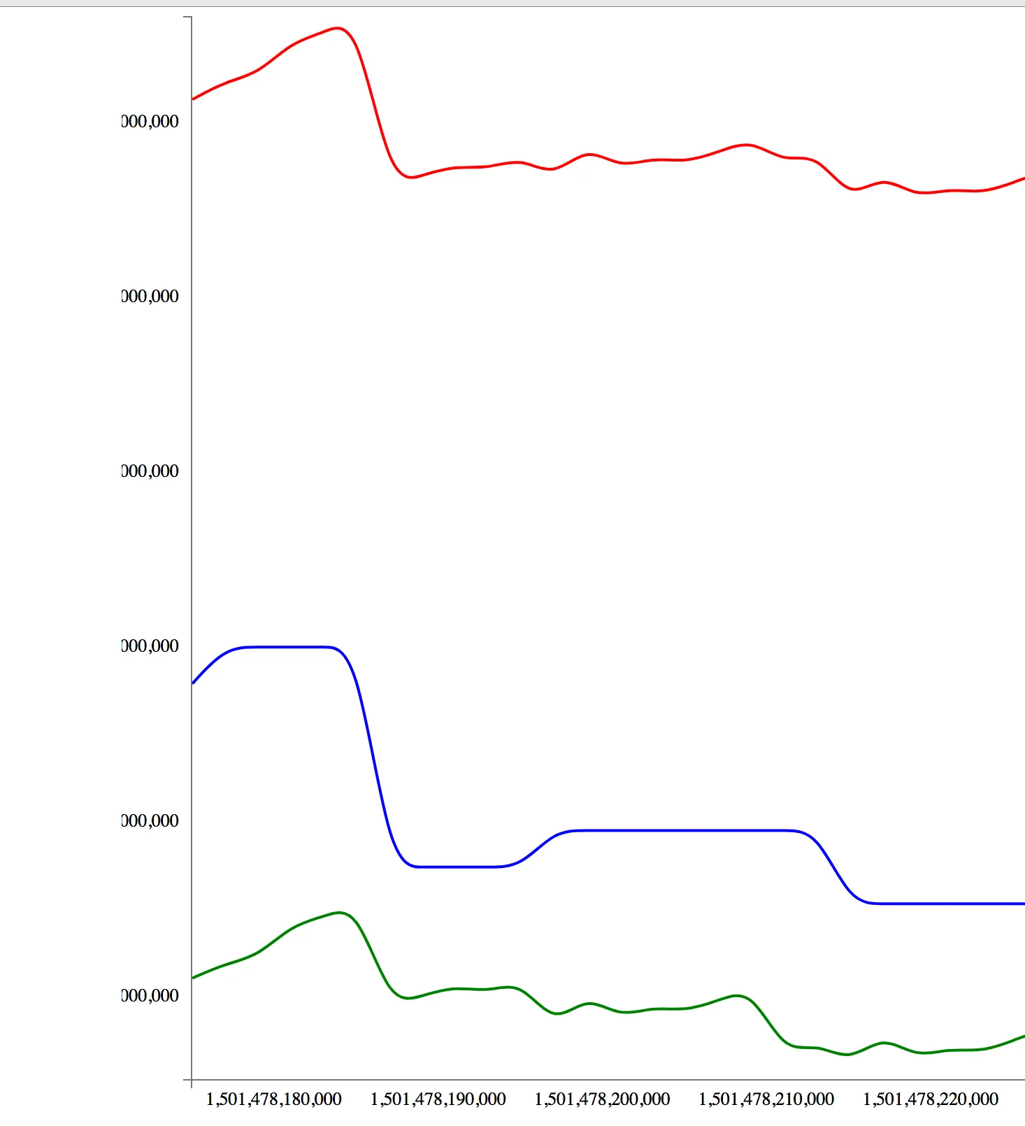
但是你可以看到,y轴标签的开头被切断了 - 有人知道如何正确显示完整的标签吗?

如果您有任何关于如何将x轴标签旋转90度的建议,那也会有所帮助。

这是生成图形的全部代码:

<!DOCTYPE html>
<html lang='en'>

<head>

  <link href='http://getbootstrap.com/dist/css/bootstrap.min.css' rel='stylesheet'>
  <link href='http://getbootstrap.com/examples/justified-nav/justified-nav.css' rel='stylesheet'>
  <script src='http://d3js.org/d3.v3.min.js' charset='utf-8'></script>

  <style>

    .axis path {
      fill: none;
      stroke: #777;
      shape-rendering: crispEdges;
    }

    .axis text {
      font-family: Lato;
      font-size: 13px;
    }

  </style>

</head>

<body>

<div class='container'>

  <div class='jumbotron'>

    <svg id='visualisation'></svg>

    <script>

      var heapTotal = JSON.parse('[{"x":1501478175044,"y":18911232},{"x":1501478177048,"y":19959808}]');
      var heapUsed = JSON.parse('[{"x":1501478175044,"y":10492112},{"x":1501478177048,"y":10904080}]');
      var rss = JSON.parse('[{"x":1501478175044,"y":35622912},{"x":1501478177048,"y":36134912}]');

      const values = heapTotal.concat(heapUsed).concat(rss).reduce(function (prev, curr) {

        console.log('curr => ', curr);

        return {
          xMin: Math.min(prev.xMin, curr.x),
          xMax: Math.max(prev.xMax, curr.x),
          yMin: Math.min(prev.yMin, curr.y),
          yMax: Math.max(prev.yMax, curr.y),
        }

      }, {
        xMin: Number.MAX_SAFE_INTEGER,
        xMax: -1,
        yMin: Number.MAX_SAFE_INTEGER,
        yMax: -1
      });

      console.log('values => ', values);

      var vis = d3.select('#visualisation'),
        WIDTH = 1200,
        HEIGHT = 800,
        MARGINS = {
          top: 20,
          right: 20,
          bottom: 20,
          left: 50
        },
        xScale = d3.scale.linear().range([MARGINS.left, WIDTH - MARGINS.right]).domain([values.xMin - 50, values.xMax + 50]),
        yScale = d3.scale.linear().range([HEIGHT - MARGINS.top, MARGINS.bottom]).domain([values.yMin - 50, values.yMax + 50]),
        xAxis = d3.svg.axis()
        .scale(xScale),
        yAxis = d3.svg.axis()
        .scale(yScale)
        .orient('left');

      vis.attr("width", WIDTH)
      .attr("height", HEIGHT);

      vis.append('svg:g')
      .attr('class', 'x axis')
      .attr('transform', 'translate(0,' + (HEIGHT - MARGINS.bottom) + ')')
      .call(xAxis);

      vis.append('svg:g')
      .attr('class', 'y axis')
      .attr('transform', 'translate(' + (MARGINS.left) + ',0)')
      .call(yAxis);

      var lineGen = d3.svg.line()
      .x(function (d) {
        return xScale(d.x);
      })
      .y(function (d) {
        return yScale(d.y);
      })
      .interpolate('basis');

      vis.append('svg:path')
      .attr('d', lineGen(heapUsed))
      .attr('stroke', 'green')
      .attr('stroke-width', 2)
      .attr('fill', 'none');

      vis.append('svg:path')
      .attr('d', lineGen(heapTotal))
      .attr('stroke', 'blue')
      .attr('stroke-width', 2)
      .attr('fill', 'none');

      vis.append('svg:path')
      .attr('d', lineGen(rss))
      .attr('stroke', 'red')
      .attr('stroke-width', 2)
      .attr('fill', 'none');


    </script>
  </div>

</div>

</body>

</html>

请注意,我删除了一些数据,示例每行只有2个数据点,但代码完全相同。def square(x): return x ** 2 nums = [1, 2, 3, 4, 5] squares = list(map(square, nums)) print(squares)class Person: def __init__(self, name, age): self.name = name self.age = age def greet(self): print(f"Hello, my name is {self.name} and I am {self.age} years old.") p1 = Person("Alice", 25) p2 = Person("Bob", 30) p1.greet() p2.greet() - Alexander Mills
2个回答

9

一种简单的 css 方法是给 svg 元素添加一些 padding。这将使地图保持更好的形状。

方法 1:只需在脚本中更改左边距值:

MARGINS = {
    top: 20,
    right: 20,
    bottom: 20,
    left: 50 // change this to something larger like 100
  },

Method 2: Using CSS

var heapTotal = JSON.parse(
  '[{"x":1501478175044,"y":18911232},{"x":1501478177048,"y":19959808}]'
);
var heapUsed = JSON.parse(
  '[{"x":1501478175044,"y":10492112},{"x":1501478177048,"y":10904080}]'
);
var rss = JSON.parse(
  '[{"x":1501478175044,"y":35622912},{"x":1501478177048,"y":36134912}]'
);

const values = heapTotal.concat(heapUsed).concat(rss).reduce(function(
  prev,
  curr
) {
  console.log("curr => ", curr);

  return {
    xMin: Math.min(prev.xMin, curr.x),
    xMax: Math.max(prev.xMax, curr.x),
    yMin: Math.min(prev.yMin, curr.y),
    yMax: Math.max(prev.yMax, curr.y)
  };
}, {
  xMin: Number.MAX_SAFE_INTEGER,
  xMax: -1,
  yMin: Number.MAX_SAFE_INTEGER,
  yMax: -1
});

console.log("values => ", values);

var vis = d3.select("#visualisation"),
  WIDTH = 1200,
  HEIGHT = 800,
  MARGINS = {
    top: 20,
    right: 20,
    bottom: 20,
    left: 50
  },
  xScale = d3.scale
    .linear()
    .range([MARGINS.left, WIDTH - MARGINS.right])
    .domain([values.xMin - 50, values.xMax + 50]),
  yScale = d3.scale
    .linear()
    .range([HEIGHT - MARGINS.top, MARGINS.bottom])
    .domain([values.yMin - 50, values.yMax + 50]),
  xAxis = d3.svg.axis().scale(xScale),
  yAxis = d3.svg.axis().scale(yScale).orient("left");

vis.attr("width", WIDTH).attr("height", HEIGHT);

vis
  .append("svg:g")
  .attr("class", "x axis")
  .attr("transform", "translate(0," + (HEIGHT - MARGINS.bottom) + ")")
  .call(xAxis);

vis
  .append("svg:g")
  .attr("class", "y axis")
  .attr("transform", "translate(" + MARGINS.left + ",0)")
  .call(yAxis);

var lineGen = d3.svg
  .line()
  .x(function(d) {
    return xScale(d.x);
  })
  .y(function(d) {
    return yScale(d.y);
  })
  .interpolate("basis");

vis
  .append("svg:path")
  .attr("d", lineGen(heapUsed))
  .attr("stroke", "green")
  .attr("stroke-width", 2)
  .attr("fill", "none");

vis
  .append("svg:path")
  .attr("d", lineGen(heapTotal))
  .attr("stroke", "blue")
  .attr("stroke-width", 2)
  .attr("fill", "none");

vis
  .append("svg:path")
  .attr("d", lineGen(rss))
  .attr("stroke", "red")
  .attr("stroke-width", 2)
  .attr("fill", "none");
#visualisation{
  padding: 0px 20px;
}
.axis path {
      fill: none;
      stroke: #777;
      shape-rendering: crispEdges;
    }

    .axis text {
      font-family: Lato;
      font-size: 13px;
    }
<script src="https://cdnjs.cloudflare.com/ajax/libs/d3/3.4.11/d3.min.js"></script>
<svg id='visualisation'></svg>


谢谢,如果我使用CSS技术并添加20像素的填充,X轴标签会消失,真是糟糕。 - Alexander Mills
@AlexanderMills,请尝试我提到的第二种方法。我认为您需要结合边距和CSS两者。 - Aslam
@AlexanderMills,还更新了CSS。现在请检查片段。 - Aslam
谢谢,看起来好像可以了,非常感谢!现在我可以尝试将x轴标签旋转90度,并查看是否可以保持良好的格式... - Alexander Mills

1
这个文件设置得非常好,使得操作变得非常容易。您只需更改左边距即可。大约设置为75可以防止轴标签被截断。
MARGINS = {
      top: 20,
      right: 20,
      bottom: 20,
      left: 75
},

jumbotron类会给整个div添加一个margin,如果这使得图表被推到右边太远,您可能需要更改它。


网页内容由stack overflow 提供, 点击上面的
可以查看英文原文,
原文链接