能否在Highcharts中创建像这样的进度图表:
https://0.s3.envato.com/files/84221450/screenshots/weblator_responsive_charts_7_bootstrap.jpg
我认为可以使用条形图来实现这个需求。但是,是否可能更改样式,使得没有坐标轴显示,并且条形标签位于条形的上方而不是前面?https://0.s3.envato.com/files/84221450/screenshots/weblator_responsive_charts_7_bootstrap.jpg
我认为可以使用条形图来实现这个需求。但是,是否可能更改样式,使得没有坐标轴显示,并且条形标签位于条形的上方而不是前面?可以重新创建,但风格不太动态。因此,您必须根据图表中的数据系列调整 css。
var chart = new Highcharts.Chart({
  chart: {
    renderTo: 'container',
    type: 'bar',

    marginBottom: 120
  },
  legend: {
    enabled: false
  },
  colors: ['#173c64'],
  xAxis: {
    categories: ['option 1', 'option 2', 'option 3', 'option 4 ', 'option 5 '],
    labels: {
      align: 'left',
      x: 5,
      y: -20, /* to be adjusted according to number of bars*/
      style: {
       fontSize: "1rem",
        color: '#000'
      }
    },
    lineWidth: 0,
    gridLineWidth: 0,
    lineColor: 'transparent',
    minorTickLength: 0,
    tickLength: 0,
    title: {
      enabled: false
    }

  },
  yAxis: {
    lineWidth: 0,
    gridLineWidth: 0,
    lineColor: 'transparent',
    labels: {
      enabled: false
    },
    minorTickLength: 0,
    tickLength: 0,
    title: {
      enabled: false
    }
  },
  plotOptions: {
    bar: {
      stacking: "normal",
      //groupPadding: 0, //add here
      //pointPadding: 0, //add here,
      dataLabels: {
        enabled: true,
        color: (Highcharts.theme && Highcharts.theme.dataLabelsColor) || 'white'
      }
    }
  },
  title: {
    margin: 0,
    useHTML: true,
    text: "Test",
    style: {
      "color": "#333333",
      "fontSize": "1.5rem",
      "fontWeight": "bold"
    }
  },

  series: [{
    data: [{
      y: 100,
      color: '#99ddff'
    }, {
      y: 10,
      color: '#ff8c1a'
    }, {
      y: 20,
      color: '#ff471a'
    }, {
      y: 60,
      color: '#c299ff'
    }, {
      y: 10,
      color: '#99ddff'
    }]
  }]
})<script src="https://code.highcharts.com/highcharts.js"></script>
<script src="https://code.highcharts.com/modules/exporting.js"></script>
<div id="container" style="min-width: 310px; height: 400px; margin: 0 auto"></div>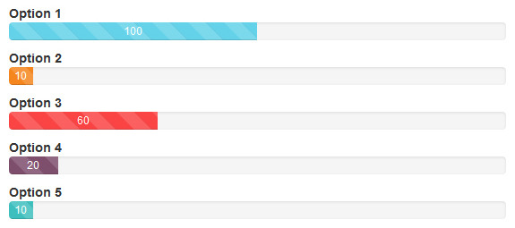