使用 Plotly 创建共享 Y 轴的小提琴图和散点图

3
我将尝试创建一个图,其中包含相同数据的两个子图:
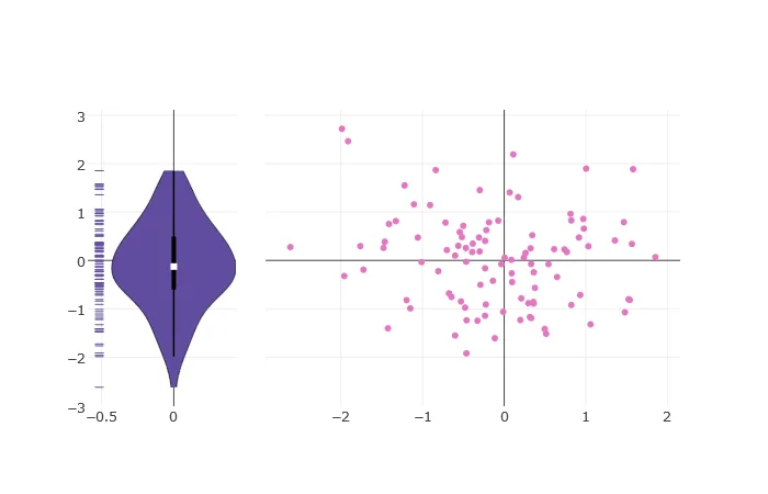
1)一个小提琴图占据图的1/4
2)一个散点图填充其余3/4的图
这两个子图应共享y轴标签。
我已经使用Matplotlib创建了这个图,但需要一个交互式版本。
如何将Plotly Violin子图与Plotly Scatter子图组合成单个图? 迄今为止,我尝试了以下方法(RANKS和SCORES是数据):
import plotly.figure_factory as ff
import plotly.graph_objs as go
from plotly import tools

fig = tools.make_subplots(rows=1, cols=2, shared_yaxes=True)
vio = ff.create_violin(SCORES, colors='#604d9e')
scatter_trace = go.Scatter(x = RANKS, y = SCORES, mode = 'markers')

# How do I combine these two subplots?

谢谢你!

1个回答

2
Plotly的小提琴图是一组散点图。因此,您可以将每个散点图单独添加到一个子图中,并将您的散点图添加到另一个子图中。

enter image description here

import plotly
import numpy as np

#get some pseudorandom data
np.random.seed(seed=42)
x = np.random.randn(100).tolist()
y = np.random.randn(100).tolist()

#create a violin plot
fig_viol = plotly.tools.FigureFactory.create_violin(x, colors='#604d9e')

#create a scatter plot
fig_scatter = plotly.graph_objs.Scatter(
    x=x,
    y=y,
    mode='markers',
)

#create a subplot with a shared y-axis
fig = plotly.tools.make_subplots(rows=1, cols=2, shared_yaxes=True)

#adjust the layout of the subplots
fig['layout']['xaxis1']['domain'] = [0, 0.25]
fig['layout']['xaxis2']['domain'] = [0.3, 1]
fig['layout']['showlegend'] = False

#add the violin plot(s) to the 1st subplot
for f in fig_viol.data:
    fig.append_trace(f, 1, 1)

#add the scatter plot to the 2nd subplot
fig.append_trace(fig_scatter, 1, 2)

plotly.offline.plot(fig)

感谢您描述小提琴图的构成;非常有用! - chasingtheinfinite

网页内容由stack overflow 提供, 点击上面的
可以查看英文原文,
原文链接