我试图模拟这个图表: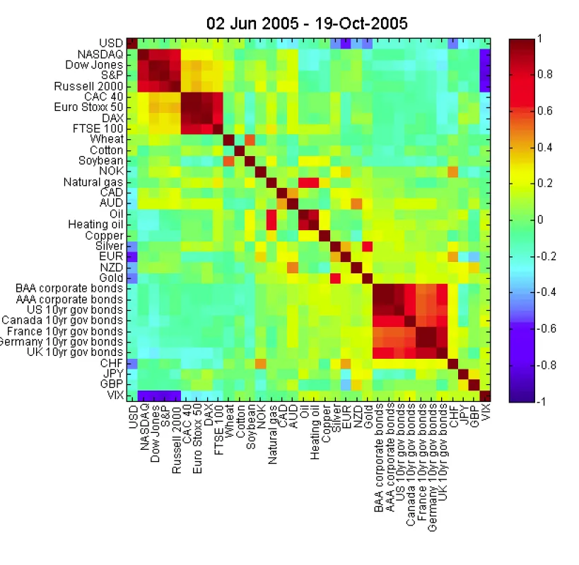
如果我有一个相关矩阵,如何创建类似的输出?
我试图模拟这个图表:
如果我有一个相关矩阵,如何创建类似的输出?
n x n的相关矩阵M和一个长度为n的标签向量L,你可以使用以下类似的方法:imagesc(M); % plot the matrix
set(gca, 'XTick', 1:n); % center x-axis ticks on bins
set(gca, 'YTick', 1:n); % center y-axis ticks on bins
set(gca, 'XTickLabel', L); % set x-axis labels
set(gca, 'YTickLabel', L); % set y-axis labels
title('Your Title Here', 'FontSize', 14); % set title
colormap('jet'); % set the colorscheme
colorbar on; % enable colorbar
旋转x轴标签不是一件容易的事情,但MATLAB中心文件交换包含一些解决方案。
补充@Thomas C. G.的答案,我会使用:
imagesc(myMatrix);
colormap(jet);
colorbar;

% then to set the axis titles you'll have to use
% Please note the curly braces for the cell array
labelNames = {'USA','NASDAQ','Dow Jones'};
set(gca,'XTickLabel',labelNames);   % gca gets the current axis
set(gca,'YTickLabel'labelNames);   % gca gets the current axis
很遗憾,据我所知,将文本标签垂直排列如图 是有一定难度的。也许其他人有不同的知识。