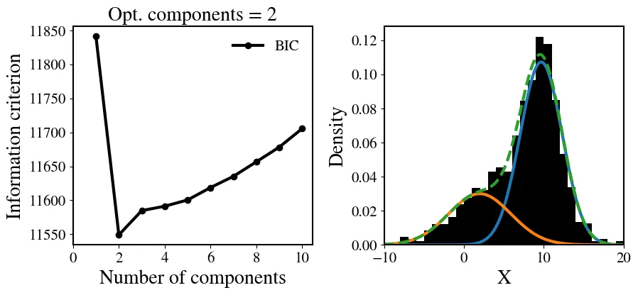
我想用混合的1D高斯分布做一个像图片中那样的直方图。
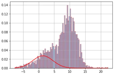
这是我的直方图:
非常感谢。
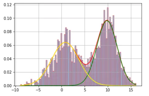
这是我的直方图:
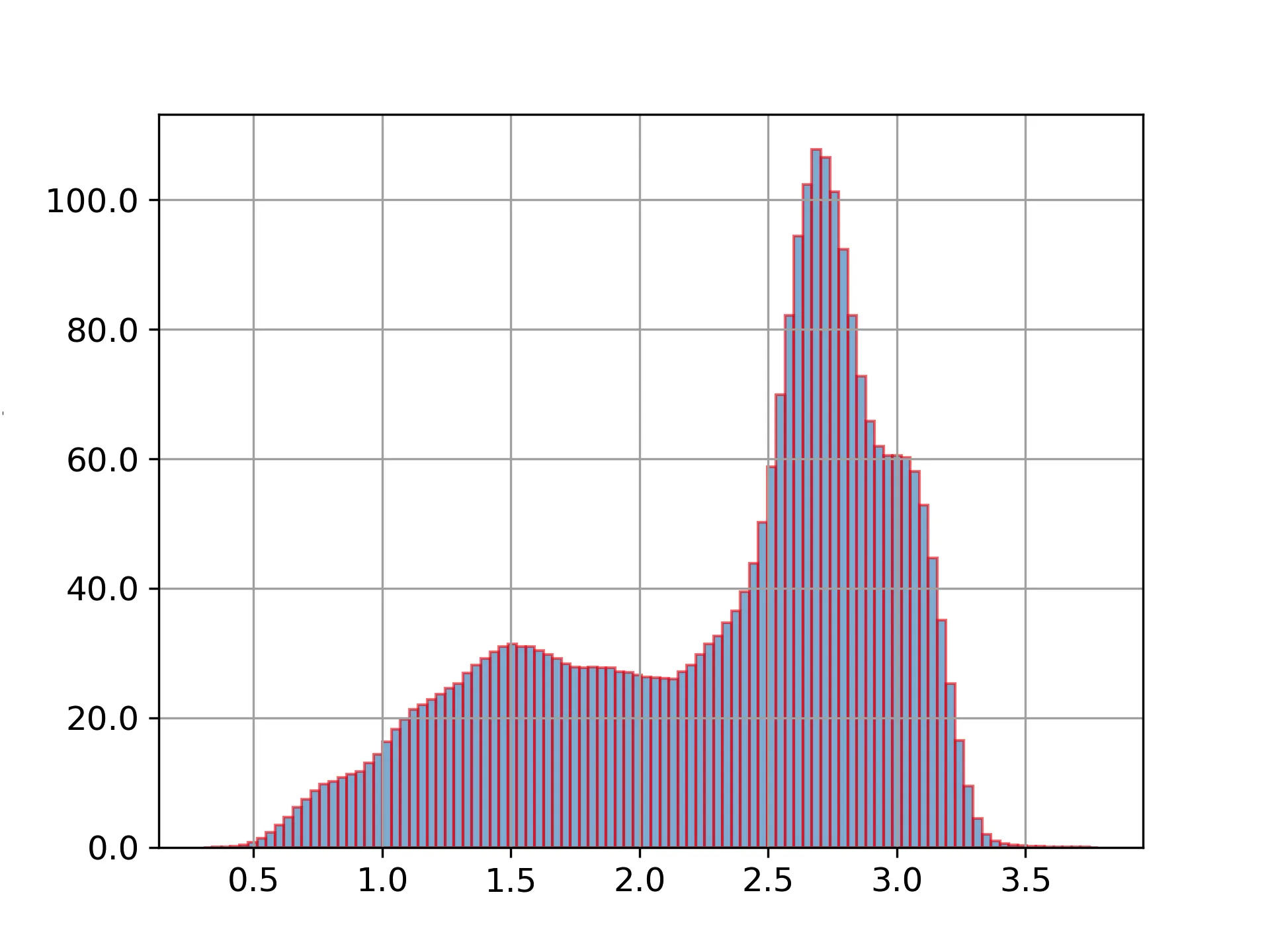
我有一个文件,其中包含一列大量数据(4,000,000个数字):
1.727182
1.645300
1.619943
1.709263
1.614427
1.522313
我正在使用Meng和Justice Lord所做的修改后的脚本:
from matplotlib import rc
from sklearn import mixture
import matplotlib.pyplot as plt
import numpy as np
import matplotlib
import matplotlib.ticker as tkr
import scipy.stats as stats

x = open("prueba.dat").read().splitlines()

f = np.ravel(x).astype(np.float)
f=f.reshape(-1,1)
g = mixture.GaussianMixture(n_components=3,covariance_type='full')
g.fit(f)
weights = g.weights_
means = g.means_
covars = g.covariances_

plt.hist(f, bins=100, histtype='bar', density=True, ec='red', alpha=0.5)
plt.plot(f,weights[0]*stats.norm.pdf(f,means[0],np.sqrt(covars[0])), c='red')
plt.rcParams['agg.path.chunksize'] = 10000

plt.grid()
plt.show()
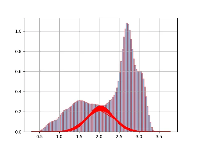
当我运行脚本时,我得到了以下的图表:
非常感谢。