Telerik甜甜圈图表 - 自定义标签

4

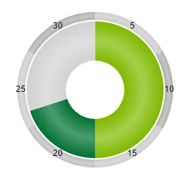
我想要自定义Telerik甜甜圈图表的标签位置,并使其看起来像期望的图片。我尝试了几个设置,但无法调整标签位置,参见POC图片。

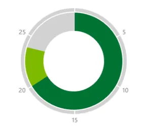
问题 - 我如何更改标签位置,以使其看起来像期望的图片。我希望5、10、15、20、25等位于第二个环外部,并且每个分类的标签应该在其结束处。

期望

enter image description here

POC

enter image description here

代码

$("#chart").kendoChart({
  legend: {
    visible: false
  },
  chartArea: {
    background: ""
  },
  seriesDefaults: {
    type: "donut",
    startAngle: 90,
    labels:{
      template: "#= category #",
    }
  },
  series: [{
    name: "abc",
    size:50,
    margin:2,
    data: [{
      category: "abc1",
      value: 50,
      color: "#7FBA00"
    },{
      category: "abc2",
      value: 20,
      color: "#007233"
    },{
      category: "abc3",
      value: 30,
      color: "#D2D2D2"
    }]
  }, {
    name: "xyz",
    size:10,
    data: [{
      category: "5",
      value: 10,
      color: "#ccc"
    },{
      category: "10",
      value: 10,
      color: "#AFAFAF"
    },{
      category: "15",
      value: 10,
      color: "#ccc"
    },{
      category: "20",
      value: 10,
      color: "#AFAFAF"
    },{
      category: "25",
      value: 10,
      color: "#ccc"
    },{
      category: "30",
      value: 10,
      color: "#AFAFAF"
    }],
    labels: {
      visible: true,
      background: "transparent",
      position: "center"
    }
  }]
});
1个回答

4
我不知道是否有任何选项可以设置您想要的特定位置,但您可以欺骗Telerik以任何方式实现它。关键是将标签放置在第三个没有背景颜色的外环中,并安排扇形图的值,使其与第二个(交替灰色)环匹配,这样就不再需要标签了。
$("#chart").kendoChart({
  legend: {
    visible: false
  },
  chartArea: {
    background: ""
  },
  seriesDefaults: {
    type: "donut",
    startAngle: 90,
    labels:{
      template: "#= category #",
    }
  },
  series: [{
    name: "yourData",
    size:50,
    margin:2,
    data: [{
      category: "abc1",
      value: 50,
      color: "#7FBA00"
    },{
      category: "abc2",
      value: 20,
      color: "#007233"
    },{
      category: "abc3",
      value: 30,
      color: "#D2D2D2"
    }]
  }, {
    name: "grayAxis",
    size:10,
    data: [{
      value: 10,
      color: "#ccc"
    },{
      value: 10,
      color: "#AFAFAF"
    },{
      value: 10,
      color: "#ccc"
    },{
      value: 10,
      color: "#AFAFAF"
    },{
      value: 10,
      color: "#ccc"
    },{
      value: 10,
      color: "#AFAFAF"
    }]
  } , {
    name: "numbers",
    size:10,
    data: [{
      category: "",
      value: 9,
      color: "none"
    },{
      category: "5",
      value: 1,
      color: "none"
    },{
      category: "",
      value: 9,
      color: "none"
    },{
      category: "10",
      value: 1,
      color: "none"
    },{
      category: "",
      value: 9,
      color: "none"
    },{
      category: "15",
      value: 1,
      color: "none"
    },{
      category: "",
      value: 9,
      color: "none"
    },{
      category: "20",
      value: 1,
      color: "none"
    },{
      category: "",
      value: 9,
      color: "none"
    },{
      category: "25",
      value: 1,
      color: "none"
    },{
      category: "",
      value: 9,
      color: "none"
    },{
      category: "X",
      value: 1,
      color: "none"
    }],
    labels: {
      visible: true,
      background: "transparent",
      template: "#= category #",
      position: "center"
    } 
  }]
});

现在,你当然可以用“”替换“X”以获得空的顶部标签,你可以调整第三个甜甜圈的值,使其更加整齐,你可以将原点从90度移动到89.5度,你可以在第二个甜甜圈中也使用我在第三个甜甜圈中使用的相同的9 + 1方案,以获得你灰色带微小白色分隔符布局等等。
无论哪种方式,这就是我所选择的方式:让你的第二个甜甜圈看起来任何你想要的样子,并使用基本上不可见的第三个甜甜圈来放置你的轴标签。
很整洁,不是吗?

网页内容由stack overflow 提供, 点击上面的
可以查看英文原文,
原文链接