有很多问题,所以我重写了它。我已经创造了你想要的东西。享受吧。=)
http://jsfiddle.net/hRkx8/53/
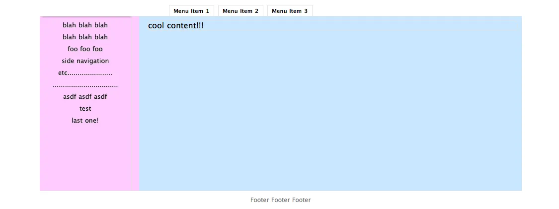
诀窍是让您的主区域具有与页脚相同高度的下边距(您绝对定位)。因此,随着您的蓝色元素变得越来越大,它将开始比通常情况下更早地推动页面底部。 (编辑:此版本移动了页脚,这更难做到;但是问题要求将蓝色区域初始化为尽可能大,请参见下面的一种方法)
我们开始吧!不幸的是,我必须将它内联包含,因为jsfiddle存在一些严重的错误,导致无法正确显示。这个版本的蓝色区域从底部开始。
绝对定位的元素似乎在页面变大时自动滚动存在一些问题,所以我创建了一个虚拟的#main div,就像你做的那样,并让它填充整个视口,然后在其中包含了#footer和#content(你的蓝色和红色内容)。#footer是绝对定位的,因此它不占用空间/文档不关心它。随着#content的扩展,#main容器也会随之扩展,同时拖动页脚。使用margin-bottom是必要的,以防止页脚隐藏文本。
实际上需要的CSS量非常少,如果删除演示内容,只有大约5行和虚拟元素。
<html>
<head>
<style>
body {
margin:0; padding:0;
}
* {
box-sizing:border-box;
padding:5px;
border:1px dashed red;
-webkit-border-radius:10px; -moz-border-radius:10px;
background-color:hsla(0,50%,50%, 0.1);
}
#main {
position:relative; width:100%; min-height:100%;
border:3px solid green;
}
#footer {
position:absolute;
left:0px; right:0px; bottom:0px; height:5em;
background-color:lightgrey;
}
#content {
position:relative;
box-sizing:border-box;
background-color:skyblue;
margin-left:auto; margin-right:auto;
padding-bottom:5em;
margin-top:10%;
width:50%;
min-height:80%;
border:3px solid blue;
}
#sidebar {
position:absolute;
top:0px; bottom:0px;
right:100%; width:7em;
background-color:pink;
overflow-y:scroll;
}
#topbar {
position:absolute;
bottom:100%; height:3em;
right:-10%; left:10%;
}
</style>
<script src="http://ajax.googleapis.com/ajax/libs/jquery/1.5.2/jquery.min.js"></script>
<script>
setTimeout("$('pre').animate({height:1500}, 3000)", 1000);
</script>
</head>
<body>
<div id="everything">
<div id="main">
<div id="content">
<div id="sidebar">
alpha
<br/>
beta
<br/>
gamma
<br/>
etc.
</div>
<div id="topbar">
Menu1 * Menu2 * Menu3 * ...
</div>
This is my site.
Yay.
<pre>
etc.
etc.
etc.
etc.
etc.
etc.
etc.
etc.
etc.
etc.
etc.
etc.
etc.
etc.
etc.
etc.
etc.
</pre>
</div>
<div id="footer">
footer
</div>
</div>
</div>
</body>
</html>