我查看了文档,但没有找到这样的属性。 我想使用css grid将一列中的所有单元格调整为其内容的宽度。
对于第一种情况,我应该对容器应用此属性:grid-template-columns: auto auto;
但是对于第二种情况,我该怎么办?
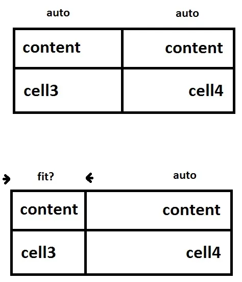
要使所有列 "收缩以适应内容", 可使用内联级别的网格容器:
article {
  display: inline-grid;
  grid-template-columns: auto auto;
}

/* non-essential demo styles */
article { background-color: black; border: 1px solid black; }
section { background-color: white; border: 1px solid black; }<article>
<section>content</section>
<section>content</section>
<section>cell3</section>
<section>cell4</section>
</article>使用min-content可以使得一个列"收缩以适应内容":
article {
  display: grid;
  grid-template-columns: min-content auto;
}

/* non-essential demo styles */
article { background-color: black; border: 1px solid black; }
section { background-color: white; border: 1px solid black; }<article>
<section>content</section>
<section>content</section>
<section>cell3</section>
<section>cell4</section>
</article>但是使用1fr的auto也可以,因为fr会消耗该行上所有的自由空间,尽可能减小其他列的宽度:
article {
  display: grid;
  grid-template-columns: auto 1fr;
}

/* non-essential demo styles */
article { background-color: black; border: 1px solid black; }
section { background-color: white; border: 1px solid black; }<article>
<section>content</section>
<section>content</section>
<section>cell3</section>
<section>cell4</section>
</article>详细信息请参考规范:
grid-template-columns: auto max-content; 对我很管用。 - satnhak在网格容器上设置以下内容:
grid-template-columns: auto 1fr;
这将使第一列的宽度等于该列中最宽的项目的宽度,而第二列的宽度则为网格的剩余宽度。
要使第二列的内容右对齐,我们可以简单地使用text-align: right。
span:nth-child(2n) {
  text-align: right;
}
div {
  display: grid;
  grid-template-columns: auto 1fr;
}
span {
  padding: 0.5em;
}
span:nth-child(2n) {
  text-align: right;
}
span:nth-child(1) {
  background-color: beige; /* colors for demo */
}
span:nth-child(2) {
  background-color: wheat;
}
span:nth-child(3) {
  background-color: lightgreen;
}
span:nth-child(4) {
  background-color: salmon;
}<div>
<span>some content here</span>
<span>content</span>
<span>cell3</span>
<span>cell4</span>
</div>NB: 使用 min-content 设置列宽度会更加“激进”,它会将列的宽度设置为该列中最长单词的宽度。
div {
  display: grid;
  grid-template-columns: min-content auto;
}
span {
  padding: 0.5em;
}
span:nth-child(2n) {
  text-align: right;
}
span:nth-child(1) {
  background-color: beige;
}
span:nth-child(2) {
  background-color: wheat;
}
span:nth-child(3) {
  background-color: lightgreen;
}
span:nth-child(4) {
  background-color: salmon;
}<div>
<span>some content here</span>
<span>content</span>
<span>cell3</span>
<span>cell4</span>
</div>
grid-template-columns: min-content auto吗? - Michael Benjaminmin-content会在空格后面换行,因此可以使用white-space: nowrap;进行修正。 - besthostmax-content来防止换行。 - Igor Fomenko