我希望使用ggplot2(v.9)绘制世界地图,将两个信息合并在一起。以下示例说明:
library(rgdal)
library(ggplot2)
library(maptools)
# Data from http://thematicmapping.org/downloads/world_borders.php.
# Direct link: http://thematicmapping.org/downloads/TM_WORLD_BORDERS_SIMPL-0.3.zip
# Unpack and put the files in a dir 'data'
gpclibPermit()
world.map <- readOGR(dsn="data", layer="TM_WORLD_BORDERS_SIMPL-0.3")
world.ggmap <- fortify(world.map, region = "NAME")
n <- length(unique(world.ggmap$id))
df <- data.frame(id = unique(world.ggmap$id),
growth = 4*runif(n),
category = factor(sample(1:5, n, replace=T)))
## noise
df[c(sample(1:100,40)),c("growth", "category")] <- NA
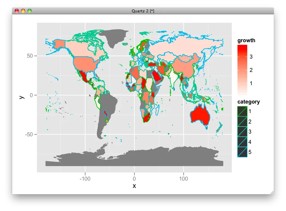
ggplot(df, aes(map_id = id)) +
geom_map(aes(fill = growth, color = category), map =world.ggmap) +
expand_limits(x = world.ggmap$long, y = world.ggmap$lat) +
scale_fill_gradient(low = "red", high = "blue", guide = "colorbar")
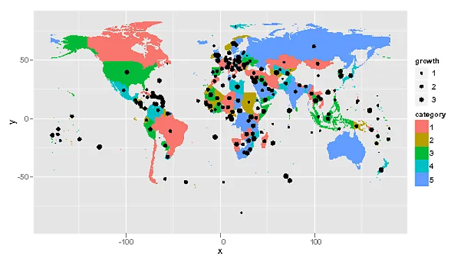
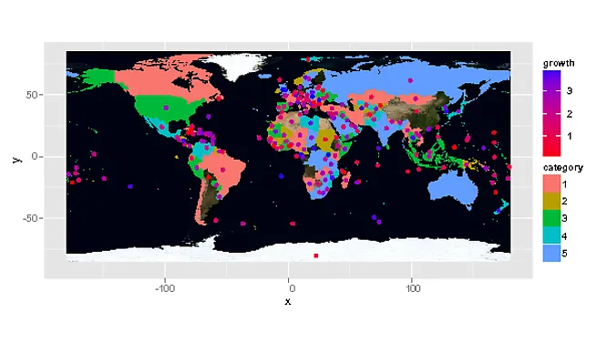
然而,这个解决方案并不是一个好的方式来展示
growth和category。 Growth非常明显,但category几乎看不到,因为它只是一个边框。我已经尝试增加边框的大小,但没有成功(新的geom_map很难使用)。 有人知道如何在上面的示例中增加边框大小,或者更好的机制来显示两个因素吗?
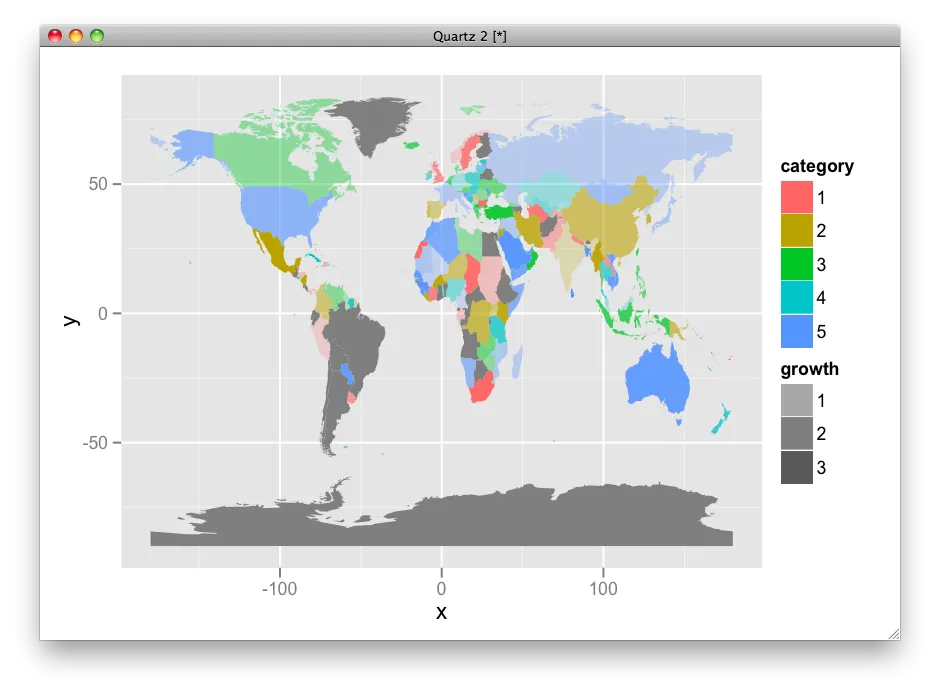
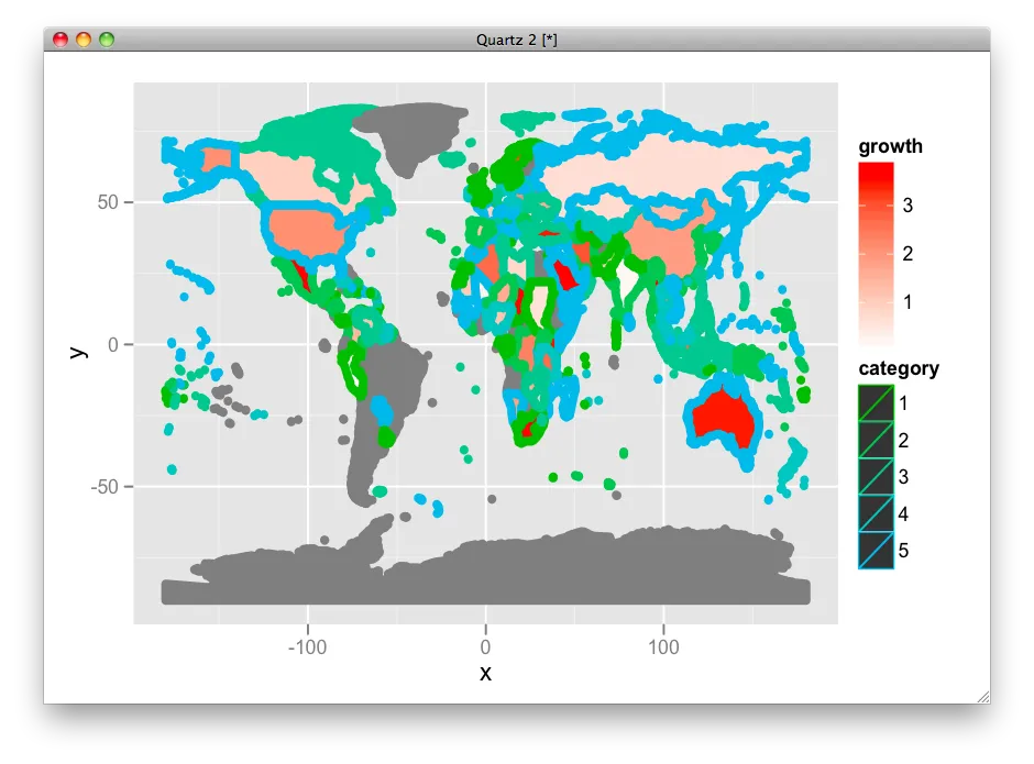
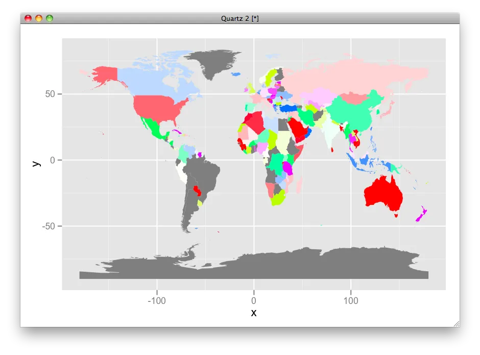
结果: result http://ompldr.org/vY3hsYQ