如何正确使用inline-block定位元素?

3
我有一张图片,一个标题和一个描述。 我想在左侧显示图片,然后在其旁边显示标题和描述。
使用浮动很容易实现,但是使用inline-block是否也可以呢?我无法找到不使用浮动就能正确显示的方法。
那么正确的方法是什么呢?使用浮动是否“不好”呢?
JSFiddle: https://jsfiddle.net/g1euvcbx

.path-team {
        text-align: left;
        .item-list {
            width: 80%;
            margin: 0 auto;
        }
        .list-item {
            margin: 0;
            padding: 0;
        }
        .field__item {
            font-weight: bold;
            padding-bottom: 5px;
            p {
                font-weight: normal;
                padding-bottom: 25px;
            }
            img {
                margin: 0 auto;
                margin-bottom: 10px;
                padding: 0;
            }
        }
        /* positioning */
        ul {
            list-style: none;
            margin: 0;
            padding: 0;
            li {}
            ul {
                margin: 0;
                padding: 0;
            }
        }
    }
<div class="path-team">

<ul class="item-list">
  <li class="list-item">
    <div class="field-collection-item">
      <div class="content">
        <div class="field field--name-field-picture">
          <div class="field__item">
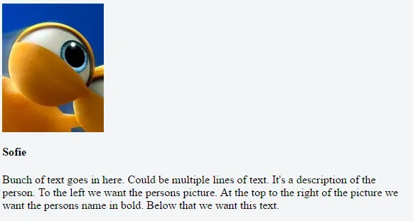
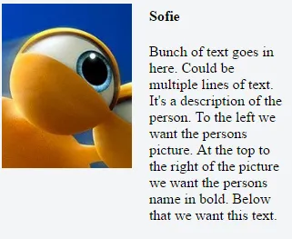
            <img src="https://i.gyazo.com/e201976d7a4fd5745d9cc1af713943b4.png" alt="Sofie">
          </div>
        </div>
        
        <div class="field field--name-team-name">
          <div class="field__item">
            Sofie
          </div>
        </div>
        
        <div class="field field--name-team-short-desc">
          <div class="field__item">
            <p>
              Bunch of text goes in here.
              Could be multiple lines of text.
              It's a description of the person.
              To the left we want the persons picture.
              At the top to the right of the picture we want the persons name in bold.
              Below that we want this text.
            </p>
          </div>
        </div>
        
      </div>
    </div>
  </li>
</ul>

</div>

这是我现在的内容:

start

我想要的最终结果是:

result


你必须使用浮点数来实现这个简单的功能,如果你清楚地了解它们的作用,使用浮点数是没有问题的。否则,你也可以使用display:table和display:table-cell来定位它们,但我认为这并不是必要的。 - w.Bala
“这该怎么正确地做呢?使用浮点数是否不好?” - 浮点数本身并不是“不好”的,它们只是不打算用于整个布局。但是长期以来,浮点数是我们最好的工具,通常是在使用表格进行列布局时唯一可行的替代方案。现在我们有更好的布局工具可用了-即弹性框架。网格布局是下一个重要的浏览器布局工具。但在此类情况下使用浮动或inline-block也是可以的。 - CBroe
2个回答

1

有多种方法可以实现这种布局。通常我建议使用display: inline-blockdisplay: flex。如果您无法决定采用哪种方式,请始终检查支持情况,对于您的情况分别为display: inline-blockdisplay: flex

此外,您可以将HTML结构简化为以下内容。这适用于两种解决方案。

HTML

<div class="field">
  <img src="https://images.pexels.com/photos/192651/pexels-photo-192651.jpeg?w=1260&h=750&auto=compress&cs=tinysrgb" alt="Title">
  <div class="content">
    <h1>Title</h1>
    <p> Bunch of text goes in here. Could be multiple lines of text. It's a description of the person. To the left we want the persons picture. At the top to the right of the picture we want the persons name in bold. Below that we want this text. </p>
  </div>
</div>

显示:内联块

CSS

* {
  box-sizing: border-box;
}

.field {
  width: calc(50% - 4px);
  background: #eee;
  font-size: 0;
  position: relative;
}

.field img,
.field .content {
  display: inline-block;
}

.field img {
  vertical-align: top;
  width: 30%;
}

.field .content {
   width: 70%;
   font-size: initial;
   padding: 10px 20px;
}

.content h1 {
  margin: 0;
}

* {
  box-sizing: border-box;
}
.field {
  width: calc(50% - 4px);
  background: #eee;
  font-size: 0;
  position: relative;
}
.field img,
.field .content {
  display: inline-block;
}
.field img {
  vertical-align: top;
  width: 30%;
}
.field .content {
  width: 70%;
  font-size: initial;
  padding: 10px 20px;
}
.content h1 {
  margin: 0;
}
<div class="field">
  <img src="https://images.pexels.com/photos/192651/pexels-photo-192651.jpeg?w=1260&h=750&auto=compress&cs=tinysrgb" alt="Title">
  <div class="content">
    <h1>Title</h1>
    <p>
      Bunch of text goes in here. Could be multiple lines of text. It's a description of the person. To the left we want the persons picture. At the top to the right of the picture we want the persons name in bold. Below that we want this text.
    </p>
  </div>
</div>

display: flex

CSS

.field {
  width: 50%;
  background: #eee;
  display: flex;
  align-items: flex-start;
}

img {
  max-width: 200px;
}

.field .content {
  padding: 10px 20px;
}

.content h1 {
  margin: 0;
}

.field {
  width: 50%;
  background: #eee;
  display: flex;
  align-items: flex-start;
}
img {
  max-width: 100px;
}
.field .content {
  padding: 10px 20px;
}
.content h1 {
  margin: 0;
}
<div class="field">
  <img src="https://images.pexels.com/photos/192651/pexels-photo-192651.jpeg?w=1260&h=750&auto=compress&cs=tinysrgb" alt="Title">
  <div class="content">
    <h1>Title</h1>
    <p>
      Bunch of text goes in here. Could be multiple lines of text. It's a description of the person. To the left we want the persons picture. At the top to the right of the picture we want the persons name in bold. Below that we want this text.
    </p>
  </div>
</div>


0

浮点数本身没有问题。但是,如果你想依赖于inline-block,你可以像这样做:

在一个新的div标签中添加名称和描述标签,如下所示:

<div class="info-container">
    <div class="field field--name-team-name">
      <div class="field__item">
        Sofie
      </div>
    </div>

    <div class="field field--name-team-short-desc">
      <div class="field__item">
        <p>
          Bunch of text goes in here.
          Could be multiple lines of text.
          It's a description of the person.
          To the left we want the persons picture.
          At the top to the right of the picture we want the persons name in bold.
          Below that we want this text.
        </p>
      </div>
    </div>
</div>

然后添加这些CSS规则:

.field-name-field-picture, .info-container {
   display: inline-block;
   vertical-align: top;
}

.info-container {
   width: 300px;
}

请注意,在 .field-name-field-picture 中删除了两个连字符,因为两个连续的连字符会使类无效。

jsFiddle


网页内容由stack overflow 提供, 点击上面的
可以查看英文原文,
原文链接