使用display:inline-block定位divs。如何适应高度?

3

我一直在搜索并尝试做一件简单的事情,但无法实现。这件事是我想将display inline-block应用于某些div,但使它们一个接一个地对齐。就像照片一样。
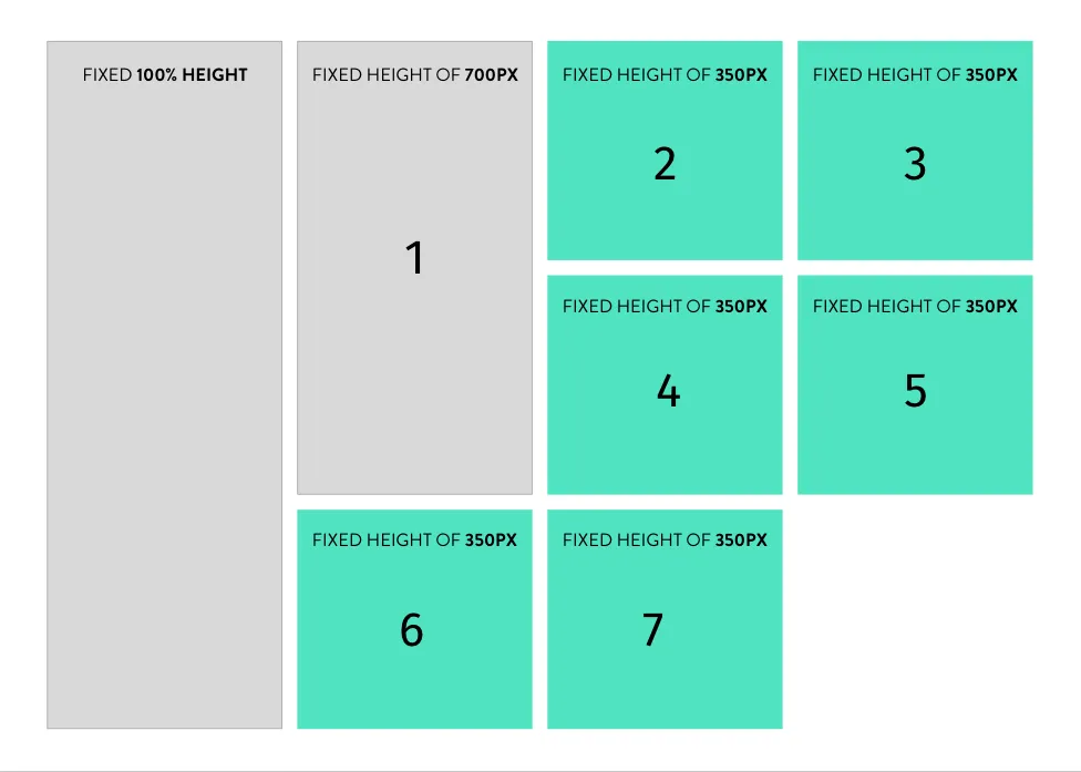
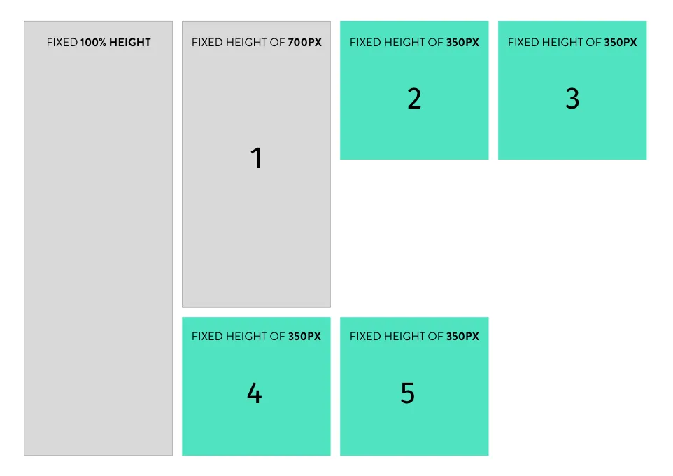
enter image description here

所以问题在于数字4和5在使用display:inline-block时被放置在数字1之后:

enter image description here

那我能做什么呢? 谢谢!

.post-it {
  background-color: #F00;
  height: 140px;
  padding: 1em;
  width: 150px;
  display: inline-block;
  margin: 0 1.3em 1.5em 0;
  box-shadow: 0px 2px 4px 0px rgba(0,0,0,0.50);
}

 .title {
   font-size: 2em;
   font-weight: bold;
   line-height: 1em;
   margin-bottom: .2em;
}

#today {
  height: 300px;
}
<div>
  <div class="post-it" id="today">
    <header>
      <div class="title">
        Day 25
      </div>
      <hr>
    </header>
  </div>
  <div class="post-it">
    <header>
      <div class="title">
        Day 26
      </div>
      <hr>
    </header>
  </div>
  <div class="post-it">
    <header>
      <div class="title">
        Day 27
      </div>
      <hr>
    </header>
  </div>
  <div class="post-it">
    <header>
      <div class="title">
        Day 28
      </div>
      <hr>
    </header>
  </div>
  <div class="post-it">
    <header>
      <div class="title">
        Day 29
      </div>
      <hr>
    </header>
  </div>
</div>

3个回答

2
尝试在外部div上设置一个固定宽度,我称之为#calendar,然后将属性float:left添加到你的.post-it类中。希望能对你有所帮助!

.post-it {
  background-color: #F00;
  height: 140px;
  padding: 1em;
  width: 150px;
  display: inline-block;
  margin: 0 1.3em 1.5em 0;
 float: left;
  box-shadow: 0px 2px 4px 0px rgba(0,0,0,0.50);
}

 .title {
   font-size: 2em;
   font-weight: bold;
   line-height: 1em;
   margin-bottom: .2em;
}

#today {
  height: 300px;
}
#calendar {
  width: 800px;
}
<div id="calendar">
  <div class="post-it" id="today">
    <header>
      <div class="title">
        Day 25
      </div>
      <hr>
    </header>
  </div>
  <div class="post-it">
    <header>
      <div class="title">
        Day 26
      </div>
      <hr>
    </header>
  </div>
  <div class="post-it">
    <header>
      <div class="title">
        Day 27
      </div>
      <hr>
    </header>
  </div>
  <div class="post-it">
    <header>
      <div class="title">
        Day 28
      </div>
      <hr>
    </header>
  </div>
  <div class="post-it">
    <header>
      <div class="title">
        Day 29
      </div>
      <hr>
    </header>
  </div>
</div>


嗨Wojo,谢谢。没有日历样式也很好用。谢谢! - Dani G.

2

试试这个:

.post-it {
  float: left;
}

哦,天啊,好傻的事... 如果我在“post-it”类中加入“float:left”,它就完美地工作了。谢谢! - Dani G.

1
您正在获得的行为是完全正常的。将内联块视为一行文本。注意:管道代表实际的div。在第一行中发生的情况类似于以下内容(将以下代码片段视为一行):
|****|***|
|

now when you add more text

|****|***| <<< opps no enough space go to next line
|

但是下一行不是A(因为它实际上仍然是同一行):
|****|***| 
| <<< A

这是一个新的空行 B

|****|***| 
| <<< A
 <<< B

so what you are looking for is floating. not inline blocks.

.post-it {
  background-color: #F00;
  height: 140px;
  padding: 1em;
  width: 150px;
  float:left;
  margin: 0 1.3em 1.5em 0;
  box-shadow: 0px 2px 4px 0px rgba(0,0,0,0.50);
}

 .title {
   font-size: 2em;
   font-weight: bold;
   line-height: 1em;
   margin-bottom: .2em;
}

#today {
  height: 300px;
}
<div>
  <div class="post-it" id="today">
    <header>
      <div class="title">
        Day 25
      </div>
      <hr>
    </header>
  </div>
  <div class="post-it">
    <header>
      <div class="title">
        Day 26
      </div>
      <hr>
    </header>
  </div>
  <div class="post-it">
    <header>
      <div class="title">
        Day 27
      </div>
      <hr>
    </header>
  </div>
  <div class="post-it">
    <header>
      <div class="title">
        Day 28
      </div>
      <hr>
    </header>
  </div>
  <div class="post-it">
    <header>
      <div class="title">
        Day 29
      </div>
      <hr>
    </header>
  </div>
</div>


网页内容由stack overflow 提供, 点击上面的
可以查看英文原文,
原文链接