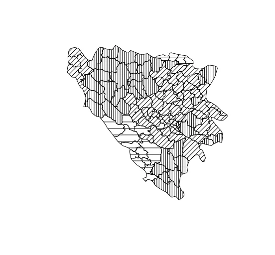
我有一张波斯尼亚地图,各个市镇被染上了生活在那里的族群的主导颜色。然而,由于要打印成黑白图,我想使用不同的图案代替颜色(或灰度)。
我已经搜索过了,但找不到解决方法。有人有办法吗? shapefile链接 这是我的代码:
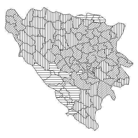
这给我提供了以下地图: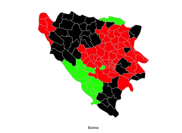
我已经搜索过了,但找不到解决方法。有人有办法吗? shapefile链接 这是我的代码:
library(RColorBrewer)
library(maptools)
library(rgdal)
library(rgeos)
library(ggplot2)
library(gridExtra)

setwd("path")

bosnia <- readOGR("path/to/file", "bosnia_analysis",
                verbose = TRUE, stringsAsFactors = FALSE)

bosnia <- readShapePoly("path/to/bosnia_analysis.shp",proj4string=CRS("+proj=longlat +datum=WGS84"))
bosnia.df <- bosnia@data

serbs <- bosnia[bosnia$SEPRIORITY > bosnia$CRPRIORITY & bosnia$SEPRIORITY > bosnia$MOPRIORITY,]
croats <-  bosnia[bosnia$CRPRIORITY > bosnia$SEPRIORITY & bosnia$CRPRIORITY > bosnia$MOPRIORITY,]
moslems <- bosnia[bosnia$MOPRIORITY > bosnia$CRPRIORITY & bosnia$MOPRIORITY > bosnia$SEPRIORITY,]

p <- ggplot(bosnia, aes(x = long, y = lat, group = group)) +
  geom_polygon(aes(x=long,y=lat,group=group), fill="white", colour="grey") +
  geom_polygon(data=serbs, aes(x=long,y=lat,group=group), fill="black", colour="grey") +
  geom_polygon(data=croats, aes(x=long,y=lat,group=group), fill="green", colour="grey") +
  geom_polygon(data=moslems, aes(x=long,y=lat,group=group), fill="red", colour="grey") +
  # Styling
  coord_map() +
  labs(x="Bosnia", y=" ") +
  theme_bw() +
  theme(panel.grid.minor=element_blank(), panel.grid.major=element_blank()) +
  theme(axis.ticks = element_blank(), axis.text.x = element_blank(), axis.text.y = element_blank()) +
  theme(panel.border = element_blank())

p
这给我提供了以下地图: