我该如何绘制这种数据的直方图?
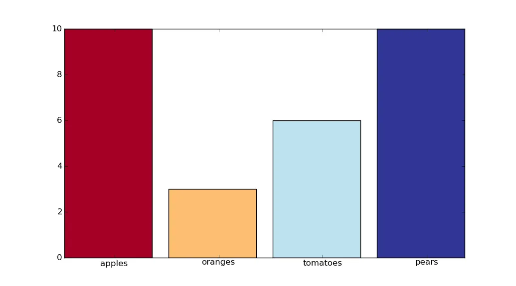
10 apples
3 oranges
6 tomatoes
10 pears
从文本文件中读取?
谢谢
10 apples
3 oranges
6 tomatoes
10 pears
从文本文件中读取?
谢谢
以下是一种给条形图分配不同颜色的方法。它适用于任何数量的条形。
import numpy as np
import pylab
import matplotlib.cm as cm

arr = np.genfromtxt('data', dtype=None)
n = len(arr)
centers = np.arange(n)
colors = cm.RdYlBu(np.linspace(0, 1, n))
pylab.bar(centers, arr['f0'], color=colors, align='center')
ax = pylab.gca()
ax.set_xticks(centers)
ax.set_xticklabels(arr['f1'], rotation=0)
pylab.show()
sep,width,left,centers)的情况下完成这个任务。实际上,你只需要使用 range(n) 来设置 set_xticks(),并在 bar() 中使用 align='center' 参数即可。 - Eric O. Lebigotgenfromtxt()中设置dtype=None更容易:数据类型会被正确推断;此外,你还可以获得一个额外的好处,即防止水果名称超过20个字符的代码出现问题。 :) - Eric O. Lebigotdtype=None 的行为与省略 dtype 不同。这很好知道。再次感谢。 - unutbudtype=float(纯数值数组)。 - Eric O. Lebigotimport numpy as np
import matplotlib.pyplot as plt
plt.figure()
indices = np.arange(4)
width = 0.5
plt.bar(indices, [10, 3, 6, 10], width=width)
plt.xticks(indices + width/2, ('Apples', 'Oranges', 'Tomatoes', 'Pears'))
plt.show()
以下内容将帮助你入门。从文本文件中加载数据很简单。
Felix 是对的。
Matplotlib 是其中一个可用的工具。看一下它,有很多例子。如果你不能画出直方图,那么你可以问另一个问题,我相信会有很多人来帮助你。
这里有一些例子:
http://matplotlib.sourceforge.net/examples/pylab_examples/histogram_demo_extended.html