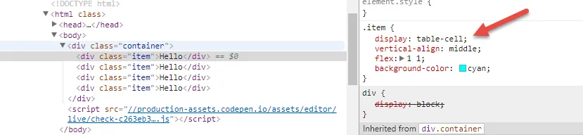
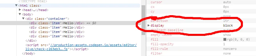
垂直对齐在flex项目上不起作用。

4
我试图在弹性盒元素内部垂直居中纯文本。 我决定使用属性display:table-cellvertical-align:middle。但它似乎在flexbox元素中不能正常工作。 如何在不使用包装器或定位的情况下实现垂直居中,同时仍使用省略号截断长文本?

.container {
  width: 400px;
  height: 400px;
  font-weight: 700;
  border: 1px solid #d9d9d9;
  display: flex;
  flex-direction: column;
}

.item {
  display: table-cell;
  vertical-align: middle;
  flex: 1 1;
  background-color: cyan;
  white-space: nowrap;
  overflow: hidden;
  text-overflow: ellipsis;
}

.item:nth-of-type(2n) {
  background-color: aliceblue;
}
<div class="container">
  <div class="item">Hello, I'm very very long string! Hello, I'm very very long string!</div>
  <div class="item">Hello</div>
  <div class="item">Hello</div>
  <div class="item">Hello</div>
</div>

View On CodePen

4个回答

6
一种解决方法是将每个伸缩项定义为自己的伸缩容器,以便使用align-items:center垂直居中其内容。要使text-overflow生效,请向每个伸缩项添加一个子元素,然后可以用省略号截断。
我无法简洁地解释为什么text-overflowdisplay:flex不兼容,David Wesst 也一样。用他的话说:
“事实上,没有一种简单的方法来实现这一点。如果你想知道我是怎么得出这个结论的,那就别问了。那些负责规范的人已经得出了这个结论,并且您可以阅读全文,从Mozilla bug report开始,导致整个邮件组讨论有关是否应该(或在这种情况下,不应)将其作为规范的一部分实施。”
以下是一个可运行的示例:

.container {
  width: 400px;
  height: 400px;
  font-weight: 700;
  border: 1px solid #d9d9d9;
  display: flex;
  flex-direction: column;
}

.item {
  display: flex;
  align-items: center;
  flex: 1;
  background-color: cyan;
}

.item span {
  white-space: nowrap;
  overflow: hidden;
  text-overflow: ellipsis;
}

.item:nth-of-type(2n) {
  background-color: aliceblue;
}
<div class="container">
  <div class="item"><span>Hello, I'm very very long string! Hello, I'm very very long string!</span></div>
  <div class="item"><span>Hello</span></div>
  <div class="item"><span>Hello</span></div>
  <div class="item"><span>Hello</span></div>
</div>

另请参见:
如何在 flex 容器中设置文本省略号


4
当你把一个元素作为flex容器(使用display: flexdisplay: inline-flex)时,所有流动子元素都变成了flex项。
所有flex项的display值都由容器控制。无论你指定什么,容器都会覆盖它。
因此,当你给一个flex项设置display: table-cell时,浏览器会忽略它。下面是在Chrome Dev Tools中的样子: 样式选项卡 enter image description here 计算选项卡 enter image description here Flex容器会使flex项“块化”,使它们具有许多块级元素的特性(来源)。
vertical-align属性只适用于内联级和表格单元格元素(来源)。
这就是为什么它不起作用的原因。
不管怎样,即使它起作用了,在这种情况下,vertical-align仍然是一种完全不必要的hack。有为在flex项中对齐内容而设计的flex属性。

.container {
  width: 500px;
  height: 500px;
  font-weight: 700;
  border: 1px solid #d9d9d9;
  display: flex;
  flex-direction: column;
}

.item {
  flex: 1 1;
  display: flex;
  justify-content: center; /* horizontal alignment, in this case */
  align-items: center;     /* vertical alignment, in this case */
  background-color: cyan;
}

.item:nth-of-type(2n) {
  background-color: aliceblue;
}
<div class="container">
  <div class="item">Hello</div>
  <div class="item">Hello</div>
  <div class="item">Hello</div>
  <div class="item">Hello</div>
</div>  

相关文章:


2
问题已经改变。原始代码中没有这么长的文本。因此,现在这个答案涵盖了新问题的对齐部分,但不包括省略号部分。 - Michael Benjamin

0

0
你还必须将这些项目定义为 flex 容器,使用以下 CSS(不使用 table-cell 显示...):
display: flex;
flex-direction: column;
justify-content: center;

.container {
  width: 400px;
  height: 400px;
  font-weight: 700;
  border: 1px solid #d9d9d9;
  display: flex;
  flex-direction: column;
}

.item {
  display: flex;
  flex-direction: column;
  justify-content: center;
  flex: 1 1;
  background-color: cyan;
  white-space: nowrap;
  overflow: hidden;
  text-overflow: ellipsis;
}

.item:nth-of-type(2n) {
  background-color: aliceblue;
}
<div class="container">
  <div class="item">Hello, I'm very very long string! Hello, I'm very very long string!</div>
  <div class="item">Hello</div>
  <div class="item">Hello</div>
  <div class="item">Hello</div>
</div>


网页内容由stack overflow 提供, 点击上面的
可以查看英文原文,
原文链接