以下是实现此布局的五个选项:
- CSS定位
- 使用不可见DOM元素的Flexbox
- 使用不可见伪元素的Flexbox
- 使用
flex: 1的Flexbox
- CSS网格布局
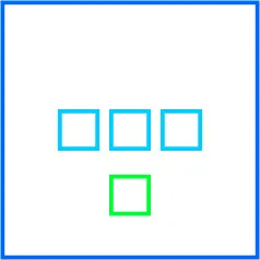
方法1:CSS定位属性
给Flex容器应用position: relative。
将绿色Flex项目应用position: absolute。
现在,绿色正方形在Flex容器中绝对定位。
更具体地说,绿色正方形从文档流中移除但仍保持在最近的已定位祖先范围内。
使用CSS偏移属性top、bottom、left和right来移动绿色正方形。
flex-container {
display: flex;
justify-content: center;
align-items: center;
flex-wrap: nowrap;
position: relative;
border: 4px solid blue;
height: 300px;
width: 300px;
}
flex-container > flex-item:first-child {
display: flex;
}
flex-container > flex-item:first-child > flex-item {
border: 4px solid aqua;
height: 50px;
width: 50px;
margin: 0 5px;
}
flex-container > flex-item:last-child {
position: absolute;
bottom: 40px;
left: 50%;
transform: translateX(-50%);
border: 4px solid chartreuse;
height: 50px;
width: 50px;
}
<flex-container>
<flex-item>
<flex-item></flex-item>
<flex-item></flex-item>
<flex-item></flex-item>
</flex-item>
<flex-item></flex-item>
</flex-container>
注意:有些浏览器可能无法完全将绝对定位的 flex 项目从正常流中移除,这会以非标准、意外的方式改变对齐方式。更多详情请见:Firefox 和 IE11 中绝对定位的 flex 项目未能从正常流中移除
方法二:使用 Flex 自动边距和不可见 Flex 项(DOM 元素)
通过组合使用auto 边距和一个新的、不可见的 Flex 项目,可以实现布局。
新的 Flex 项目与底部项目相同,放置在相反的端点(顶部)。
具体来说,由于 Flex 对齐是基于自由空间的分配而确定的,所以新项目是必要的平衡因子,以保持三个蓝色方框垂直居中。新项目必须与现有绿色项目高度相同,否则蓝色方框就不会被精确居中。
新项目使用visibility: hidden使其不可见。
简而言之:
- 创建绿色方框的副本。
- 将其放置在列表开头。
- 使用 Flex
auto 边距使蓝色方框居中,使两个绿色方框从两端均衡地创建平衡。
- 将复制的绿色方框应用
visibility: hidden属性。
flex-container {
    display: flex;
    flex-direction: column;
    align-items: center;
    border: 4px solid blue;
    height: 300px;
    width: 300px;
}
flex-container > flex-item:first-child {
    margin-top: auto;
    visibility: hidden;
}
flex-container > flex-item:nth-child(2) {
    margin-top: auto;
    display: flex;
}
flex-container > flex-item:last-child {
    margin-top: auto;
    margin-bottom: auto;
}
flex-container > flex-item:first-child,
flex-container > flex-item:last-child {
    border: 4px solid chartreuse;
    height: 50px;
    width: 50px;
}
flex-container > flex-item:nth-child(2) > flex-item {
    border: 4px solid aqua;
    height: 50px;
    width: 50px;
    margin: 0 5px;
}
<flex-container>
<flex-item></flex-item>
<flex-item>
<flex-item></flex-item>
<flex-item></flex-item>
<flex-item></flex-item>
</flex-item>
<flex-item></flex-item>
</flex-container>
方法3:Flex自动边距和不可见的Flex项目(伪元素)
这种方法与方法2类似,但在语义上更加清晰,绿色框的高度必须是已知的。
- 创建一个伪元素,其高度与现有的绿色框相同。
- 使用
::before将其放置在容器的开始处。
- 使用flex
auto边距来保持蓝色框居中,绿色伪元素和DOM元素从两端创建平衡。
flex-container {
display: flex;
flex-direction: column;
align-items: center;
border: 4px solid blue;
height: 300px;
width: 300px;
}
flex-container::before {
content: "";
margin-top: auto;
height: calc(50px + 8px);
visibility: hidden;
}
flex-container > flex-item:first-child {
margin-top: auto;
display: flex;
}
flex-container > flex-item:last-child {
margin-top: auto;
margin-bottom: auto;
border: 4px solid chartreuse;
height: 50px;
width: 50px;
}
flex-container > flex-item:first-child > flex-item {
border: 4px solid aqua;
height: 50px;
width: 50px;
margin: 0 5px;
}
<flex-container>
<flex-item>
<flex-item></flex-item>
<flex-item></flex-item>
<flex-item></flex-item>
</flex-item>
<flex-item></flex-item>
</flex-container>
方法 #4:给顶部和底部的项目添加 flex: 1
在使用上述方法 #2 或 #3 的基础上,不必担心顶部和底部项目的等高以保持平衡,只需为每个项目添加 flex: 1。这将强制它们都占用可用空间,从而使中间项目居中对齐。
然后您可以为底部项目添加 display: flex 以对齐内容。
方法 #5:CSS Grid 布局
这可能是最简洁、最有效的方法。不需要绝对定位、虚假元素或其他技巧。
只需创建一个有三行的网格。然后将第二行和第三行中的项目居中对齐。第一行可以保持为空。
grid-container {
  display: grid;
  grid-template-rows: repeat(3, 1fr);
  align-items: center;
  justify-items: center;
  border: 4px solid blue;
  height: 300px;
  width: 300px;
}

grid-item:nth-child(2) {
  display: flex;
}

grid-item:nth-child(2)>flex-item {
  width: 50px;
  height: 50px;
  margin: 0 5px;
  border: 4px solid aqua;
}

grid-item:nth-child(3) {
  border: 4px solid chartreuse;
  height: 50px;
  width: 50px;
}
<grid-container>
<grid-item></grid-item>
<grid-item>
<flex-item></flex-item>
<flex-item></flex-item>
<flex-item></flex-item>
</grid-item>
<grid-item></grid-item>
</grid-container>