IE11中绝对定位的flex项未被从正常流中移除。

29
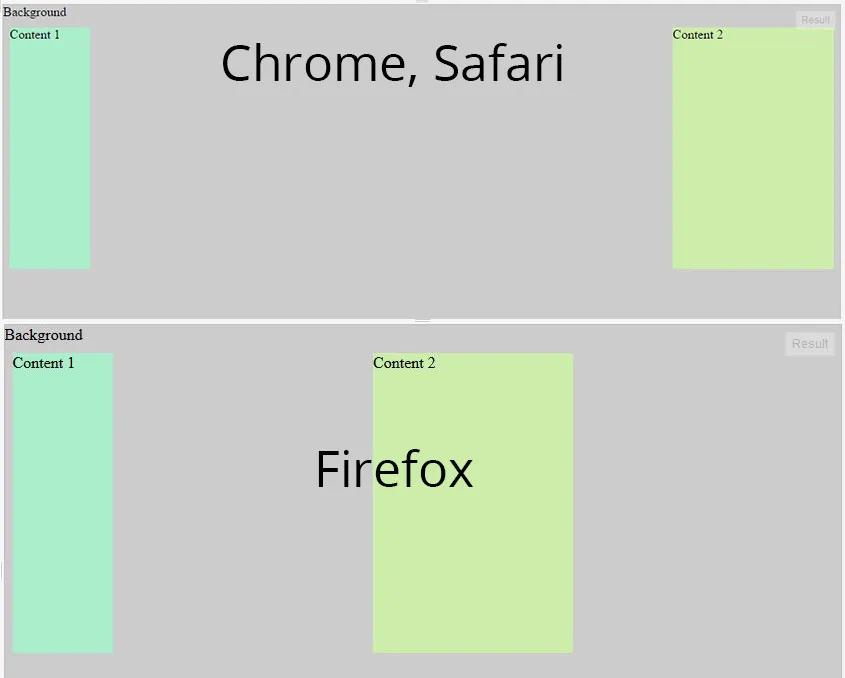
我们有两个带内容的div和一个绝对定位的背景div。
容器是一个flexbox。
在Chrome和Safari中都正常工作,但是Firefox和IE11会考虑到绝对定位的div,并像有3个div在一行中一样分配空间。

enter image description here

我已经创建了一个jsfiddle示例。是否有任何方法可以修复这个bug? https://jsfiddle.net/s18do03e/2/

div.container {
  display: flex;
  flex-direction: row;
  width: 100%;
  height: 300px;
  justify-content: space-between;
  width: 100%;
  outline: 1px solid;
}
div.c1 {
  background: #aaeecc;
  width: 100px;
  position: relative;
  z-index: 50;
  top: 20px;
  display: flex;
}
div.c2 {
  background: #cceeaa;
  width: 200px;
  position: relative;
  z-index: 50;
  top: 20px;
  display: flex;
}
div.bg {
  background: #ccc;
  width: 100%;
  height: 100%;
  z-index: 0;
  left: 0px;
  top: 0px;
  position: absolute;
  display: flex;
}
<div class="container">
  <div class="c1">Content 1</div>
  <div class="c2">Content 2</div>
  <div class="bg">Background</div>
</div>


2019年12月的现状是:在flex容器内进行绝对定位。链接为https://codepen.io/ekadagami/pen/mdyPybq - Denis Giffeler
4个回答

37

更新:这个问题已经在Firefox中得到解决(从v52开始,于2017年3月发布)。IE11仍存在此问题。


正如您在问题中所写:

Firefox计算绝对定位的div,并像行中有3个div一样在div之间分配空间。

Firefox认为第三个div(.bg)是一个流内的flex项目,并将其纳入到其space-between的计算中。(IE11也是如此;Chrome和Edge则忽略它。)

显然,这不符合当前的flexbox规范:

4.1. Absolutely-Positioned Flex Children

由于它是没有流动性的,flex容器的绝对定位子项不参与flex布局。

以下是一些解决方法:

为什么不将绝对定位的div移动到其他两个之间?

而不是这样:

<div class="container">
    <div class="c1">Content 1</div>
    <div class="c2">Content 2</div>
    <div class="bg">Background</div>
</div>

尝试这个:

<div class="container">
    <div class="c1">Content 1</div>
    <div class="bg">Background</div>
    <div class="c2">Content 2</div>
</div>

div.container {
  display: flex;
  flex-direction: row;
  width: 100%;
  height: 300px;
  justify-content: space-between;
  width: 100%;
  outline: 1px solid;
}
div.c1 {
  background: #aaeecc;
  width: 100px;
  position: relative;
  z-index: 50;
  top: 20px;
  display: flex;
}
div.c2 {
  background: #cceeaa;
  width: 200px;
  position: relative;
  z-index: 50;
  top: 20px;
  display: flex;
}
div.bg {
  background: #ccc;
  width: 100%;
  height: 100%;
  z-index: 0;
  left: 0px;
  top: 0px;
  position: absolute;
  display: flex;
}
<div class="container">
  <div class="c1">Content 1</div>
  <div class="bg">Background</div>
  <div class="c2">Content 2</div>
</div>

或者...从flex容器中删除.bg

<div class="container">
    <div class="c1">Content 1</div>
    <div class="c2">Content 2</div>
</div>
<div class="bg">Background</div>

div.container {
  display: flex;
  flex-direction: row;
  width: 100%;
  height: 300px;
  justify-content: space-between;
  width: 100%;
  outline: 1px solid;
}
div.c1 {
  background: #aaeecc;
  width: 100px;
  position: relative;
  z-index: 50;
  top: 20px;
  display: flex;
}
div.c2 {
  background: #cceeaa;
  width: 200px;
  position: relative;
  z-index: 50;
  top: 20px;
  display: flex;
}
div.bg {
  background: #ccc;
  width: 100%;
  height: 100%;
  z-index: 0;
  left: 0px;
  top: 0px;
  position: absolute;
  display: flex;
}
<div class="container">
  <div class="c1">Content 1</div>
  <div class="c2">Content 2</div>
</div>
<div class="bg">Background</div>

或者使用弹性布局的order属性来重新排列弹性项目。

将以下代码添加到您的代码中:

.c2 { order: 1; }

div.container {
  display: flex;
  flex-direction: row;
  width: 100%;
  height: 300px;
  justify-content: space-between;
  width: 100%;
  outline: 1px solid;
}
div.c1 {
  background: #aaeecc;
  width: 100px;
  position: relative;
  z-index: 50;
  top: 20px;
  display: flex;
}
div.c2 {
  background: #cceeaa;
  width: 200px;
  position: relative;
  z-index: 50;
  top: 20px;
  display: flex;
  order: 1;
}
div.bg {
  background: #ccc;
  width: 100%;
  height: 100%;
  z-index: 0;
  left: 0px;
  top: 0px;
  position: absolute;
  display: flex;
}
<div class="container">
  <div class="c1">Content 1</div>
  <div class="c2">Content 2</div>
  <div class="bg">Background</div>
</div>


4
这是一个非常详尽的回答。完全正确,伙计。 - Jhecht
1
请注意,Firefox(和IE)具有此行为,因为它是flexbox规范的早期版本所要求的 - 关于绝对定位的flex子元素的规范文本随着时间的推移而发生了很大变化。好消息是,当前的规范行为将在Firefox 52中发布[(https://bugzilla.mozilla.org/show_bug.cgi?id=1269046)]!(预计于2017年3月7日发布) - dholbert
2
做得好,这是最佳答案。我建议在其他建议之前使用“order”属性,因为这实际上是一个CSS问题,将背景div放在最后的源顺序更好,并且从容器中删除它可能不可行。 - Blorf
它将源代码中第二个元素.c2移动到第三个位置(更多信息)。@DrazenBjelovuk - Michael Benjamin
这只适用于3个元素吗?我正在尝试在类似的5个元素场景中复制修复,但即使将它们全部移动到中心位置,它仍然似乎占用IE中的空间。 - Drazen Bjelovuk
显示剩余4条评论

16

这是因为 justify-content: space-between; 会将项目均匀分布,第一个项目在开头,最后一个项目在结尾。所以只需将 <div class="bg">背景</div> 放置在 <div class="c1">内容1</div><div class="c2">内容2</div> 之间,就像这样

<div class="container">
    <div class="c1">Content 1</div>
    <div class="bg">Background</div>
    <div class="c2">Content 2</div>

</div>

您可以在https://developer.mozilla.org/en-US/docs/Web/CSS/justify-content上查看原因。


6
有时候无法重新排列元素,比如使用 ::before::after 时。这种情况下,你可以手动使用 order 属性来排序元素。
在你的情况下,你需要这样做:
.c1 {
  order: -1;
}
.c2 {
  order: 10;
}
order属性是flex规范的一部分,可以让你重新排列弹性项(在MDN上的参考)。它非常方便,可用于多种目的,包括此目的。
我使用了-1,因为该值是序数,因此将其设置为负数可以确保它位于所有其他默认值之前,而您无需指定::before的值。出于同样的原因,使用10可以确保第二个div出现在最后,即使您向容器添加了大量元素。您可以将其增加到100或其他任何值。
尽管如此,Firefox的行为似乎令人感到困惑。position:absolute通常会从常规dom流中删除元素,我希望该元素也能从flex流中删除,就像在Safari和Chrome中一样。我不确定规范是否澄清了这一点。

1
作为替代方案,您可以在内容选择器中使用flex属性:
    div.c1 {
      background: #aaeecc;
      width: 100px;
      position: relative;
      z-index: 50; top: 20px;
      display: flex;

      flex: 1; /* add this */
    }

这将设置 flex-grow 属性。也许这不完全符合您的需求,但或许能帮助那些无法重新排序内容 div 或将其从 flex 包装器中移除的人。
以下是演示: https://jsfiddle.net/s18do03e/14/

网页内容由stack overflow 提供, 点击上面的
可以查看英文原文,
原文链接