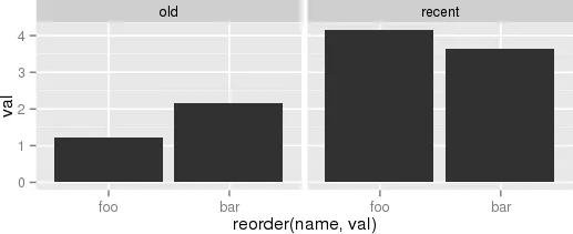
“有几种不同的方法可以实现 OP 的目标,详见
this answer。
(1) 使用
reorder_within() 函数在
period 分面内重新排序
name。”
library(tidyverse)
library(forcats)

df <- data.frame(
  name = c("foo", "bar", "foo", "bar"),
  period = c("old", "old", "recent", "recent"),
  val = c(1.23, 2.17, 4.15, 3.65)
)

reorder_within <- function(x, by, within, fun = mean, sep = "___", ...) {
  new_x <- paste(x, within, sep = sep)
  stats::reorder(new_x, by, FUN = fun)
}

scale_x_reordered <- function(..., sep = "___") {
  reg <- paste0(sep, ".+$")
  ggplot2::scale_x_discrete(labels = function(x) gsub(reg, "", x), ...)
}

ggplot(df, aes(reorder_within(name, val, period), val)) +
  geom_col() +
  scale_x_reordered() +
  facet_grid(period ~ ., scales = "free", space = "free") +
  coord_flip() +
  theme_minimal() +
  theme(panel.grid.major.y = element_blank())

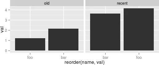
或者(2)类似的想法。
df %>%
mutate(name = reorder(name, val)) %>%
group_by(period, name) %>%
arrange(desc(val)) %>%
ungroup() %>%
mutate(name = factor(paste(name, period, sep = "__"),
levels = rev(paste(name, period, sep = "__")))) %>%
ggplot(aes(name, val)) +
geom_col() +
facet_grid(period ~., scales = "free", space = 'free') +
scale_x_discrete(labels = function(x) gsub("__.+$", "", x)) +
coord_flip() +
theme_minimal() +
theme(panel.grid.major.y = element_blank()) +
theme(axis.ticks.y = element_blank())

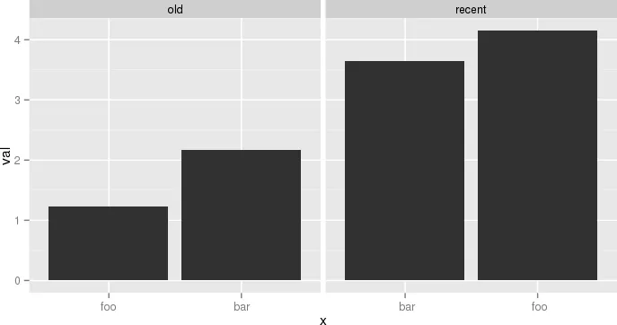
或者(3)对整个数据框进行排序,并且对每个分面组内的类别(`period`)进行排序!
df2 <- df %>%
ungroup() %>%
arrange(period, val) %>%
mutate(order = row_number())
df2
ggplot(df2, aes(order, val)) +
geom_col() +
facet_grid(period ~ ., scales = "free", space = "free") +
coord_flip() +
theme_minimal() +
theme(panel.grid.major.y = element_blank())

ggplot(df2, aes(order, val)) +
geom_col() +
scale_x_continuous(
breaks = df2$order,
labels = df2$name) +
facet_grid(period ~ ., scales = "free", space = "free") +
coord_flip() +
theme_minimal() +
theme(panel.grid.major.y = element_blank()) +
theme(legend.position = "bottom",
axis.ticks.y = element_blank())

2018年11月05日创建,使用reprex包(v0.2.1.9000)
 另一个例子,虽然有点傻但更接近于我的实际用例,是:
 闭上眼睛,想象帝国,并尽情享受。
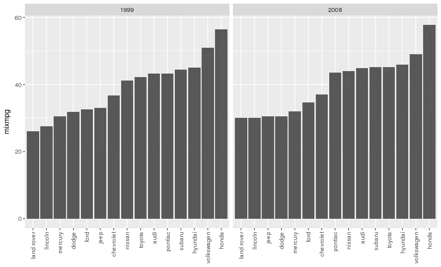
gridExtra包中的grid.arrange。但我同意这通常不会得到一个非常好的图形。(在ggplot中你会发现很多这样的情况;如果某些事情真的很难做,那可能是因为它试图阻止你做一些愚蠢的事情。并非总是如此,但大多数情况下是这样的...) - jorangrid.arrange。但是大多数人只是假设 faceting = 排列多个通常相似的图形。 - joran