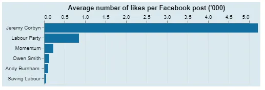
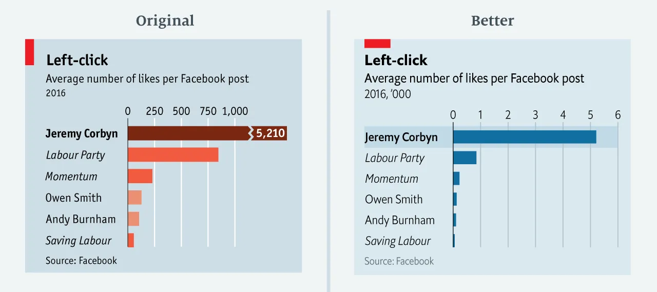
我非常喜欢Altair在Python中制作图表。为了致敬,我想重新生成《经济学人》的图表(如"Mistakes, we’ve drawn a few"所示):
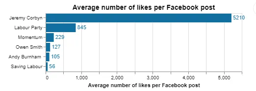
 这是第一次尝试的代码:
更新(1)和(4)的答案来自jakevdp和aberna:
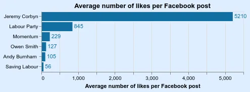
这是第一次尝试的代码:import numpy as np
import pandas as pd
import altair as alt
df = pd.read_csv('http://infographics.economist.com/databank/Economist_corbyn.csv').dropna()
bars = alt.Chart(df, title="Average number of likes per Facebook post").mark_bar().
encode(
y=alt.Y('Page:O', axis=alt.Axis(title=''),
sort=alt.EncodingSortField(
field="Average number of likes per Facebook post 2016:Q", # The field to use for the sort
op="sum", # The operation to run on the field prior to sorting
order="ascending" # The order to sort in
)),
color=alt.value("#116EA1"),
x=alt.X("Average number of likes per Facebook post 2016:Q",
axis=alt.Axis(title='Average number of likes per Facebook post')),
)
text = bars.mark_text(
align='left',
baseline='middle',
dx=3, # Nudges text to right so it doesn't appear on top of the bar,
).encode(
text='Average number of likes per Facebook post 2016:Q'
)
(bars+text).configure_title(fontSize=14)
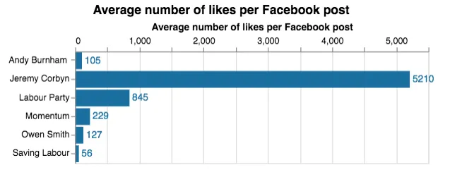
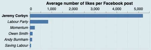
- 如何使用纯色 ##D9E9F0 填充背景?
- 如何使第一行突出显示(通过在粗体标签“Jeremy Corbyn”上添加框)?
- 我可以在左下角使用新版Altair文本图层功能添加浅灰色版权声明吗?如果可以,怎么做?
- 如何将x轴刻度放在图形顶部?
更新(1)和(4)的答案来自jakevdp和aberna:
df['x'] = df['Average number of likes per Facebook post 2016']/1000.0
bars = alt.Chart(
    df, title="Average number of likes per Facebook post ('000)"
).mark_bar().encode(
    y=alt.Y('Page:O', axis=alt.Axis(title=''),
           sort=alt.EncodingSortField(
            field="Average number of likes per Facebook post 2016:Q",  # The field to use for the sort
            op="sum",  # The operation to run on the field prior to sorting
            order="ascending"  # The order to sort in
        )),
    color=alt.value("#116EA1"),
    x=alt.X("x:Q",
            axis=alt.Axis(title='', orient="top"),
            scale=alt.Scale(round=True, domain=[0,5])),
)

bars.configure_title(fontSize=14).configure(background='#D9E9F0')