在R中使用图标作为x轴标签 - ggplot2

5

这是原问题(在R中将图标作为x轴标签)的扩展。它寻找了一个ggplot解决方案而不是plot解决方案。由于ggplot是基于gridplot是基于graphics,所以方法是非常不同的。

我想要绘制像这篇论文中的情况,其中使用图标作为刻度标签。

enter image description here

原问题的被接受答案为:

library(igraph)    
npoints <- 15
y <- rexp(npoints)
x <- seq(npoints)

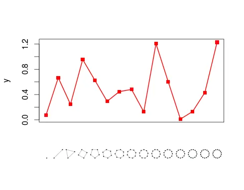
# reserve some extra space on bottom margin (outer margin)
par(oma=c(3,0,0,0))
plot(y, xlab=NA, xaxt='n',  pch=15, cex=2, col="red")
lines(y, col='red', lwd=2)

# graph numbers 
x = 1:npoints   

# add offset to first graph for centering
x[1] = x[1] + 0.4
x1 = grconvertX(x=x-0.4, from = 'user', to = 'ndc')
x2 = grconvertX(x=x+0.4, from = 'user', to = 'ndc')

for(i in x){  

  print(paste(i, x1[i], x2[i], sep='; '))

  # remove plot margins (mar) around igraphs, so they appear bigger and 
  # `figure margins too large' error is avoided
  par(fig=c(x1[i],x2[i],0,0.2), new=TRUE, mar=c(0,0,0,0))
  plot(graph.ring(i), vertex.label=NA)  
}

enter image description here

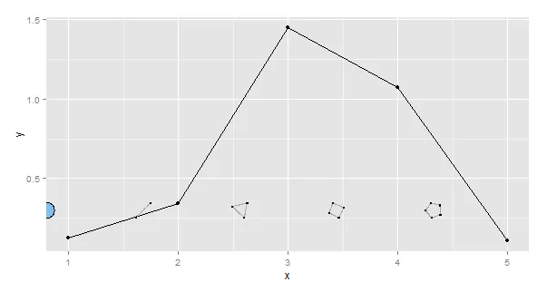
我们如何使用ggplot制作类似的图表呢?

这是我得到的最接近的结果:

library(ggplot2)
library(grImport)
library(igraph)

npoints <- 5
y <- rexp(npoints)
x <- seq(npoints)

pics  <- vector(mode="list", length=npoints)
for(i in 1:npoints){
  fileps <- paste0("motif",i,".ps")
  filexml <- paste0("motif",i,".xml")

  # Postscript file
  postscript(file = fileps, fonts=c("serif", "Palatino"))
  plot(graph.ring(i), vertex.label.family="serif", edge.label.family="Palatino")
  dev.off()

  # Convert to xml accessible for symbolsGrob
  PostScriptTrace(fileps, filexml)
  pics[i] <- readPicture(filexml)
}
xpos <- -0.20+x/npoints
my_g <- do.call("grobTree", Map(symbolsGrob, pics, x=xpos, y=0))
qplot(x, y, geom = c("line", "point")) + annotation_custom(my_g, xmin=-Inf, xmax=Inf, ymax=0.4, ymin=0.3)

enter image description here


2
完全不是!这个需要一个ggplot的解决方案。 - alberto
3
三:a)利用ggplot的功能(易用性、功能等)在不久的将来进一步改进图形。(b) 我在代码的其他部分(同质性)中使用ggplot。(c) 为了好玩和满足好奇心。 - alberto
1
这是你要找的吗?https://dev59.com/02ox5IYBdhLWcg3w5IRv - hrbrmstr
1
@hrbrmstr 注意,使用opts(axis.text.x = my_axis())已被弃用。 - alberto
1
@hrbrmstr,你提供的解决方案对于最新版本的
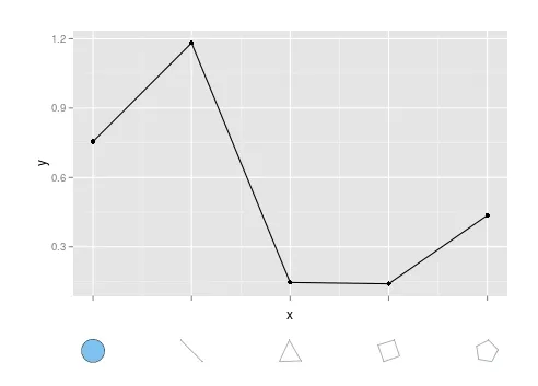
ggplot2根本不起作用。 - alberto
显示剩余6条评论
1个回答

3

这增强了您的尝试。

(在rexp函数之前我使用了set.seed(1),并且还调整了图形以增加边缘粗度:plot(graph.ring(i), vertex.label=NA, edge.width=30))

继续上面的内容:

# Initial plot
p <- qplot(x, y, geom = c("line", "point")) 

# Use the plot to get the x-positions of the labels
g <- ggplotGrob(p)    
xpos <- g$grobs[[grep("axis-b", g$layout$name)]]$children[[2]]$grobs[[2]]$x

# Create grob tree 
my_g <- do.call("grobTree", Map(symbolsGrob, pics, x=xpos, y=0.5))

# Make second plot
# Add extra space under the plot for the images 
# Remove x-axis details
# Note the annotation is below the lower y-axis limit
# The limits were selected by inspection
p2 <- p + annotation_custom(my_g, xmin=-Inf, xmax=Inf, ymax=-0.1, ymin=-0.2) + 
            theme(axis.text.x = element_blank(), 
                  plot.margin=unit(c(1,1,2,1), "cm"))

# remove clipping so the images render
g <- ggplotGrob(p2)
g$layout$clip[g$layout$name=="panel"] <- "off"

grid.newpage()
grid.draw(g)

enter image description here

有一种正确的方法/与之前可爱的解决方案相一致,但无论如何...


这段话涉及IT技术相关内容,需要进一步了解上下文才能提供更准确的翻译。

使用ggplot2 3.0.0版本,现在可以通过my_plot + coord_cartesian(clip = 'off')来禁用裁剪,这比网格解决方案(即g$layout$clip[g$layout$name=="panel"] <- "off")更简单。 - bschneidr
@bschneidr;请随意更新答案,如果有更好的方法或粗略路径已经损坏等。 - user20650

网页内容由stack overflow 提供, 点击上面的
可以查看英文原文,
原文链接