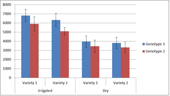
我正在尝试创建两个子组的图表,就像下面的图片一样(ggplot2 multiple sub groups of a bar chart)。但是,我想要为一组图表进行此操作。
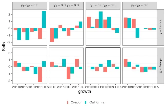
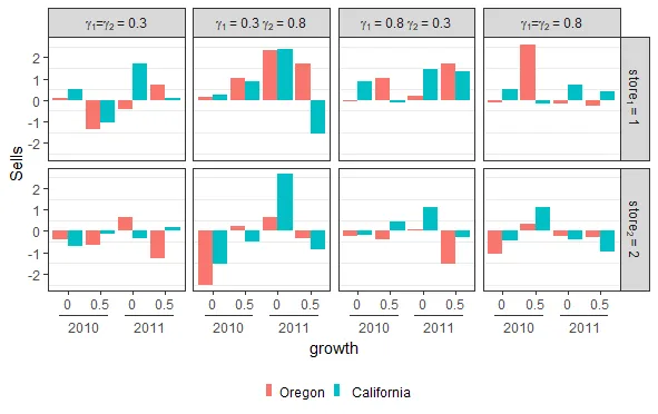
我在编码中遇到了麻烦,想让我的变量“year”像“Irrigated / Dry”一样,变量“growth”像“Variety1 / Variety2”一样。目前,图表的显示如下:
这是我的代码:
library(ggplot2)

#Creates the data

d <- expand.grid(c(.3, .8), c(.3, 0.8), c(0, 0.5), c(1, 2), c("Oregon"," California"), c("2010","2011"))
colnames(d) <- c("gamma1", "gamma2", "growth",  "store", "state", "year")
d$sells <- rnorm(64)

d$gamma_plot <- as.factor(paste(d$gamma1, d$gamma2, sep = "_"))
d$store <- as.factor(d$store)

d$growth <- factor(d$growth)
d$gamma_plot = factor(d$gamma_plot,
                              labels=c(expression(paste(gamma[1],"=", gamma[2]," = 0.3")),
                                       expression(paste(gamma[1], " = 0.3 ", gamma[2], " = 0.8")),
                                       expression(paste(gamma[1], " = 0.8 ", gamma[2], " = 0.3")),
                                       expression(paste(gamma[1],"=", gamma[2]," = 0.8"))
                              )
)

d$store = factor(d$store,
                          labels = c(expression(paste(store[1], " = 1")),
                                     expression(paste(store[2], " = 2"))
                          )
)

#Creates the plot
p = ggplot(data=d, aes(x=interaction(year, growth), y=sells, fill=state)) +
  geom_col(position="dodge") +
  theme_bw() +
  facet_grid(store ~ gamma_plot, labeller = label_parsed) +
  theme(legend.title = element_blank(), legend.position="bottom",
        panel.grid.major = element_blank(),
        legend.key.size = unit(0.10, "cm"),
        legend.key.width = unit(0.15,"cm")) +
  guides(fill = guide_legend(nrow = 1)) +
  labs(x=expression(growth), y = "Sells")
编辑:
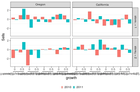
对于我的问题所给出的两个解决方案非常好,我非常感谢。 我已经决定稍微修改一下情节,让gamma_plot和growth之间有交互。我无法让R理解gamma_plot是一个表达式。有什么想法吗?
#Creates the plot using teunbrand's code :)

ggplot(data=d, aes(x=interaction(growth, gamma_plot, sep = "&"), y=sells, fill=year)) +
  geom_col(position="dodge") +
  theme_bw() +
  facet_grid(store ~ state, labeller = label_parsed) +
  theme(legend.title = element_blank(), legend.position="bottom",
        panel.grid.major = element_blank(),
        legend.key.size = unit(0.10, "cm"),
        legend.key.width = unit(0.15,"cm"),
        axis.text.x = element_text(margin = margin(2,2,2,2))) +
  scale_x_discrete(guide = guide_axis_nested(delim = "&")) +
  guides(fill = guide_legend(nrow = 1)) +
  labs(x=expression(growth), y = "Sells")

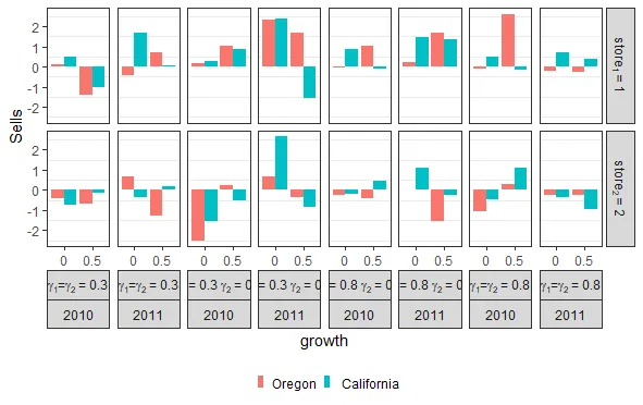
data_plot? - Peter