如何使用 gcf() 或 gca() 自定义 matplotlib 绘图?

6

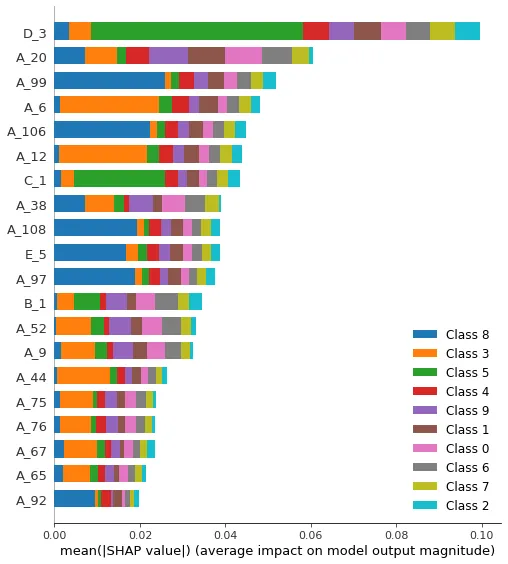
我正在使用一个名为 shap 的包,其中有一个集成的绘图函数。 但是我想调整一些东西,比如标签、图例、颜色、大小等。

显然由于开发人员,可以通过使用 plt.gcf() 实现

我像这样调用绘图,这将给出一个图形对象,但我不知道该如何使用它:

fig = shap.summary_plot(shap_values_DT, data_train,color=plt.get_cmap("tab10"), show=False)
ax = plt.subplot()

图片描述在这里输入

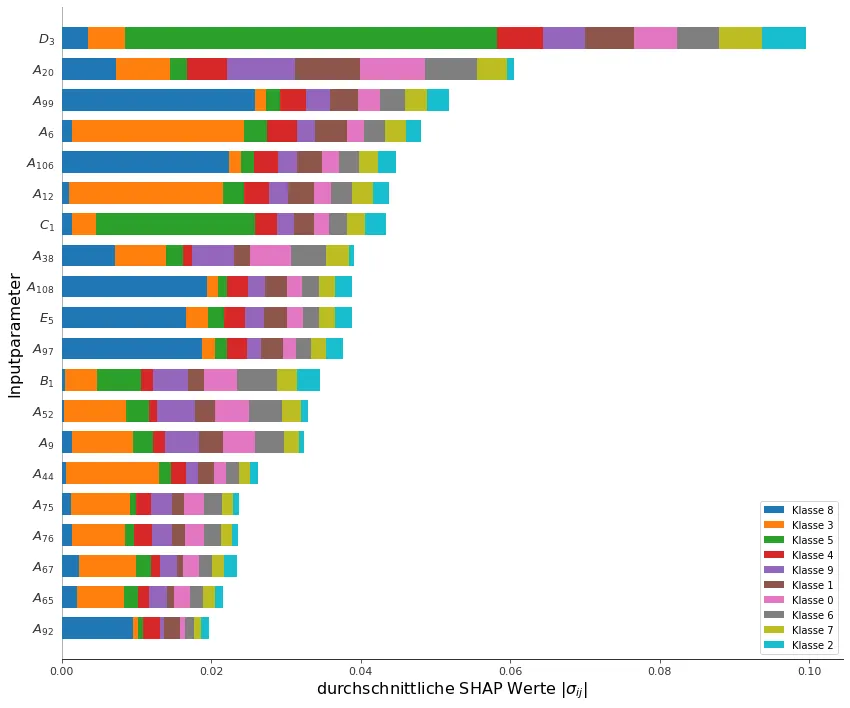
更新/解决方案 最终,我通过以下方式将所有内容调整为所需状态:

shap.summary_plot(shap_values_DT, data_train, color=plt.get_cmap("tab10"), show=False)
fig = plt.gcf()
fig.set_figheight(12)
fig.set_figwidth(14)
ax = plt.gca()
ax.set_xlabel(r'durchschnittliche SHAP Werte $\vert\sigma_{ij}\vert$', fontsize=16)
ax.set_ylabel('Inputparameter', fontsize=16)
ylabels = string_latexer([tick.get_text() for tick in ax.get_yticklabels()])
ax.set_yticklabels(ylabels)
leg = ax.legend()
for l in leg.get_texts(): l.set_text(l.get_text().replace('Class', 'Klasse'))
plt.show()

enter image description here


1
它是ax=plt.gca() - ImportanceOfBeingErnest
@ImportanceOfBeingErnest 谢谢,有了这个我得到了大部分的工作,最后一块缺失的是图例颜色,如果我改变图例标签,它会偏移1个颜色..你有什么想法是什么原因导致这个问题? - Quastiat
不好意思,从您展示的图片中我没有看到任何移位,所以我可能不明白存在什么问题。 - ImportanceOfBeingErnest
@ImportanceOfBeingErnest,问题已经解决了,不过还是谢谢! - Quastiat
2个回答

10

最终,我通过以下步骤将所有内容调整为我想要的:

shap.summary_plot(shap_values_DT, data_train, color=plt.get_cmap("tab10"), show=False)
fig = plt.gcf()
fig.set_figheight(12)
fig.set_figwidth(14)
ax = plt.gca()
ax.set_xlabel(r'durchschnittliche SHAP Werte $\vert\sigma_{ij}\vert$', fontsize=16)
ax.set_ylabel('Inputparameter', fontsize=16)
ylabels = string_latexer([tick.get_text() for tick in ax.get_yticklabels()])
ax.set_yticklabels(ylabels)
leg = ax.legend()
for l in leg.get_texts(): l.set_text(l.get_text().replace('Class', 'Klasse'))
plt.show()

enter image description here


1

我还没有使用过shap,但也许你可以按照以下方式进行修改:

shap.summary_plot(shap_values_DT, data_train,color=plt.get_cmap("tab10"), show=False)
plt.title('my custom title')
plt.savefig('test.png')

更新 根据官方文档,我读到:
import xgboost
import shap

# load JS visualization code to notebook
shap.initjs()

# train XGBoost model
X,y = shap.datasets.boston()
model = xgboost.train({"learning_rate": 0.01}, xgboost.DMatrix(X, label=y), 100)

# explain the model's predictions using SHAP values
# (same syntax works for LightGBM, CatBoost, and scikit-learn models)
explainer = shap.TreeExplainer(model)
shap_values = explainer.shap_values(X)

# visualize the first prediction's explanation (use matplotlib=True to avoid Javascript)
shap.force_plot(explainer.expected_value, shap_values[0,:], X.iloc[0,:])

我快速尝试了这个示例,如果你添加matplotlib=True选项,它似乎可以工作。然而,并非所有功能都支持它...


感谢您的输入,我已经让一些东西工作了,但是我最关心的是summary_plot()函数,它没有matplotlib=True选项。我将在问题中添加一些关于我的进展和剩下要做的事情的细节。 - Quastiat

网页内容由stack overflow 提供, 点击上面的
可以查看英文原文,
原文链接