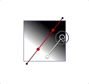
我正在尝试在Sketch中重新创建渐变工具。Sketch中的该工具使用两个带有不同颜色的点来定义渐变:
我希望输出结果是一个CSS线性渐变值。CSS线性渐变的构建方式为一个角度和x个彩色停止位置,每个停止位置包括一个颜色和一个百分比值: https://developer.mozilla.org/en-US/docs/Web/CSS/linear-gradient
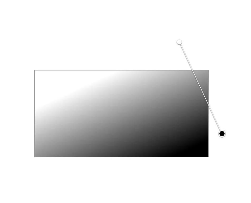
因此,我想将相对于应呈现渐变的矩形的两个点转换为CSS格式(带有正确百分比的两个参数)。
有什么想法可以解决这个问题吗?
我正在尝试在Sketch中重新创建渐变工具。Sketch中的该工具使用两个带有不同颜色的点来定义渐变:
我希望输出结果是一个CSS线性渐变值。CSS线性渐变的构建方式为一个角度和x个彩色停止位置,每个停止位置包括一个颜色和一个百分比值: https://developer.mozilla.org/en-US/docs/Web/CSS/linear-gradient
因此,我想将相对于应呈现渐变的矩形的两个点转换为CSS格式(带有正确百分比的两个参数)。
有什么想法可以解决这个问题吗?
没有通用的公式,但是您需要进行一些操作/计算,以找到梯度的程度以及渐变的background-size/background-position。
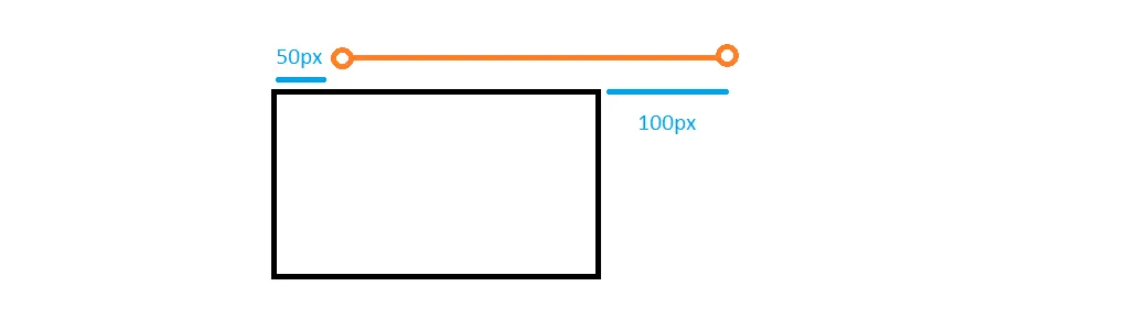
让我们从一个简单的例子开始:
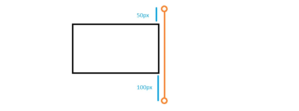
这里我们有一个渐变,角度为180度(或0度)。起点在顶部的50px处,终点在底部的100px处。考虑到这一点,我们会得到以下渐变:
.box {
  width: 200px;
  height: 100px;
  border: 1px solid;
  margin: 20px;
  background-image: linear-gradient(180deg, white, black);
  background-size: 100% calc(100% + 50px + 100px);
  background-position: 0 -50px;
  background-repeat: no-repeat;
}<div class="box"></div>100%+ 150px,我们将有一个偏移量为-50px的位置。我们还可以考虑100px的偏移量,它将是100%+ 100px:
.box {
  width:200px;
  height:100px;
  border:1px solid;
  margin:20px;
  background-image:linear-gradient(180deg,white,black);
  background-size:100% calc(100% + 50px + 100px);
  background-position:0 calc(100% + 100px);
  background-repeat:no-repeat;
}<div class="box">
</div>这是另一个例子:
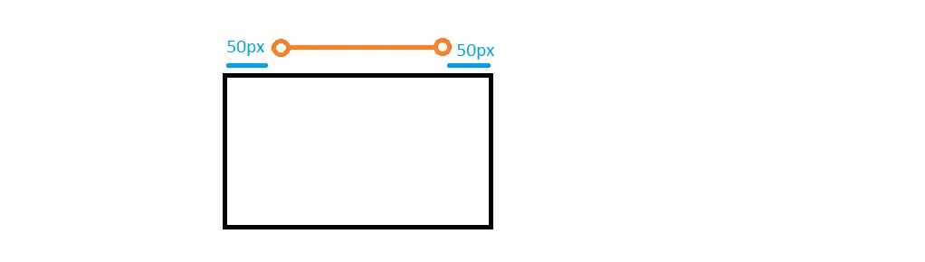
.box {
  width: 200px;
  height: 100px;
  border: 1px solid;
  margin: 20px;
  background-image: linear-gradient(90deg, white 50px, black calc(100% - 50px));
}<div class="box"></div>这里是一个混合体,我们有一个外部点和一个内部点:
.box {
  width: 200px;
  height: 100px;
  border: 1px solid;
  margin: 20px;
  background-image: linear-gradient(90deg, white 50px, black);
  background-size: calc(100% + 100px) 100%;
  background-position: 0 0;
  background-repeat: no-repeat;
}<div class="box"></div>正方向的情况相对来说比较容易。我们只需找到梯度的大小、位置和渐变内颜色的停止点即可。
当涉及到其他角度值时,就会更加棘手。
这里是一个示例的插图:
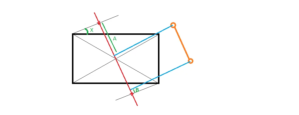
background-image:linear-gradient(Xdeg,white Apx,black calc(100% - Bpx));
background-size的两个方向,这也有些棘手。
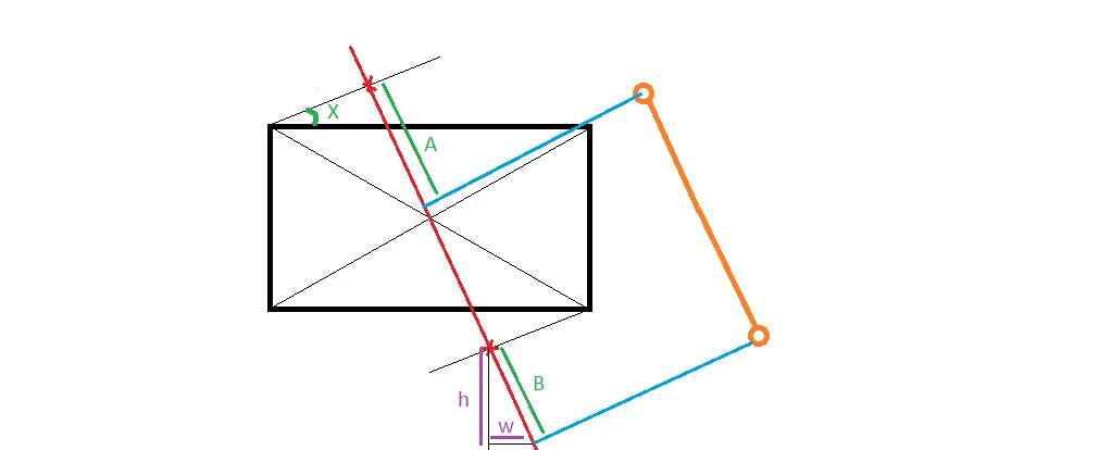
正如您所看到的,我们有一个点在梯度点之外,由距离B定义。我们建立了一个直角三角形来找到如何增加background-size。
我们的渐变将如下所示:
background-image:linear-gradient(Xdeg,white Apx,black);
background-size:calc(100% + w) calc(100% + h);
background-position:0 0;
更新
如果您不想使用background-size/background-position,另一种方法是将渐变转换为使用内部点。当然,只有在点位于外部且想要找到最接近的内部点以获得相同的渐变效果时,此方法才有用。
让我们重新看一下第一个例子。在该示例中,我们在顶部的50px处有第一个点,逻辑上最接近的内部点是0px处的点(与其他点的逻辑相同)。因此,我们只需要找到新点的颜色并使用它们即可。
.box {
  width: 200px;
  height: 100px;
  border: 1px solid;
  margin: 20px;
}

.old {
  background-image: linear-gradient(180deg, white, black);
  background-size: 100% calc(100% + 50px + 100px);
  background-position: 0 -50px;
  background-repeat: no-repeat;
}
.new {
  background-image:linear-gradient(180deg,rgb(203, 203, 203),rgba(103, 103, 103));
}<div class="box old"></div>
<div class="box new"></div>250px,白色 (255,255,255) 和黑色 (0,0,0) 之间有 255 个值 (几乎是 250),所以我们从中减去了 50 来找到第一种颜色,并添加了 100 来找到最后一种颜色。128,0,128) 和橙色 (255,165,0),渐变的大小是 250px,所以第一个偏移量 (50px) 是大小的20%,第二个偏移量 (100px) 是大小的40%。我们使用这些百分比来找到新的颜色。
对于红色,我们有128和255,因此差值为127,其中的20%为25.4(40%为50.4),因此第一个点将具有153.4(128 + 25.4),而最后一个点将具有204.2(255-50.4)。我们对绿色和蓝色做同样的计算,然后得到以下渐变:
.box {
  width: 200px;
  height: 100px;
  border: 1px solid;
  margin: 20px;
}

.old {
  background-image: linear-gradient(180deg, purple, orange);
  background-size: 100% calc(100% + 50px + 100px);
  background-position: 0 -50px;
  background-repeat: no-repeat;
}
.new {
  background-image:linear-gradient(180deg,rgb(153, 33, 102),rgba(204, 99, 51));
}<div class="box old"></div>
<div class="box new"></div>ax = ((p1.x - gradientLine.point1.x) * (gradientLine.length / 2)) / (gradientLine.point2.x - gradientLine.point1.x);
ay = ((p1.y - gradientLine.point1.y) * (gradientLine.length / 2)) / (gradientLine.point2.y - gradientLine.point1.y);
percentValue = (((ax + ay) / line.length) * 100);
ax = ((p2.x - gradientLine.point2.x) * (gradientLine.length / 2)) / (gradientLine.point1.x - gradientLine.point2.x);
ay = ((p2.y - gradientLine.point2.y) * (gradientLine.length / 2)) / (gradientLine.point1.y - gradientLine.point2.y);
percentValue = 100 - ((((ax + ay) / gradientLine.length) * 100));
background: linear-gradient([angle]deg, black [percentValue1]%, white [percentValue2]%)