根据变量中出现频率最高的前N个值,对数据框进行子集筛选。

5

我的目标是创建一个简单的密度图或者柱状图,展示课程(MOOC)中各国籍相对频率的长格式数据框。我只想显示前10个国籍,不希望显示所有国籍。下面是我创建的示例数据框和我用于绘图的ggplot2代码。

d=data.frame(course=sample(LETTERS[1:5], 500,replace=T),nationality=as.factor(sample(1:172,500,replace=T)))
mm <- ggplot(d, aes(x=nationality, colour=factor(course)))
mm + geom_bar() + theme_classic()

...但是,如上所述:我想要一个基于频率的数据子集。上面显示了所有数据。

附带说明一下,我添加了ggplot2代码以提供上下文,也许ggplot2本身有一些能够实现这个目标的方法(但我怀疑)。

编辑 2014-12-11:当前的答案使用ddplyr或table方法来得到所需的子集,但我想知道是否有更直接的方法来实现同样的功能。暂时保留这个问题,看看是否有其他方法。


关于你的“PS”和“EDIT”:通常更容易使用你选择的数据处理工具_首先_准备数据框,_然后_调用ggplot这个问答,与你的情况类似,是许多例子之一。干杯。 - Henrik
3个回答

5

使用dplyr函数counttop_n获取前10个国籍。由于top_n考虑并列,因此此示例中包括的国籍数量超过了10个。对计数进行arrange,使用factorlevels按降序设置国籍。

# top-10 nationalities
d2 <- d %>%
  count(nationality) %>%
  top_n(10) %>%
  arrange(n, nationality) %>%
  mutate(nationality = factor(nationality, levels = unique(nationality)))

d %>%
  filter(nationality %in% d2$nationality) %>%
  mutate(nationality = factor(nationality, levels = levels(d2$nationality))) %>%
  ggplot(aes(x = nationality, fill = course)) +
    geom_bar()

enter image description here


非常感谢。就在今天下午,我正在研究 dplyr,但意识到我没有时间深入研究它。看起来语法很不错,以后会再去了解一下。 - Thieme Hennis

3

以下是选择前10个国籍的方法。请注意,有多个国籍具有相同的频率。因此,选择前10个结果会省略一些具有相同频率的国籍。

# calculate frequencies
tab <- table(d$nationality)
# sort
tab_s <- sort(tab)
# extract 10 most frequent nationalities
top10 <- tail(names(tab_s), 10)
# subset of data frame
d_s <- subset(d, nationality %in% top10)
# order factor levels
d_s$nationality <- factor(d_s$nationality, levels = rev(top10))

# plot
ggplot(d_s, aes(x = nationality, fill = as.factor(course))) +
  geom_bar() + 
  theme_classic()

请注意,我将colour更改为fill,因为colour会影响边框的颜色。

输入图像说明


这个问题对我来说更易懂,但你会如何对ggplot的结果进行排序? - Thieme Hennis

0

虽然这个问题已经提出了一段时间,但为了完整起见,我提出另外两个解决方案:

d_raw <- data.frame(
  course = sample(LETTERS[1:5], 500, replace = T),
  nationality = as.factor(sample(1:172, 500, replace=T))
)
  • 使用 forcats 包中的 fct_lump_n()filter()

     d1 <- d_raw %>% 
       mutate(nationality = fct_lump_n(
         f = nationality, 
         n = 10,
         ties.method = "first"
       )) %>% 
       filter(nationality != "Other")
    
     d1 %>% count(nationality, sort = TRUE)
    
     ggplot(d1, aes(x = nationality, fill = course)) + # 这里不需要使用 factor()
       geom_bar() + 
       theme_classic()
    

    fct_lump_n() 函数将除了前 10 个最常见的国籍以外的所有国籍归为类别 "Other"。请注意,在 fct_lump_n() 的参数中,需要使用 ties.method = "first" 才能确实只获取前十个国籍,而不是第 11 或 12 个国籍。即使其他国籍可能与前十个国籍同样频繁地出现,它们也都被标为 "Other"。
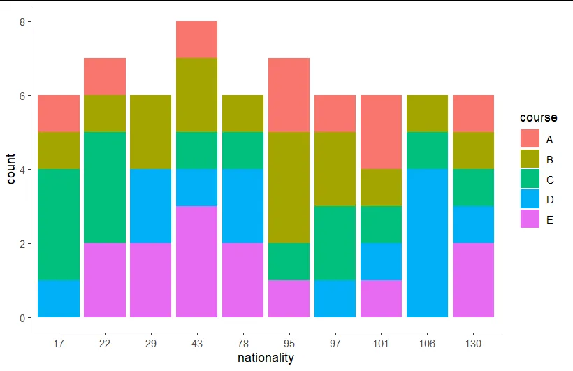
    国籍的级别仅按字母顺序排序。

    enter image description here

  • 另一种解决方案是使用 forcats 包中的 fct_infreq()cur_group_id()filter()

     d2 <- d_raw %>% 
       group_by(nationality = fct_infreq(nationality)) %>% 
       filter(cur_group_id() <= 10) %>% 
       ungroup()
    
     d2 %>% count(nationality, sort = TRUE)
    
     ggplot(d2, aes(x = nationality, fill = course)) + # 这里不需要使用 factor()
       geom_bar() + 
       theme_classic()
    

    cur_group_id() 函数为每个国籍分配一个组 ID。要从最常见的国籍开始,我们首先需要按其频率对列 nationality 进行排序。然后,我们筛选前十个组 ID 或者说最常见的国籍。

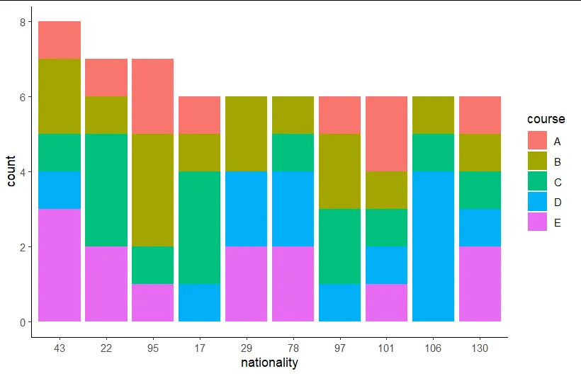
    国籍的级别首先按照 n 排序,然后按字母顺序排序。

  • 我使用 count() 来验证两个数据框 d1d2 是否相同。 这两种解决方案的优点是,我们不需要第二个(临时)数据框或临时向量。

    希望这能对未来的某个人有所帮助。


    网页内容由stack overflow 提供, 点击上面的
    可以查看英文原文,
    原文链接