我需要在ggplot中复制InDesign生成的图表以进行再现性。
在这个特定的例子中,我有两个图表被合并成一个复合图表(我使用了
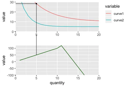
然后,我需要在一个图表上连接关键点的线条与底部图表上对应的点。
这两个图表是从相同的数据生成的,具有相同的x轴值,但具有不同的y轴值。
我在Stack Overflow上看到了这些示例,但这些示例处理跨越facet绘制线条,这在我尝试跨越单独的图表绘制线条时不起作用: 我尝试了几种方法,目前最接近的方法是:
期望的是,panel_B 中的图应该仍然像在 panel_A 中一样显示,但是连接线应该链接到图之间的点。
在这个特定的例子中,我有两个图表被合并成一个复合图表(我使用了
{patchwork}包)。然后,我需要在一个图表上连接关键点的线条与底部图表上对应的点。
这两个图表是从相同的数据生成的,具有相同的x轴值,但具有不同的y轴值。
我在Stack Overflow上看到了这些示例,但这些示例处理跨越facet绘制线条,这在我尝试跨越单独的图表绘制线条时不起作用: 我尝试了几种方法,目前最接近的方法是:
- 使用
{grid}包添加带有grobs的行 - 使用
{gtable}将第二个图形转换为gtable,并将面板的剪辑设置为关闭,以便我可以将线条向上延伸超出绘图的面板。 - 使用
{patchwork}再次将图形组合成单个图像。
问题出现在最后一步,因为在添加线条并将剪辑设置为关闭之前,x轴不再对齐(请参见代码示例)。
我还尝试了使用ggarrange, {cowplot}, {egg}和{patchwork}将图形组合起来,{patchwork}是最接近的。
以下是我尝试创建的最佳minimal reprex,但仍捕捉到我想要实现的细微差别。
library(ggplot2)
library(dplyr)
library(tidyr)
library(patchwork)
library(gtable)
library(grid)
# DATA
x <- 1:20
data <- data.frame(
quantity = x,
curve1 = 10 + 50*exp(-0.2 * x),
curve2 = 5 + 50*exp(-0.5 * x),
profit = c(seq(10, 100, by = 10),
seq(120, -240, by = -40))
)
data_long <- data %>%
gather(key = "variable", value = "value", -quantity)
# POINTS AND LINES
POINTS <- data.frame(
label = c("B", "C"),
quantity = c(5, 10),
value = c(28.39397, 16.76676),
profit = c(50, 100)
)
GROB <- linesGrob()
# Set maximum y-value to extend lines to outside of plot area
GROB_MAX <- 200
# BASE PLOTS
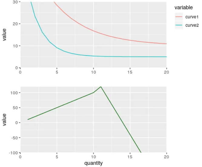
# Plot 1
p1 <- data_long %>%
filter(variable != "profit") %>%
ggplot(aes(x = quantity, y = value)) +
geom_line(aes(color = variable)) +
labs(x = "") +
coord_cartesian(xlim = c(0, 20), ylim = c(0, 30), expand = FALSE) +
theme(legend.justification = "top")
p1
# Plot 2
p2 <- data_long %>%
filter(variable == "profit") %>%
ggplot(aes(x = quantity, y = value)) +
geom_line(color = "darkgreen") +
coord_cartesian(xlim = c(0, 20), ylim = c(-100, 120), expand = FALSE) +
theme(legend.position = "none")
p2
# PANEL A
panel_A <- p1 + p2 + plot_layout(ncol = 1)
panel_A
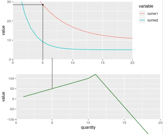
# PANEL B
# ATTEMPT - adding grobs to plot 1 that end at x-axis of p1
p1 <- p1 +
annotation_custom(GROB,
xmin = 0,
xmax = POINTS$quantity[POINTS$label == "B"],
ymin = POINTS$value[POINTS$label == "B"],
ymax = POINTS$value[POINTS$label == "B"]) +
annotation_custom(GROB,
xmin = POINTS$quantity[POINTS$label == "B"],
xmax = POINTS$quantity[POINTS$label == "B"],
ymin = 0,
ymax = POINTS$value[POINTS$label == "B"]) +
geom_point(data = POINTS %>% filter(label == "B"), size = 1)
# ATTEMPT - adding grobs to plot 2 that extend up to meet plot 1
p2 <- p2 + annotation_custom(GROB,
xmin = POINTS$quantity[POINTS$label == "B"],
xmax = POINTS$quantity[POINTS$label == "B"],
ymin = POINTS$profit[POINTS$label == "B"],
ymax = GROB_MAX)
# Create gtable from ggplot
g2 <- ggplotGrob(p2)
# Turn clip off for panel so that line can extend above
g2$layout$clip[g2$layout$name == "panel"] <- "off"
panel_B <- p1 + g2 + plot_layout(ncol = 1)
panel_B
# Problems:
# 1. Note the shift in axes when turning the clip off so now they do not line up anymore.
# 2. Turning the clip off mean plot 2 extends below the axis. Tried experimenting with various clips.
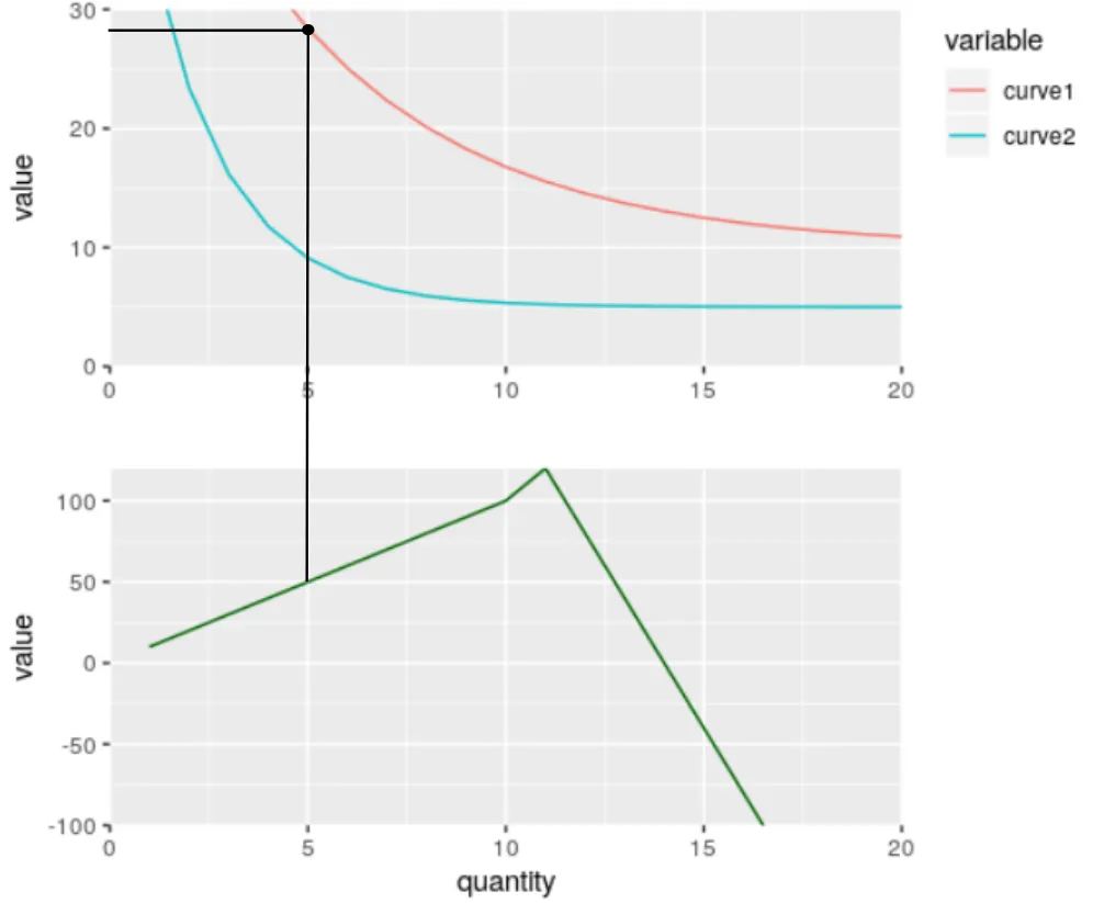
期望的是,panel_B 中的图应该仍然像在 panel_A 中一样显示,但是连接线应该链接到图之间的点。
我正在寻求解决上述问题的帮助,或者尝试其他替代方法。
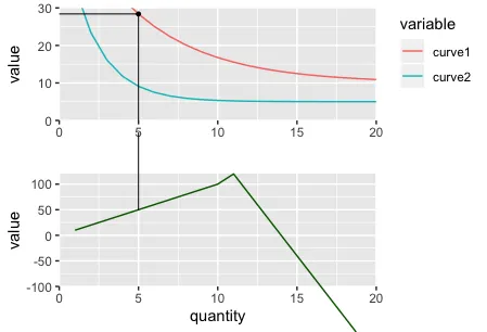
作为参考,不运行上面的代码 - 链接到图片,因为我不能发布它们。
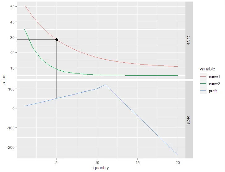
Panel A
面板B:当前的外观
面板B:我想要它看起来像什么!

GROB_MAX变量)。我认为,根据分辨率,y=200可能不足以达到顶部图形的“高度”。 - kikoralstongB$layout$clip[g2$layout$name == "panel"] <- "off"改成了gB$layout$clip[gB$layout$name == "panel"] <- "off"。 - kikoralston