我该如何使用CSS构建下面的内容?我想要一个钻石形状的图像,它始终跟随背景颜色。
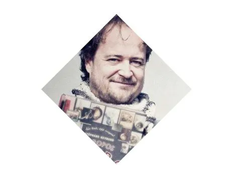
我想要补充Lloan的回答:如果你想让图片保持原来的方向,并简单地从中裁剪出一个菱形,则需要稍微不同的操作。
在下面的示例中,"square"是可见的菱形。Pic嵌套在其中,以便“square”可以正确地切掉所使用的图像的边缘。这样,我们就可以将“square”旋转为菱形,并将图像旋转回其原始方向。
body {
  /* To show the background color is no problem here */
  background-color: #efefef;
}

.square {
  width: 100px;
  height: 100px;
  margin: 25px;
  -ms-transform: rotate(-45deg);
  -webkit-transform: rotate(-45deg);
  transform: rotate(-45deg);
  overflow: hidden;
}
.pic {
  background: url(http://placekitten.com/g/150/150);
  width: 150px;
  height: 150px;
  margin: -25px;
  -ms-transform: rotate(45deg);
  -webkit-transform: rotate(45deg);
  transform: rotate(45deg);
}<div class="square">
<div class="pic">
</div>
</div>