如何对齐二维散点图并进行链接?

3

我偶尔会看到这样的图示,即在3D空间中将两个二维散点图叠加在一起,以便将对应点连接起来。通常它们采用网络形式,其中两个网络叠加在一起。例如:

enter image description here 
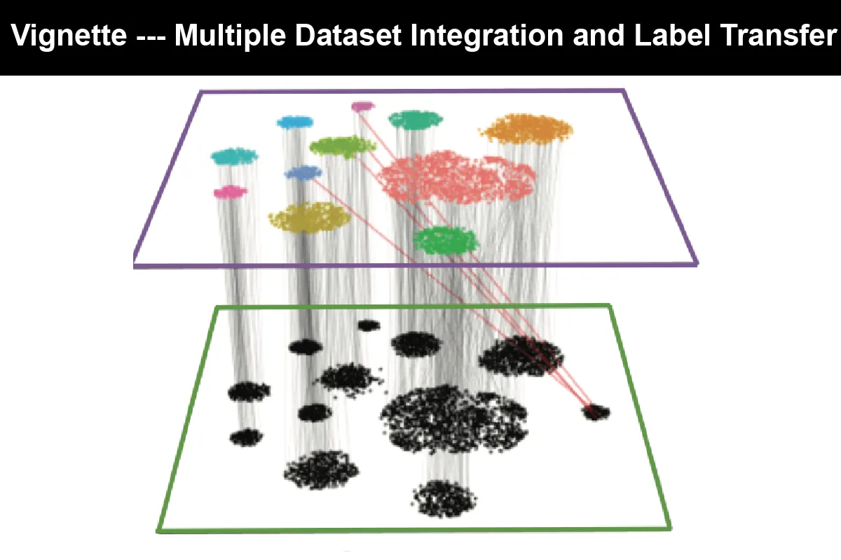
参考:https://satijalab.org/seurat/v3.0/pbmc3k_tutorial.html

在这里输入图片描述 参考资料: https://image.slidesharecdn.com/2007mauricioarango-end-to-endqosviaoverlaynetworksandbandwidthon-demand-091102230540-phpapp02/95/providing-endtoend-network-qos-via-overlay-networks-and-bandwidth-ondemand-mauricio-arango-2007-5-728.jpg?cb=1257203157

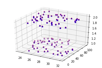
我知道,我可以任意地添加一个共同的第三维度到二维图中,以获得如此的绘图:

from mpl_toolkits.mplot3d import Axes3D
import matplotlib.pyplot as plt
import numpy as np

def randrange(n, vmin, vmax):
    return (vmax - vmin)*np.random.rand(n) + vmin

n = 100

fig = plt.figure()
ax = fig.add_subplot(111, projection='3d')

xs = randrange(n, 23, 32)
ys = randrange(n, 0, 100)
zs = np.append(np.repeat(1, 50), np.repeat(2, 50))

for c, m in [('r', 'o'), ('b', '^')]:
     ax.scatter(xs, ys, zs, c=c, marker = m)

enter image description here

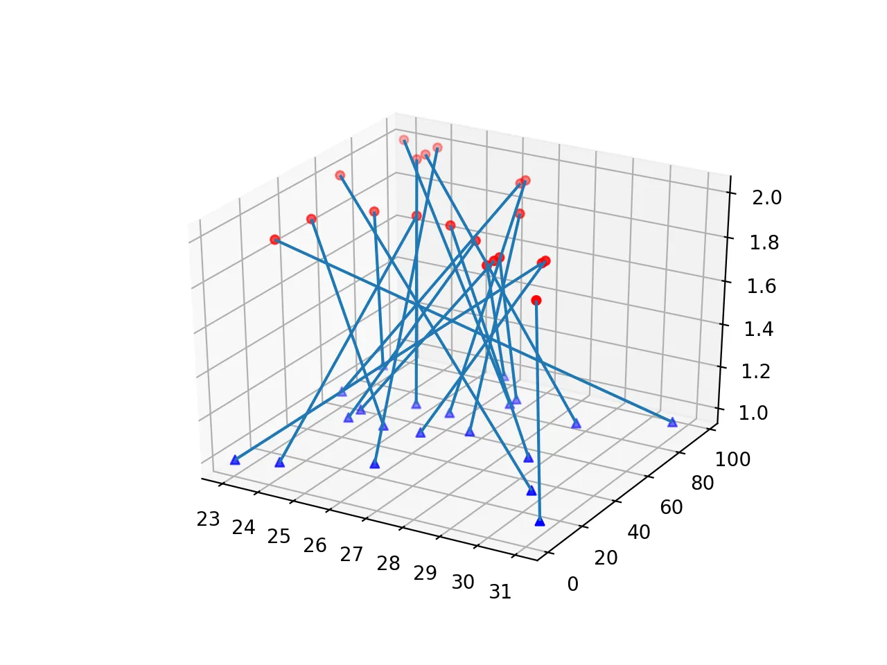
然后连接相关点,但我认为在R或Python中构建这样的图像可能有更直接的方法?


如何运行您的脚本?它是相同的函数调用“random.randrange(start, stop[, step])”吗?然后开始大于停止。 - Alex Lopatin
@AlexanderLopatin 我已经添加了 randrange() 函数。 - G_T
1个回答

0

在 matplotlib 中我没有找到任何直接的方法。一种可能的解决方案是使用 quiver:

from mpl_toolkits.mplot3d import Axes3D  # keep it for projection='3d'
import matplotlib.pyplot as plt
import random


def calculate_vectors(x0, y0, z0, x1, y1, z1):
    u = []
    v = []
    w = []
    for i, x in enumerate(x0):
        dx = x1[i] - x
        dy = y1[i] - y0[i]
        dz = z1[i] - z0[i]
        u.append(dx)
        v.append(dy)
        w.append(dz)
    return u, v, w


def make_plot():
    n = 20
    x1 = [random.randrange(23, 32, 1) for _ in range(n)]
    y1 = [random.randrange(0, 100, 1) for _ in range(n)]
    z1 = [1.0 for _ in range(n)]

    x2 = [random.randrange(23, 32, 1) for _ in range(n)]
    y2 = [random.randrange(0, 100, 1) for _ in range(n)]
    z2 = [2.0 for _ in range(n)]

    u, v, w = calculate_vectors(x1, y1, z1, x2, y2, z2)

    fig = plt.figure()
    ax = fig.gca(projection='3d')
    ax.scatter(x1, y1, z1, c='b', marker='^')
    ax.scatter(x2, y2, z2, c='r', marker='o')
    ax.quiver(x1, y1, z1, u, v, w, arrow_length_ratio=0.0)


make_plot()
plt.show()

我没有使用numpy,因为刷新向量和sin/cos计算更有趣。这是输出结果:

enter image description here


网页内容由stack overflow 提供, 点击上面的
可以查看英文原文,
原文链接