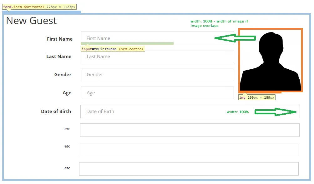
我正在开发一个基于Bootstrap 3的表单,其中包含一系列文本控件和图像。该表单占用其容器的100%,文本输入框也设置为100%的宽度。当不必担心图像时,这很有效。我使用了Bootstrap的.form-control和.form-horizontal类使其工作(底部附有代码):
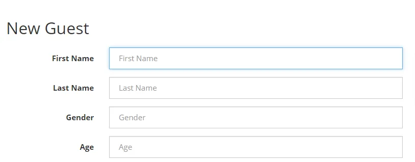
当前外观
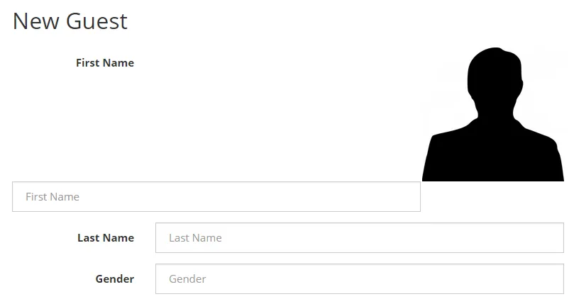
我需要将图像放置在这些表单控件的右侧,并适当缩小它们的宽度:
模型
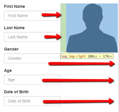
我可以简单地在Bootstrap的网格系统中再添加一列来处理此问题,但是,当图像完成后,我还希望列返回到全宽度,就像上面模型中所示的那样。类似于Microsoft Word中的“紧凑”图像布局。我尝试将float:right;和display:inline-block'设置为图像类,但结果不正确:
目前还不能正常工作
有人知道如何使设计与我在模型中描述的一样吗?
<!DOCTYPE html>
<html>

<head>
  <script src="//code.jquery.com/jquery.min.js"></script>
  <link href="//maxcdn.bootstrapcdn.com/bootstrap/3.3.0/css/bootstrap.min.css" rel="stylesheet" type="text/css" />
  <script src="//maxcdn.bootstrapcdn.com/bootstrap/3.3.0/js/bootstrap.min.js"></script>
  <meta charset="utf-8">
  <title>JS Bin</title>
</head>

<body>
  <div>
    <h2>New Guest</h2>

    <form class="form-horizontal" role="form">
      <img src="http://images.all-free-download.com/images/graphiclarge/man_silhouette_clip_art_9510.jpg" style="float: right; max-width: 200px; display: inline-block;" />

      <div class="form-group" id="group-tbFirstName">
        <label for="tbFirstName" class="col-sm-3 control-label">First Name</label>

        <div class="col-sm-9">
          <input type="text" class="form-control" id="tbFirstName" placeholder="First Name" value="" />
        </div>
      </div>

      <div class="form-group" id="group-tbLastName">
        <label for="tbLastName" class="col-sm-3 control-label">Last Name</label>

        <div class="col-sm-9">
          <input type="text" class="form-control" id="tbLastName" placeholder="Last Name" value="" />
        </div>
      </div>

      <div class="form-group" id="group-optGender">
        <label for="optGender" class="col-sm-3 control-label">Gender</label>

        <div class="col-sm-9">
          <input type="text" class="form-control" id="optGender" placeholder="Gender" value="" />
        </div>
      </div>

      <div class="form-group" id="group-tbAge">
        <label for="tbAge" class="col-sm-3 control-label">Age</label>

        <div class="col-sm-9">
          <input type="number" class="form-control" step="any" id="tbAge" value="" placeholder="Age" />
        </div>
      </div>

      <div class="form-group" id="group-dtDateOfBirth">
        <label for="dtDateOfBirth" class="col-sm-3 control-label">Date of Birth</label>

        <div class="col-sm-9">
          <input type="text" class="form-control" id="dtDateOfBirth" placeholder="Date of Birth" value="" />
        </div>
      </div>
    </form>
  </div>
</body>

</html>
我想要实现的效果是,使图像下方的输入框再次扩展到100%。 就像这样:
我知道可以浮动图像,但我不希望所有在图像所在行上的输入框都与其相同宽度。 我希望它们能够扩展。