如何创建跑马灯效果?的答案展示了如何创建跑马灯效果,但是在每次迭代结束时会留下很多空白空间。
有没有一种使用CSS实现平滑的<marquee></marquee>效果,而不会有这种空白空间呢?
我有很多小元素,看起来有点像Stack Overflow的蓝色标签,它们专门填充跑马灯的内容,而不是一个连续的主体或一堵墙的文本。
如何创建跑马灯效果?的答案展示了如何创建跑马灯效果,但是在每次迭代结束时会留下很多空白空间。
有没有一种使用CSS实现平滑的<marquee></marquee>效果,而不会有这种空白空间呢?
我有很多小元素,看起来有点像Stack Overflow的蓝色标签,它们专门填充跑马灯的内容,而不是一个连续的主体或一堵墙的文本。
以下是一个示例,您可以通过设置延迟和持续时间来控制文本之间的间距。
.marquee {
  background-color: #ddd;
  width: 500px;
  margin: 0 auto;
  overflow: hidden;
  white-space: nowrap;
}
.marquee span {
  display: inline-block;
  font-size: 20px;
  position: relative;
  left: 100%;
  animation: marquee 8s linear infinite;
}
.marquee:hover span {
  animation-play-state: paused;
}

.marquee span:nth-child(1) {
  animation-delay: 0s;
}
.marquee span:nth-child(2) {
  animation-delay: 0.8s;
}
.marquee span:nth-child(3) {
  animation-delay: 1.6s;
}
.marquee span:nth-child(4) {
  animation-delay: 2.4s;
}
.marquee span:nth-child(5) {
  animation-delay: 3.2s;
}

@keyframes marquee {
  0%   { left: 100%; }
  100% { left: -100%; }
}<p class="marquee">
<span>this is a</span>
<span>simple marquee</span>
<span>using css</span>
<span>only tech</span>
<span>with a delay</span>
</p>animation: marquee 8s linear infinite; 移动到一个独立的类中,在事件处理程序中将该类添加到 marquee 元素即可。 - AsonsCSS3无空白间隔跑马灯效果
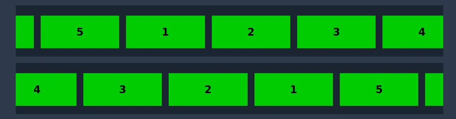
Horizontal Marquee
水平 有一个右侧和一个左侧: https://codepen.io/Rayeesac/pen/JjGEYRZ
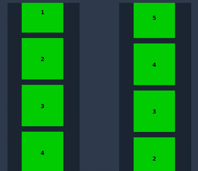
Vertical Marquee
垂直式,顶部和底部各一个: https://codepen.io/Rayeesac/pen/eYJgpVy
.marquee {
  width: 100%;
  height: 80px;
  margin: 0 auto;
  overflow: hidden;
  white-space: nowrap;
  border: 1px solid blue;
}
.marquee-content {
  display: inline-block;
  margin-top: 5px;
  animation: marquee 15s linear infinite;
}
.item-collection-1 {
  position: relative;
  left: 0%;
  animation: swap 15s linear infinite;
}
@keyframes swap {
  0%, 50% {
    left: 0%;
  }
  50.01%,
  100% {
    left: 100%;
  }
}
.marquee-content:hover {
  animation-play-state: paused
}
.item1 {
  display: inline-block;
  height: 70px;
  width: 140px;
  background: cyan;
  vertical-align: top;
  margin-left: 15px;
}
.item2 {
  display: inline-block;
  height: 70px;
  width: 100px;
  background: magenta;
  vertical-align: top;
  margin-left: 15px;
  line-height: 14px;
}
/* Transition */

@keyframes marquee {
  0% {
    transform: translateX(0)
  }
  100% {
    transform: translateX(-100%)
  }
}<div class="marquee">
<div class="marquee-content">
<span class="item-collection-1">
<span><img src="https://cdn.sstatic.net/Sites/stackoverflow/img/apple-touch-icon@2.png" height="80"></span>
<span class="item1"></span>
<span><img src="https://cdn.sstatic.net/Sites/stackoverflow/img/apple-touch-icon@2.png" height="80"></span>
<span class="item1"></span>
<span class="item1"></span>
<span class="item1"></span>
<span class="item1"></span>
</span>
<span class="item-collection-2">
<span class="item2"></span>
<span class="item2"></span>
<span class="item2"></span>
<span class="item2"></span>
<span class="item2"></span>
<span class="item2"></span>
<span class="item2"></span>
<span class="item2"></span>
</span>
</div>
</div>