好的,我知道这个问题已经被问了很多次,但是我无法让它工作:
我尝试在Ubuntu 16.04 LTS 64位系统上使用Python 2.7.12 64位版本的Matplotlib,并使用来自matplotlib.org/xkcd/examples的示例代码,但我仍然得到这个结果!
我已经做了什么
- 通过pip安装了Matplotlib(版本2.2.2)
- 安装了xkcd和xkcd script字体(来自ipython/xkcd-font)
- 安装了Humor Sans字体(来自imkevinxu/xkcdgraphs)
- 更新了字体缓存数据库(fc-cache -fv)
- 删除了~/.cache/matplotlib目录(整个目录)
- 重新启动电脑
- 验证了字体是否在~/.cache/matplotlib/fontList.json中
有什么线索可以让我让它工作吗?我感激任何提示!
问候,Micha
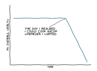
我使用matplotlib.org/xkcd/examples的示例代码:
from matplotlib import pyplot as plt
import numpy as np

plt.xkcd()

fig = plt.figure()
ax = fig.add_subplot(1, 1, 1)
ax.spines['right'].set_color('none')
ax.spines['top'].set_color('none')
plt.xticks([])
plt.yticks([])
ax.set_ylim([-30, 10])

data = np.ones(100)
data[70:] -= np.arange(30)

plt.annotate(
    'THE DAY I REALIZED\nI COULD COOK BACON\nWHENEVER I WANTED',
    xy=(70, 1), arrowprops=dict(arrowstyle='->'), xytext=(15, -10))

plt.plot(data)

plt.xlabel('time')
plt.ylabel('my overall health')

fig = plt.figure()
ax = fig.add_subplot(1, 1, 1)
ax.bar([-0.125, 1.0-0.125], [0, 100], 0.25)
ax.spines['right'].set_color('none')
ax.spines['top'].set_color('none')
ax.xaxis.set_ticks_position('bottom')
ax.set_xticks([0, 1])
ax.set_xlim([-0.5, 1.5])
ax.set_ylim([0, 110])
ax.set_xticklabels(['CONFIRMED BY\nEXPERIMENT', 'REFUTED BY\nEXPERIMENT'])
plt.yticks([])

plt.title("CLAIMS OF SUPERNATURAL POWERS")

plt.show()