我想使用 Bokeh 绘制整个 pandas DataFrame。也就是说,我正在寻找第三行的 Bokeh 等价物:
import pandas as pd
income_df = pd.read_csv("income_2013_dollars.csv", sep='\t', thousands=',')
income_df.plot(x="year")
目前有没有一种方法可以做到这一点,还是我必须分别传递每个y值?
Bokeh项目维护者的提示:此答案涉及一个已过时和弃用的API,该API已经被Bokeh删除。有关使用现代和完全支持的Bokeh API创建条形图的信息,请参见其他问题/答案。
您可能会发现图表示例很有用:
https://github.com/bokeh/bokeh/tree/master/examples/charts
如果您需要一个条形图,则可以执行以下操作:
from bokeh.charts import Bar
Bar(income_df, notebook=True).show()  # assuming the index is corretly set on your df
from bokeh.charts import Bar
from bokeh.plotting import output_notebook, show
output_notebook()
bar = Bar(income_df)
show(bar)
然而,以下操作不能执行:
from bokeh.charts import Bar
from bokeh.plotting import output_notebook
output_notebook()
Bar(income_df).show()  # WILL GIVE YOU AN ERROR
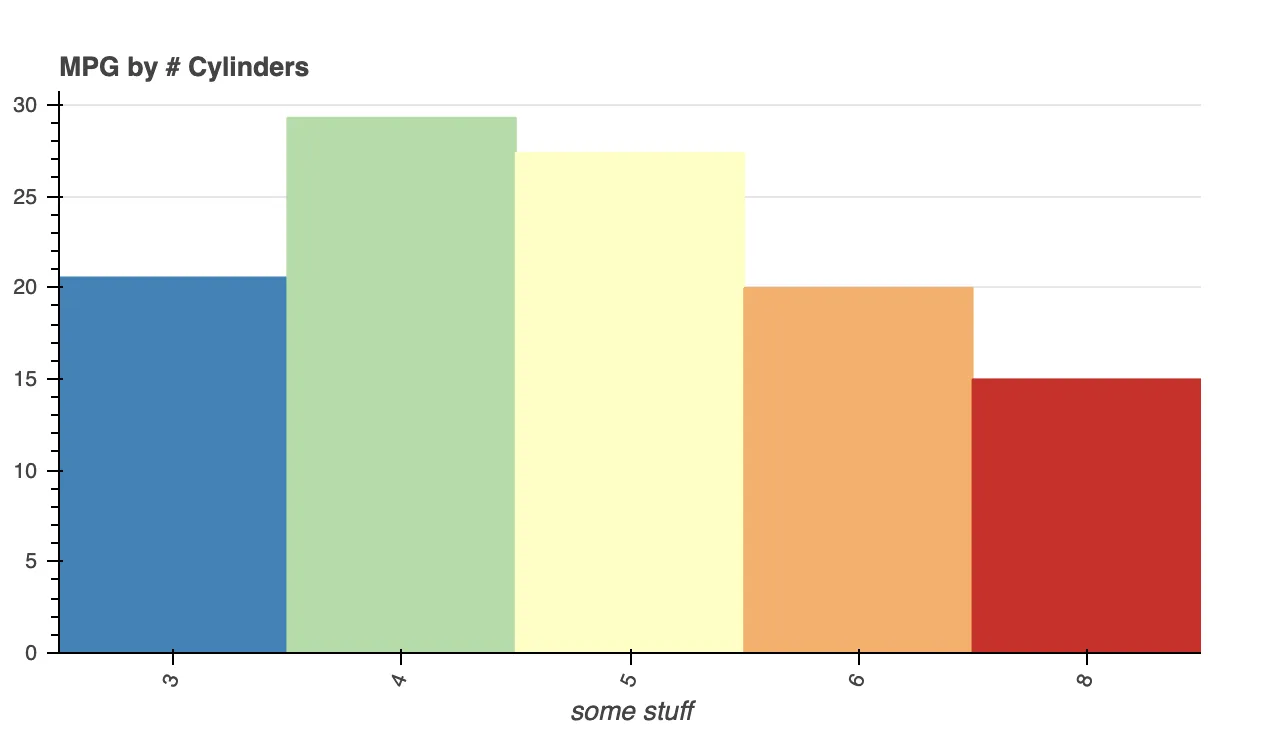
https://docs.bokeh.org/en/latest/docs/user_guide/categorical.html#pandas
例如:
from bokeh.models import ColumnDataSource
from bokeh.plotting import figure, show
from bokeh.sampledata.autompg import autompg as df
from bokeh.transform import factor_cmap

df.cyl = df.cyl.astype(str)
group = df.groupby('cyl')

source = ColumnDataSource(group)

cyl_cmap = factor_cmap('cyl', palette="Spectral5", factors=sorted(df.cyl.unique()))

p = figure(x_range=group, title="MPG by # Cylinders",
           toolbar_location=None, tools="")

p.vbar(x='cyl', top='mpg_mean', width=1, source=source,
       line_color=cyl_cmap, fill_color=cyl_cmap)

p.y_range.start = 0
p.xgrid.grid_line_color = None
p.xaxis.axis_label = "some stuff"
p.xaxis.major_label_orientation = 1.2
p.outline_line_color = None

show(p)
df['y_col'].values这可能是必要的,否则df['y_col'].values.to_list()将会给你一个列表。 - EdChum