使用箱线图为大数据集进行可视化

3

I have a dataframe in the following format.

item    price
item1    23
item2    45
item1    24
item3    98
item2    45.9
item3    97.2

基于此,我需要显示每个不同项目的价格分布箱线图。有大约80个不同的项目。因此,我不确定如何对它们进行分组,以便在每个图中获取至少4个唯一项目的范围,并为所有80个唯一项目创建多个这样的图表。 我不确定是否需要重新调整我的数据框架,即使需要重新调整,也应该基于什么? 我尝试使用facet_wrap,但nrow没有起到任何作用。 非常感谢您提供的任何帮助。

1
为什么不按
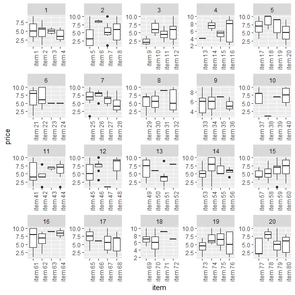
price列排序,创建一个基于price列值范围的新列,然后可以使用facet_wrap()进行分面呈现。 - TheSciGuy
@TheSciGuy 但是,这样相同的项目将不会在一起。我需要每个项目的分布,对吧? - savi
啊,我以为每个“物品”的“价格”是相似的。如果同一“物品”的“价格”相差很大,那么这样做就没有意义了。 - TheSciGuy
2个回答

1

您需要根据项目名称创建一个分组变量。由于示例中所有项目都称为item#,因此我从中提取了数字以创建分组变量:

df <- df %>%
  mutate(group = gsub("item", "", item))

p <- ggplot(df, aes(x=item, y=price)) + 
  geom_boxplot() +
  facet_wrap(item~group,scales="free")
p

0
如果你想要每个图有4个箱线图,可以尝试以下代码:
#library
library(tidyverse)
library(ggplot2)

#simulate your data
set.seed(2323)
data <- tibble(item=rep(paste("item",1:80),sample(1:10,80, replace=T)),
               price=sample(1:10,407,replace=T))


#group you data
n=4 #groups

data %>% 
  mutate(item=factor(item,levels=unique(item))) %>% 
  group_by(item) %>% 
  mutate(nr=group_indices()) %>% 
  mutate(supergroup=as.numeric(cut(nr,seq(0,length(unique(.$nr)),n)))) %>% 
  select(item,price,supergroup) -> grouped_data

#draw plot         
ggplot(grouped_data,aes(x=item,y=price)) +
  geom_boxplot() + 
  facet_wrap(~supergroup,scales="free") +
  theme(axis.text.x = element_text(angle=90, hjust=1))

enter image description here


网页内容由stack overflow 提供, 点击上面的
可以查看英文原文,
原文链接