ggplot线条和线段的填充

3

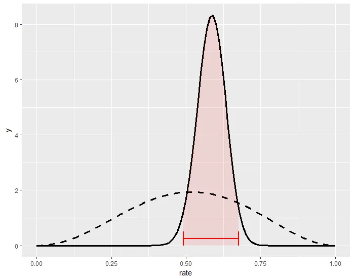
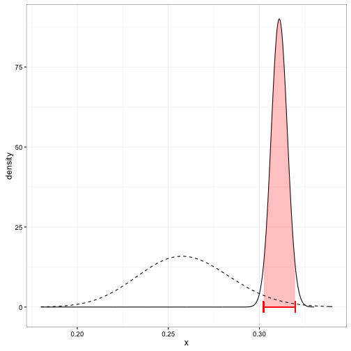
我想创建一个类似于David Robinson的方差解释博客上的这个的图表:

http://varianceexplained.org/figs/2015-10-21-credible_intervals_baseball/jeter_plot-1.png

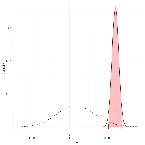
我认为除了填充可信区间和后验曲线之间的部分,我已经理解了。如果有人知道如何做到这一点,能给予一些建议就太好了。

以下是示例代码:

library(ebbr)
library(ggplot2)
library(dplyr)

sample<- data.frame(id=factor(1:10), yes=c(20, 33, 44, 51, 50, 50, 66, 41, 91, 59), 
                total=rep(100, 10))

sample<-
  sample %>%
  mutate(rate=yes/total)

pri<-
  sample %>%
  ebb_fit_prior(yes, total)

sam.pri<- augment(pri, data=sample)

post<- function(ID){
  a<-
    sam.pri %>%
    filter(id==ID)

  ggplot(data=a, aes(x=rate))+
    stat_function(geom="line", col="black",  size=1.1, fun=function(x) 
      dbeta(x, a$.alpha1, a$.beta1))+
    stat_function(geom="line", lty=2, size=1.1,
                  fun=function(x) dbeta(x, pri$parameters$alpha,     pri$parameters$beta))+
    geom_segment(aes(x=a$.low, y=0, xend=a$.low, yend=.5), col="red", size=1.05)+
    geom_segment(aes(x = a$.high, y=0, xend=a$.high, yend=.5), col="red", size=1.05)+
    geom_segment(aes(x=a$.low, y=.25, xend=a$.high, yend=.25), col="red", size=1.05)+
xlim(0,1)
}

post("10")
1个回答

5

我通常通过手动生成描述曲线的数据,为阴影区域的最小值和最大值添加零y值,并使用geom_polygon()来完成。

library(ebbr)
library(ggplot2)
library(dplyr)

sample <- data.frame(id = factor(1:10), yes = c(20, 33, 44, 51, 50, 50, 66, 41, 91, 59), 
                    total = rep(100, 10)) %>%
  mutate(rate=yes/total)

pri <- sample %>%
  ebb_fit_prior(yes, total)

sam.pri <- augment(pri, data = sample)

a <- sam.pri %>%
  filter(id == 10)

# Make the x values for the shaded region
x <- seq(from = a$.low, to = a$.high, length.out = 100)

# Make the y values for the shaded region
y <- dbeta(x, a$.alpha1, a$.beta1)

# Make a data.frame for the shaded region, including zeroes
shaded <- data.frame(x = c(x, a$.high, a$.low), y = c(y, 0, 0))

ggplot(data = a, aes(x = rate)) +
  stat_function(geom = "line", col = "black", size = 1.1, 
                fun = function(x)  dbeta(x, a$.alpha1, a$.beta1)) +
  geom_polygon(data = shaded, aes(x, y),
               fill = "red", alpha = 0.1) +
  stat_function(geom = "line", lty = 2, size = 1.1,
                fun = function(x ) dbeta(x, pri$parameters$alpha,     pri$parameters$beta)) +
  geom_segment(aes(x = a$.low, y = 0, xend = a$.low, yend = 0.5), col = "red", size = 1.05) +
  geom_segment(aes(x = a$.high, y = 0, xend = a$.high, yend = .5), col = "red", size = 1.05) +
  geom_segment(aes(x = a$.low, y = .25, xend = a$.high, yend = .25), col = "red", size = 1.05) +
  xlim(0,1)

enter image description here


网页内容由stack overflow 提供, 点击上面的
可以查看英文原文,
原文链接