我希望有人能帮忙解决这个问题。我正在使用gnuplot 5.0.0绘制雷达(或蜘蛛网)图:
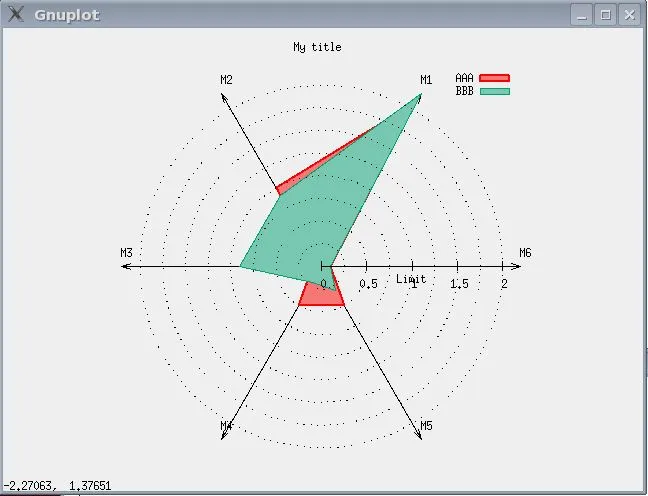
所有轴的刻度和范围都相同。1及1以上的数字具有特殊含义,我想突出显示。
我考虑了三件事情,可以增加可见性:
只需使标记为1(标记为“Limit”)加粗。如何突出显示特定的刻度和标签?
我还可以突出显示级别为1的圆形虚线
在图中,我希望半径大于1的背景颜色不同。
如何实现上述三个选项之一?当然,三个选项都是理想的,但仅与该值的其余部分有所区别即可。
以下是链接中生成图表的内容:
set term x11
set title "My title "
set polar
set angles degrees
npoints = 6

a1 = 360/npoints*1
a2 = 360/npoints*2
a3 = 360/npoints*3
a4 = 360/npoints*4
a5 = 360/npoints*5
a6 = 360/npoints*6

set grid polar 360
set size square
set style data lines

unset border

set grid ls 0
set linetype 1 lc rgb 'red' lw 2 pt 7 ps 2

M=2.2
set arrow from 0,0 to first M*cos(a1), M*sin(a1)
set arrow from 0,0 to first M*cos(a2), M*sin(a2)
set arrow from 0,0 to first M*cos(a3), M*sin(a3)
set arrow from 0,0 to first M*cos(a4), M*sin(a4)
set arrow from 0,0 to first M*cos(a5), M*sin(a5)
set arrow from 0,0 to first M*cos(a6), M*sin(a6)

a1_min = 0
a1_max = 1
a2_min = 0
a2_max = 1
a3_min = 0
a3_max = 1
a4_min = 0
a4_max = 1
a5_min = 0
a5_max = 1
a6_min = 0
a6_max = 1

set label "M1" at M*cos(a1),M*sin(a1) center offset char 1,1
set label "M2" at M*cos(a2),M*sin(a2) center offset char 1,1
set label "M3" at M*cos(a3),M*sin(a3) center offset char 1,1
set label "M4" at M*cos(a4),M*sin(a4) center offset char 1,1
set label "M5" at M*cos(a5),M*sin(a5) center offset char 1,1
set label "M6" at M*cos(a6),M*sin(a6) center offset char 1,1


set xrange [0:1]
set yrange [0:1]

set xtics axis 0,0.5,M
unset ytics

set rrange [0:M]

set rtics (""0,""0.25,""0.5,""0.75,"Limit"1,""1.25,""1.50,""1.75,""2)
set rtics scale 0 format ''

set style fill transparent solid 0.5
set style function filledcurves y1=0.5
set grid noxtics nomxtics noytics nomytics front


plot  '-' u ($1==1?a1:($1==2?a2:($1==3?a3:($1==4?a4:($1==5?a5:($1==6?a6:$1)))))):($1==1?(($2-a1_min)/(a1_max-a1_min)):($1==2?(($2-a2_min)/(a2_max-a2_min)):($1==3?(($2-a3_min)/(a3_max-a3_min)):($1==4?(($2-a4_min)/(a4_max-a4_min)):($1==5?(($2-a5_min)/(a5_max-a5_min)):($1==6?(($2-a6_min)/(a6_max-a6_min)):$1)))))) w filledcurve lt 1 title "AAA",\
 '-' u ($1==1?a1:($1==2?a2:($1==3?a3:($1==4?a4:($1==5?a5:($1==6?a6:$1)))))):($1==1?(($2-a1_min)/(a1_max-a1_min)):($1==2?(($2-a2_min)/(a2_max-a2_min)):($1==3?(($2-a3_min)/(a3_max-a3_min)):($1==4?(($2-a4_min)/(a4_max-a4_min)):($1==5?(($2-a5_min)/(a5_max-a5_min)):($1==6?(($2-a6_min)/(a6_max-a6_min)):$1)))))) w filledcurve lt 2 title "BBB"

1 2.1
2 1
3 0.1
4 0.5
5 0.5
6 0.1
1 2.1
EOF
1 2.2
2 0.9
3 0.9
4 0.2
5 0.3
6 0.1
1 2.2
EOF
set output