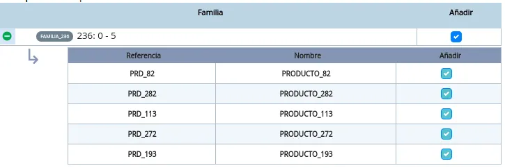
更改Bootstrap 4复选框的背景颜色

31
我想知道如何在此示例中更改Bootstrap 4复选框的背景颜色。

.custom-control-label::before,
.custom-control-label::after {
  top: .8rem;
  width: 1.25rem;
  height: 1.25rem;
}
<link rel="stylesheet" href="https://maxcdn.bootstrapcdn.com/bootstrap/4.0.0-beta.3/css/bootstrap.min.css" integrity="sha384-Zug+QiDoJOrZ5t4lssLdxGhVrurbmBWopoEl+M6BdEfwnCJZtKxi1KgxUyJq13dy" crossorigin="anonymous">


<div class="custom-control form-control-lg custom-checkbox">
  <input type="checkbox" class="custom-control-input" id="customCheck1">
  <label class="custom-control-label" for="customCheck1">Check this custom checkbox</label>
</div>

4个回答

70

当复选框未被选中时,您可以使用以下 CSS 让它变红色,选中后变为黑色。

.custom-control-label:before{
  background-color:red;
}
.custom-checkbox .custom-control-input:checked~.custom-control-label::before{
  background-color:black;
}

以下代码可以改变箭头的颜色

.custom-checkbox .custom-control-input:checked~.custom-control-label::after{
  background-image:url("data:image/svg+xml;charset=utf8,%3Csvg xmlns='http://www.w3.org/2000/svg' viewBox='0 0 8 8'%3E%3Cpath fill='red' d='M6.564.75l-3.59 3.612-1.538-1.55L0 4.26 2.974 7.25 8 2.193z'/%3E%3C/svg%3E");
}
此代码将使勾号变为红色,您可以通过更改fill='red'的值来更改颜色为您喜欢的颜色。

编辑:如果指定RGB颜色,例如 #444444,请使用 %23 替换 #,例如 %23444444

或者,您也可以使用任何您喜欢的图片代替。

<link rel="stylesheet" href="https://maxcdn.bootstrapcdn.com/bootstrap/4.0.0-beta.3/css/bootstrap.min.css" integrity="sha384-Zug+QiDoJOrZ5t4lssLdxGhVrurbmBWopoEl+M6BdEfwnCJZtKxi1KgxUyJq13dy" crossorigin="anonymous">

<style>
    .custom-control-label:before{
        background-color:red;
    }
    .custom-checkbox .custom-control-input:checked~.custom-control-label::before{
        background-color:black;
    }
    .custom-checkbox .custom-control-input:checked~.custom-control-label::after{
        background-image:url("data:image/svg+xml;charset=utf8,%3Csvg xmlns='http://www.w3.org/2000/svg' viewBox='0 0 8 8'%3E%3Cpath fill='red' d='M6.564.75l-3.59 3.612-1.538-1.55L0 4.26 2.974 7.25 8 2.193z'/%3E%3C/svg%3E");
    }
    .custom-control-input:active~.custom-control-label::before{
        background-color:green;
    }
   
    /** focus shadow pinkish **/
    .custom-checkbox .custom-control-input:focus~.custom-control-label::before{
        box-shadow: 0 0 0 1px #fff, 0 0 0 0.2rem rgba(255, 0, 247, 0.25); 
    }
</style>  

<div class="custom-control form-control-lg custom-checkbox">  
    <input type="checkbox" class="custom-control-input" id="customCheck1">  
    <label class="custom-control-label" for="customCheck1">Check this custom checkbox</label>  
</div>

编辑: 根据@cprcrack的要求添加了一个焦点颜色(粉色)


甜美,但是内部图标的颜色怎么改变? - Bezelinjah
添加了必须使用的CSS以更改勾选图标。 - knetsi
2
按住鼠标点击时出现的浅蓝色怎么样? - shaneparsons
2
@shaneparsons 更新了代码片段,现在它应该显示为绿色。 - knetsi
聚焦时出现的淡蓝色阴影怎么样? - cprcrack
显示剩余6条评论

0

我想在这里添加一个答案,它是knetsi答案的更简单和通用版本,适用于那些可能不感兴趣使颜色变化取决于:checked伪类的人。

我只是想定义一个类my-error,我可以将其添加或删除到复选框中以更改其颜色,在这种情况下反映错误条件。无论是否选中该框,颜色都保持不变。

以下是代码示例:

<link rel="stylesheet" href="https://stackpath.bootstrapcdn.com/bootstrap/4.1.2/css/bootstrap.min.css" integrity="sha384-Smlep5jCw/wG7hdkwQ/Z5nLIefveQRIY9nfy6xoR1uRYBtpZgI6339F5dgvm/e9B" crossorigin="anonymous">

<style>
  .custom-checkbox .custom-control-input.my-error~.custom-control-label::before{
    background-color:orangered;
  }
</style>

<div class="custom-control custom-checkbox">
  <input type="checkbox" class="custom-control-input my-error" id="customCheck1">
  <label class="custom-control-label" for="customCheck1">Check this custom checkbox</label>
</div>

-1
编程环境 Angular 10.0
预览- 预览}
Html
<!-- BLUE CHECKBOX -->
<div class="custom-control custom-checkbox">
  <input type="checkbox" [checked]="true" class="custom-control-input" [id]="['chk-add',item.id,uniqueTag].join('-')" />
  <label class="custom-control-label" [for]="['chk-add',item.id,uniqueTag].join('-')"></label>
</div>
<!-- GREEN CHECKBOX -->
<div class="custom-control-products custom-checkbox-products">
  <input type="checkbox" [checked]="true" class="custom-control-input-products" [id]="['chk-add',item.id,td.id,uniqueTag].join('-')" />
  <label class="custom-control-label-products" [for]="['chk-add',item.id,td.id,uniqueTag].join('-')"></label>
</div>

Scss / css
  .custom-control-products {
    position: relative;
    display: block;
    min-height: 1.5rem;
    padding-left: 1.5rem;
  }

  .custom-control-input-products {
    position: absolute;
    left: 0;
    z-index: -1;
    width: 1rem;
    height: 1.25rem;
    opacity: 0;
  }
  
  .custom-control-input-products:checked ~ .custom-control-label-products::before {
    color: #fff;
    border-color: #007bff;
    background-color: #007bff;
  }
  
  .custom-control-input-products:focus ~ .custom-control-label-products::before {
    box-shadow: 0 0 0 0.2rem rgba(0, 123, 255, 0.25);
  }
  
  .custom-control-input-products:focus:not(:checked) ~ .custom-control-label-products::before {
    border-color: #80bdff;
  }
  
  .custom-control-input-products:not(:disabled):active ~ .custom-control-label-products::before {
    color: #fff;
    background-color: #b3d7ff;
    border-color: #b3d7ff;
  }
  
  .custom-control-input-products[disabled] ~ .custom-control-label-products, .custom-control-input-products:disabled ~ .custom-control-label-products {
    color: #6c757d;
  }
  
  .custom-control-input-products[disabled] ~ .custom-control-label-products::before, .custom-control-input-products:disabled ~ .custom-control-label-products::before {
    background-color: #e9ecef;
  }
  
  .custom-control-label-products {
    position: relative;
    margin-bottom: 0;
    vertical-align: top;
  }
  
  .custom-control-label-products::before {
    position: absolute;
    top: 0.25rem;
    left: -1.5rem;
    display: block;
    width: 1rem;
    height: 1rem;
    pointer-events: none;
    content: "";
    background-color: #fff;
    border: #adb5bd solid 1px;
  }
  
  .custom-control-label-products::after {
    position: absolute;
    top: 0.25rem;
    left: -1.5rem;
    display: block;
    width: 1rem;
    height: 1rem;
    content: "";
    background: no-repeat 50% / 50% 50%;
  }
  
  .custom-control-input-products:checked ~ .custom-control-label-products::before {
    color: #fff;
    border-color: #007bff;
    background-color: #17a2b8a8 !important;
  }

  .custom-checkbox-products .custom-control-label-products::before {
    border-radius: 0.25rem;
  }
  
  .custom-checkbox-products .custom-control-input-products:checked ~ .custom-control-label-products::after {
    background-image: url("data:image/svg+xml,%3csvg xmlns='http://www.w3.org/2000/svg' width='8' height='8' viewBox='0 0 8 8'%3e%3cpath fill='%23fff' d='M6.564.75l-3.59 3.612-1.538-1.55L0 4.26l2.974 2.99L8 2.193z'/%3e%3c/svg%3e");
  }
  
  .custom-checkbox-products .custom-control-input-products:indeterminate ~ .custom-control-label-products::before {
    border-color: #007bff;
    background-color: #007bff;
  }
  
  .custom-checkbox-products .custom-control-input-products:indeterminate ~ .custom-control-label-products::after {
    background-image: url("data:image/svg+xml,%3csvg xmlns='http://www.w3.org/2000/svg' width='4' height='4' viewBox='0 0 4 4'%3e%3cpath stroke='%23fff' d='M0 2h4'/%3e%3c/svg%3e");
  }
  
  .custom-checkbox-products .custom-control-input-products:disabled:checked ~ .custom-control-label-products::before {
    background-color: rgba(0, 123, 255, 0.5);
  }
  
  .custom-checkbox-products .custom-control-input-products:disabled:indeterminate ~ .custom-control-label-products::before {
    background-color: rgba(0, 123, 255, 0.5);
  }

-1
使用以下CSS
input.form-check-input:checked {
  background-color: black;
}

网页内容由stack overflow 提供, 点击上面的
可以查看英文原文,
原文链接