这是我的代码:
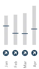
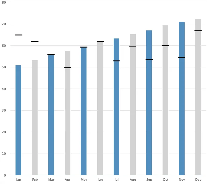
我想在代表“life”列的每个柱状图上添加水平线“--”,以实现以下效果:
data <- gapminder::gapminder %>% filter(country == 'Brazil') %>%
  mutate(life = rnorm(12,mean = 55,sd = 5),
         months = month.abb)
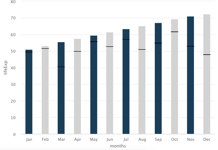
这是我的图表:
 data%>%
      mutate(months = as_factor(months)) %>%
      mutate(index = rep(c(1,2),6), .before = everything()) %>%

      hchart(
        'column',
        names = 'SQUADS',
        hcaes(x = months,
              y = lifeExp,
              group = months),

        color = rep(c('#1B3D59','lightgray'),6),

        name = 'Sales',
        # groupPadding = 1.5,
        pointWidth = 20,
        showInLegend = FALSE
      )
我想在代表“life”列的每个柱状图上添加水平线“--”,以实现以下效果: