Python中绘制网格数据的极地色彩地图绘图

3
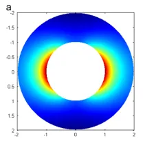
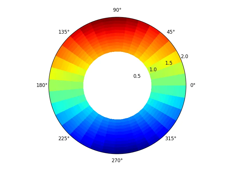
我想绘制极坐标形式的网格数据的彩色地图。在数据中,r的范围是1到2,theta的范围是0到360。我希望得到如下的地图:
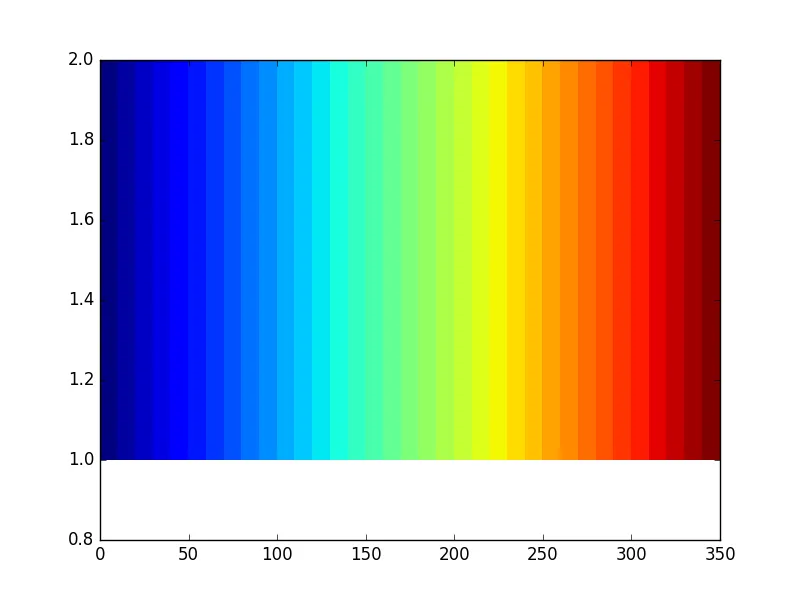
enter image description here 我已经绘制了以下地图:

#x1 of shape(12,)
#y1 0f shape(36,1)
#z of shape(36,12)
fig=plt.figure()  
ax=fig.add_subplot(111) #Output Figure 1
#ax=fig.add_subplot(111,polar='True') #Output Figure 2
ax=fig.add_subplot(111)
ax.pcolor(y1,x1,z)
plt.show()

输出结果: 在此输入图片描述

在此输入图片描述

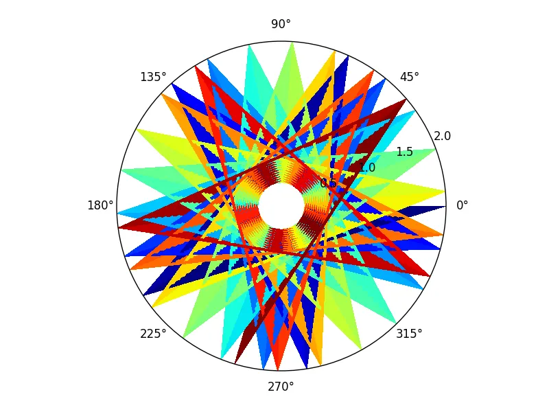
有没有想法如何绘制上面的图形?我也试着将 r、theta 转换成 x、y,但是在 r < 1 的范围内得到了颜色映射,而我不想要。

1个回答

2

正如这里所指出的,pcolormesh()在此很有用。

import matplotlib.pyplot as plt
import numpy as np

theta = np.linspace(0, 2*np.pi, 36)
r = np.linspace(1, 2, 12)

R, THETA = np.meshgrid(r, theta)
Z = np.sin(THETA) * R

plt.subplot(111, projection='polar')
plt.pcolormesh(THETA, R, Z)
plt.gca().set_rmin(0.0)

plt.show()

output figure


谢谢兄弟!我也在做同样的事情,现在我检查了我的数据,发现数据中有一个错误。 - undefined
这个回答解决了你的问题吗?如果是的话,请标记为答案。谢谢。 - undefined
我已经标记过了。我之前使用的是以度数为单位的θ,现在我改成弧度,现在它可以工作了 :) - undefined

网页内容由stack overflow 提供, 点击上面的
可以查看英文原文,
原文链接