将元素扩展以适应表格单元格内其余容器的大小

3

我想知道是否有可能在不使用JavaScript的情况下使一个容器在另一个元素中扩展到其父元素的高度。
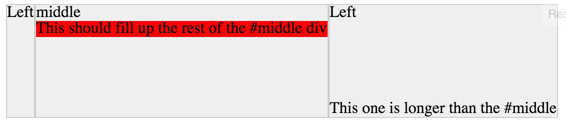
以下是一个简单的示例,以说明我的意思:

HTML:

<div id="left">Left</div>
<div id="middle">
    middle
    <div id="container">This should fill up the rest of the #middle div</div>
</div>
<div id="right">Left<br><br><br><br><br><br>This one is longer than the #middle</div>

CSS:

#left, #middle, #right { 
    display: table-cell; 
    background: #eee;  
    border: #ccc 1px solid; 
}

#container { background: red; }

jsfiddle

在table-cell中展开元素

我没有找到解决方案。有什么想法吗?


你必须使用 display:table-cell; 吗? - MMachinegun
4个回答

1

只需用外部 flexbox 替换 display:table-cell;,使中间列成为垂直 flexbox,进而支持您想要实现的自动增长。

body {display: flex;}
#middle {display: flex;flex-direction: column;}
#container {background-color:red;flex-grow:1;}

1

Adding display:inline-flex; and height:100%; to #container will do it. Do same to any of the DIV's that you want to fill whole space.

#left, #middle, #right { 
    display: table-cell; 
    background: #eee;  
    border: #ccc 1px solid; 
}

#container { 
    background: red;
    display: inline-flex;
    height: 100%;
}
<div id="left">Left</div>
<div id="middle">
    middle
    <div id="container">This should fill up the rest of the #middle div</div>
</div>
<div id="right">Left<br><br><br><br><br><br>This one is longer than the #middle</div>


但是这会使容器重叠其父元素:http://jsfiddle.net/ubm7eyu8/1/ - damian
它没有重叠,您可以根据需要管理重叠和边距。还可以在此处查看方法http://jsfiddle.net/ubm7eyu8/3/ - Sleek Geek
在 Chrome 上进行了检查,看看是否有任何打字错误。 - Sleek Geek
对我也不起作用,OP想要的是高度而不是宽度。 - user169600

-1
如果只是视觉上的问题,你可以直接调换背景颜色:
设置
#middle {
    background: red
}

#middle-top {
    width: 100%;
    background: #eee
}

这样看起来好像底部填充了剩下的部分,但实际上你只是将顶部设置成与其余部分相同的外观。 ;)

这里是完整的代码片段:或者一个pen

#left, #middle, #right { 
    display: table-cell; 
    background: #eee;  
    border: #ccc 1px solid; 
}

#middle {
    background: red
}

#middle-top {
    width: 100%;
    background: #eee
}
<div id="left">Left</div>
<div id="middle">
  <div id="middle-top">middle</div>
  This should fill up the rest of the #middle div
</div>
<div id="right">Left<br><br><br><br><br><br>This one is longer than the #middle</div>


-1

你需要将#middle设置为相对定位,将#container设置为绝对定位,并适当设置#container的顶部和底部位置,之后你还需要设置#middle的宽度。

#left,
#middle,
#right {
  display: table-cell;
  background: #eee;
  border: #ccc 1px solid;
}
#container {
  background: red;
  top: 13%;
  height:86%;
}
#middle {
  width: 200px;
  height:128px;
}
<div id="left">Left</div>
<div id="middle">
  middle
  <div id="container">This should fill up the rest of the #middle div</div>
</div>
<div id="right">Left
  <br>
  <br>
  <br>
  <br>
  <br>
  <br>This one is longer than the #middle</div>

已编辑

我已更新上述代码,它与任何元素的位置样式无关。


网页内容由stack overflow 提供, 点击上面的
可以查看英文原文,
原文链接