如何在Plots.jl(GR)中将图例移动到绘图区域之外?

21

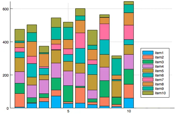
我有一个绘图,其中一部分数据被图例遮挡:

using Plots; gr()
using StatPlots
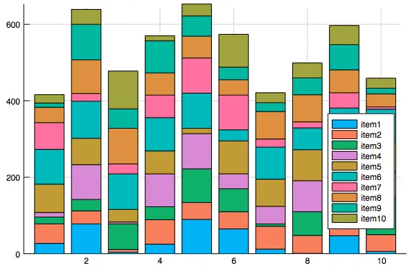
groupedbar(rand(1:100,(10,10)),bar_position=:stack, label="item".*map(string,collect(1:10)))

stacked bar plot

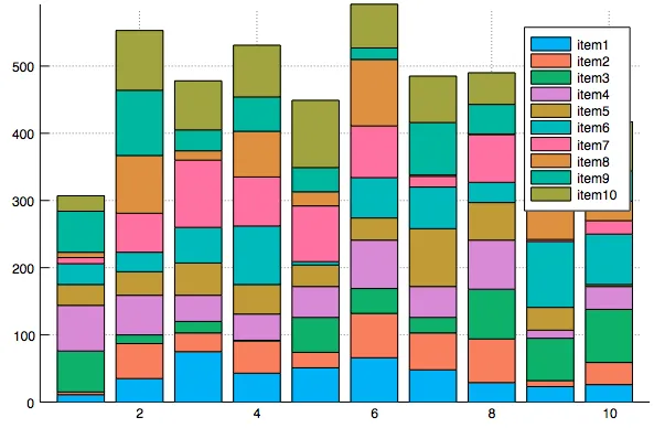
我可以看到,使用"legend"属性,图例可以移动到绘图区域的各个位置,例如:

groupedbar(rand(1:100,(10,10)),bar_position=:stack, label="item".*map(string,collect(1:10)),legend=:bottomright)

stacked bar plot with legend at bottom right

有没有办法将图例完全移出绘图区域,例如移到绘图右侧或下方?对于这种堆积条形图,真的没有合适的位置将图例放在绘图区域内。到目前为止,我能想到的唯一解决办法是在输入数据矩阵中创建一些“假”的空行,以此来腾出空间,但这似乎有点取巧,并且每次制作图表时都需要调整额外行数的数量。
groupedbar(vcat(rand(1:100,(10,10)),zeros(3,10)),bar_position=:stack, label="item".*map(string,collect(1:10)),legend=:bottomright)

stacked bar plot with legend placed in extra white space

我看到有人提出了一个关于pyplot的解决方案,请问是否有类似于GR后端的解决方案?另一个解决方案是我能否将图例本身保存到不同的文件中,以便我可以在Inkscape中将它们重新组合?

1
Plotly和PlotlyJS后端支持外部图例(这是它们的默认设置),但我不确定其他后端。你应该在GitHub上提交一个问题(在GR.jl或Plots.jl上)。 - Pietro Vertechi
2个回答

37
现在可以轻松使用Plots.jl实现此操作:Plots.jl
示例:
plot(rand(10), legend = :outertopleft)

enter image description here


9

使用布局,我可以创建一个解决方案,只使用图例来创建一个假的图表。

using Plots
gr()
l = @layout [a{0.001h}; b c{0.13w}]

values = rand(1:100,(10,10))

p1 = groupedbar(values,bar_position=:stack, legend=:none)
p2 = groupedbar(values,bar_position=:stack, label="item".*map(string,collect(1:10)), grid=false, xlims=(20,3), showaxis=false)


p0=plot(title="Title",grid=false, showaxis=false)

plot(p0,p1,p2,layout=l)

enter image description here


网页内容由stack overflow 提供, 点击上面的
可以查看英文原文,
原文链接